搜索
楼主: hefeiddd

一个笨蛋的股指交易记录-------地狱级炒手

  [复制链接]
 楼主| 发表于 2009-3-22 16:44 | 显示全部楼层
Helping traders overcome fears and emotions in trading


A Quick Look at Crude Oil and the US Dollar
March 21st, 2009 by Corey Rosenbloom


I posted yesterday about “Crude Oil and the S&P 500 Index” but let’s take a look now at Crude Oil and the US Dollar both on the weekly timeframe.
Crude Oil (WTIC):

Crude Oil seems to be completing a “Rounded Reversal” pattern that I’ve been highlighting for some time now, and we’re finally getting a rally of the significant positive momentum divergence that has been forming (particularly on the daily charts).
As it stands now, we’re at key potential resistance via the 20 week EMA, but if price clears this level, there is ‘open air’ or open room to make a play for $70 per barrel.  Again, this is just taking a chart view on this possibility, not including fundamental or other considerations.  If the dollar continues to weaken, crude oil prices (and that of many commodities) will continue to rise.  A little inflation would be a good thing in an environment of deflation virtually across the board.
US Dollar Index:

The Dollar Index appears quite bearish in its weekly chart, particularly after having formed a doji (and sort of evening star pattern) at its recent price highs at the $89 level.  Look closely to see that a distinct negative momentum divergence formed on these highs as well.
The “angle of ascent” (I drew trendlines around it) ‘feels’ odd - almost corrective in nature, and that a down-move seems the natural pathway to work off that rise.  It almost feels like an “AB = CD” Measured Move pattern is forming, whose targets would be roughly the $78 index area.
There is potential support about the $81.50 level via the rising 50 week EMA, but if that support level gets taken out, then we would have similar ‘open space’ on the weekly chart to the downside as we do upside in Crude Oil.
We’re sitting now on the 38.2% Fibonacci retracement from the 2008 lows to the 2009 highs, and the 50% comes in at roughly $80.50, while the 61.8% retracement is at the $78.30 level.  The $79 level also reflects prior resistance from the September price swing, which should be expected to act as (at least) temporary support.
Keep watching these charts closely for additional clues.
Corey Rosenbloom
Afraid to Trade.com

Follow Corey on Twitter:  http://twitter.com/afraidtotrade
Register (free) for the Afraid to Trade.com Blog to stay updated

9 Comments | add comment


Two Markets - Two Directions - SP500 and Crude Oil
March 20th, 2009 by Corey Rosenbloom

Adam Hewison of Market Club released a video last night (that was precient on today’s move!) where he discusses the ‘rhythm’ of the S&P 500, Fibonacci resistance (as I’ve been describing), and the next likely move in both the S&P 500 and Crude Oil.

(Clicking the image opens the free video page)
Entitled “Two Markets - Two Directions,” Hewison traces the likely pathway for the S&P 500 and then compares that to a potentially different move in Crude Oil.
Strangely enough, Adam draws the same conclusion I’m finding in both markets, only without using Elliott Waves, Moving Averages, Oscillators, Trendlines, and the like.  Sometimes it helps to ‘keep it simple’ as he always says.  There’s clearly a reason why he’s a 30 year veteran of the markets!
Take a moment to watch the video (was was released earlier to members and released here by permission) and consider becoming a member.  I have a heads up and have previewed the new charts for Market Club members and they’re quite impressive.  I’ll keep you updated when they roll out those long-awaited upgrades!
Corey Rosenbloom
11 Comments | add comment


A Look Back on Prior Quadruple Witching Days
March 20th, 2009 by Corey Rosenbloom

Friday brings us the infamous “Quadruple Witching” event which might be a big deal in the market, and it might not.  Let’s define the concept and then look back in the past at some recent Quadruple Witching Days.
Options traders know that the third Friday of every month is “Options Expiration Days” which can lead to frenzied activity, volume, and volatility as large funds (and traders) ’square up’ any remaining open options positions before they expire and settle on Saturday.  Perhaps they would prefer not to take posession of a large amount of stock, and so they may unwind hedges and/or sell/buy positions in the options (and stock) market.
Quadruple Witching occurs not only when equity options (like Google, Exxon-Mobile) and index options (like DIA, SPY), but also when futures contracts “roll over” and options on equity index futures (like @YM, @ES, @NQ) expire along with single stock futures options.
The following four components comprise a “Quadruple Witching” Day:
Equity Options
Equity Index Options
Index Futures Options
Single-Stock Futures Options
Often, the result is a rather erratic, volatile trading day that can confuse many intraday traders who aren’t aware of this occurrence.  Quadruple Witching occurs on Expiration Friday in March, June, September, and December.
Let’s look back at regular Expiration Fridays and also Quadruple Witching Days in the S&P 500:

(You’ll need to click the chart for a larger image)
The last Quadruple Witching occurred on December 19th which resulted in a small-range day with volume running only slightly above the average at the time.  It was a ‘dud’ in terms of normal Quadruple Witchings.
Prior to that, we had a decent range day on September 19th, with volume surging during the run-up to that Friday as price began its downslide into the October lows.  That Friday took many traders by surprise as it was a sudden up-move in a down-swing that only served to delay the inevitable decline.
The first example shown on the chart comes from June 2008, where price formed a Trend Day Down on higher than average volume in the context of a down-swing.
So, not all Quadruple Witching days result in big moves, but the intraday squiggles (price swings) can occur seemingly randomly and not follow the typical expectations of technical analysis.  Funds are balancing positions and they typically are looking at their books and not their charts to do so, which can cause seemingly perfect intraday trade set-ups to fail.
So, do trade with caution today but perhaps not with extreme caution.  Some retail traders take these days off and start their weekend early. In the end, it’s up to you.
Corey Rosenbloom
Afraid to Trade.com
Follow Corey on Twitter:  http://twitter.com/afraidtotrade
Register (free) for the Afraid to Trade.com Blog to stay updated
16 Comments | add comment


Fibonacci Confluence on NASDAQ and Dow Jones
March 19th, 2009 by Corey Rosenbloom

A couple of readers have also asked me to post the Fibonacci Confluence Levels (grids) for the NASDAQ and the Dow Jones Index currently.  Here is a quick, mid-day update on these levels (which, to me, are not as clear as the confluence on the S&P 500).
NASDAQ Daily Fibonacci Confluence:

The grid logic is roughly the same as this morning’s “Fibonacci Confluence in the S&P 500” post.  Fibonacci grids are taken off the November, January, and February highs and all drawn to the recent March Lows to find confluence (overlap).
The NASDAQ Index has already blown through its key Confluence Zone at roughly 1,465, though it appears to be coming back to this zone in today’s action, having found resistance at its second-level confluence zone (the 50% from November and 61.8% from January).
Dow Jones Daily Fibonacci Confluence:

I’m not picking up much Fibonacci Confluence (at least, not as clearly as we are in the S&P 500) in the Dow Jones at the moment, as the confluence ranges from 7,601 to 7,757 (a 150 point spread really shouldn’t be called ‘confluence’).
However, the Dow is holding resistance just beneath these levels.
Once again, Fibonacci is only a tool for market analysis - there is no guarantee these levels will hold but sometimes it can be quite useful in your analysis and trading.
Corey Rosenbloom
Afraid to Trade.com
Follow Corey on Twitter:  http://twitter.com/afraidtotrade

1 Comment | add comment


Next Page »
金币:
奖励:
热心:
注册时间:
2006-7-3

回复 使用道具 举报

 楼主| 发表于 2009-3-22 16:49 | 显示全部楼层
Triple Fibonacci Confluence at 800 on SP500
March 19th, 2009 by Corey Rosenbloom

I’ve been pointing out Fibonacci confluence at the 800 level on the S&P 500 for a little while now, but I wanted to show a third layer to the 800 level which perhaps is turning out to be rather significant resistance.  There’s no guarantee 800 will hold, but it can be helpful to know of what’s overhead resistance that could give the bulls trouble at this level.

I captured this chart from TradeStation and tried to draw your attention only to the Fibonacci Confluence Levels.
All Fibonacci grids are drawn to the recent March (closing) Low at 675.
Grid 1 is drawn from the November highs
Grid 2 is drawn from the January highs
Grid 3 is drawn from the February highs
Letting the chart speak for itself (click for larger image), the November 38.2% Retracement is at 801; January 50.0% Retracement is at 805; and February 61.8% Retracement is at 797.
Again, there’s no guarantee these levels will stop the market going up here, but it’s something quite interesting that we get three levels of almost identical confluence at the 800 level, which also serves as ’round number’ resistance and prior support off the January lows.
I’m sure everyone’s watching this level like a hawk; you should probably be watching it as well if you’re not already.
Corey Rosenbloom
Afraid to Trade.com
Follow Corey on Twitter:  http://twitter.com/afraidtotrade
Register (free) for the Afraid to Trade.com Blog to stay updated
No Comments | add comment


The Fallout from Wednesday’s Fed Meeting
March 18th, 2009 by Corey Rosenbloom

With all the spastic intraday moves that resulted from today’s Federal Reserve announcement (assessment of the economy - that it is contracting; that rates will be kept low; and that the Fed will buy treasuries) there were some major moves in the Stock Market, Bond Market, Gold (and Silver) Market, and US Dollar Index.  Let’s take a quick look at some examples on the daily chart to get a quick glance on what might be changing as a result.
Quick comments and charts only -
S&P 500:

Quick Take:  Key resistance at 800 (804).  If broken, it would be a major feat for the bulls.  We have prior support, a declining trendline, and confluence Fibonacci at the 800/805 level.  All eyes are on this level.
Gold:

Quick Take: Sharp spike (like silver) down in the morning - massive recovery after the announcement.  Price is still in a range consolidatioin - a break above $950 could send us immedaitely up to challenge $1,000 with little effort.  Price is still in an uptrend, after all.
TLT (20y T-Bond Fund):


Quick Take: Price - like gold - is still in a range consolidation (rectangle).  We had a sharp spike outside the range today which quickly took us right back inside the consolidation.  There’s key support about the $100 level, though the upper trend-channel (which is the 50 day EMA) is declining.  For now, it looks slightly more bearish than bullish - though a break above $105 will test the ‘open airs’ above and could rally back to $120.
US Dollar Index:

Quick Take:  The Traders who got hammered the worst today - at the close that is - were the US Dollar Bulls.
Price sliced through the 50 EMA support like it wasn’t even there and now we’ve opened up the possibility to test the rising 200 SMA at $81 (or weekly 50 EMA at $82).  A bullish picture just last week is now shattered and odds seem to favor lower prices for the meantime.
What a day.  Remember the end of this week brings us “Quadruple Witching” where futures, index, equity, and single stock futures options all expire - the main take-away is that we’re likely to see large volume and erratic price movements as large funds square away their positions.
By all means be careful out there.
Corey Rosenbloom
Afraid to Trade.com
Follow Corey on Twitter:  http://twitter.com/afraidtotrade
Register (free) for the Afraid to Trade.com Blog to stay updated
3 Comments | add comment


Bear Flags Galore in Silver SLV
March 18th, 2009 by Corey Rosenbloom

Silver (and SLV) took a brutal hit today, and fell at one point 6% intraday.  It provided an interesting structure and lesson in momentum lows and bear flags.  Let’s see it as it’s developing.
SLV (Silver ETF) 5-min chart:

I’ve never seen so many bear flags in a single day (at least not that I can remember).  Each retracement took price back to the falling 20 EMA, where - in all cases - nice little dojis formed which offered excellent, low-risk entries (stop beyond the 20 or 50 EMA, entry on the candle after the doji).
I’ve also never seen such perfect plunges after a bear flag formed.  This is a good day for the record books.
Also, we learn a lesson on momentum - such that New Momentum Lows Precede New Price Lows.
Notice on each of the flags, we had three new momentum lows, which implied that - following a retracement (the flag) - odds favored the actual price low was yet to come.
On where I captured the chart mid-day, we’re seeing a distinct positive momentum divergence into the most recent price lows after 1:00 - momentum is NOT confirming this price low.  So many times actual intraday price lows are formed on positive momentum divergences.  I’d be willing to bet that we’ve put in the low for the day or at least that odds are reduced that a bear flag will form successfully off this recent retracement rally.
Still, just take today’s action as an educational lesson in momentum, “Trend Day,” and bear flags.
As always, check out the Market Club for additional analysis, videos, education, trading ideas, and charting.
Corey Rosenbloom
Afraid to Trade.com
Follow Corey on Twitter:  http://twitter.com/afraidtotrade
Register (free) for the Afraid to Trade.com Blog to stay updated
11 Comments | add comment


What is the Cradle Trade?
March 18th, 2009 by Corey Rosenbloom

A few readers have been asking me to explain the “Cradle Trade” Concept with an example and I wanted to take the time to do that in this post.
The “Cradle” has become my favorite trade, and it is one that I discovered through repeated observation.  I’m sure others have figured out the same thing, but I’ve never seen a name given to this concept or trade set-up, so I began pointing it out and asked readers to come up with a name for it.  Some were creative, but the name “Cradle Cross” stuck which I shortened to the “Cradle.”
The Logic is the following:
Let’s assume price is in an uptrend and then price breaks beneath the 20 EMA then also breaks beneath the 50 EMA (exponential moving averages).  Eventually, the 20 EMA (shorter) will cross under the 50 EMA (longer), which will occur at an exact point.  This is the “Cross-over.”
Price moves in a wave-like structure, so if price swings back up to test this exact point, then this sets up the “Cradle Trade,” as price is said to have “come back into the cradle crossover zone.”  The trade is to get short as close to the cross-over price as possible and place a tight stop just beyond the confluence created by the EMAs.  The risk/reward is favorable, as the EMAs are expected to hold as resistance, and if they don’t, then the stop is small relative to the downside target if it is achieved.
The term “Cradle Trade” sums that up in a visual concept.

The main “Cradle” Trade occurred at 1:00pm in the TLT.  Price broke the 20 and 50 EMAs, those EMAs ‘crossed bearishly,’ and then price rallied up into the confluence resistance created by the crossover price at $101.60.  We expect EMAs to hold as support and resistance, and the logic is when both EMAs come together, that should be a confluence resistance area.
And if the ‘cradle’ doesn’t hold (price runs through it), then we have a stop just beyond (though, of course more than a few ticks) the crossover.  You can play for whatever downside target you feel appropriate.
Notice at the end of the chart, a New Cradle has formed as the 20 crossed back above the 50 EMA.
There are subtle nuances to this trade set-up that I won’t share publicly, but hopefully this gives a basic overview of the concept that is becoming one of my favorite trade set-ups at the moment.
For more examples, type “Cradle” or “Cradle Trade” into the blog’s search bar.
Corey Rosenbloom
Afraid to Trade.com
Follow Corey on Twitter:  http://twitter.com/afraidtotrade
Register (free) for the Afraid to Trade.com Blog to stay updated
8 Comments | add comment


« Previous PageNext Page »
金币:
奖励:
热心:
注册时间:
2006-7-3

回复 使用道具 举报

 楼主| 发表于 2009-3-22 16:50 | 显示全部楼层
Intraday Tactics for St Patrick’s Day 09
March 17th, 2009 by Corey Rosenbloom

The market was supposed to go down today, wasn’t it?!  I sure felt that way but price - after all - is king.  Let’s step inside March 17 ‘09 to see the “Idealized” Intraday Trades of the day.

I even included a money shamrock to spice up the chart today.
The bias was - for me at least - to the downside (off confluence Fibonacci resistance from yesterday and a shooting star daily candle).  In fact, I know of more than a few people who are surprised (and upset) with today’s action.  But we do the best we can.
Price initially ran up to test the falling 20 EMA before inflecting back down (failing to make new lows) and then ran up to test the falling 50 EMA, though it only formed a bear-flag (in hindsight).  Both of these were ‘idealized trades,’ though both (likely) wound up with a stop-loss as price reversed.
One thing I hinted at in this morning’s post, but didn’t come out and say, was the potential for a “Three Push” Reversal pattern to form - and that’s exactly what happened.  That’s why I write these end-of-day summaries - the more you see these actual patterns, the better you’ll be in real-time… whether you believe their signal or not (I was a little too baised to the short-side, while I saw the Three-Push, I chose to ignore it… at my peril).
Anyway, price broke up out of the declining (narrow) trendline at noon and then the EMAs crossed and converged to set-up my favorite trade - the Cradle Trade.  It was at this point the bulls had officially taken over the day and the squeezed the shorts (bears) into the close.
I even tried to read a Head and Shoulders Reversal pattern after lunch - it formed quite well… but it too failed as the bulls charged forward into the close.  The “Oops” on the chart reflects the actual and confirmed sell-signal… which was overruled by bullish action and a bullish break above all EMAs.
Afterwards, two more retracements formed to the rising 20 EMA, signaling good entries to those of us who weren’t blinded by our bearishness.
In the end, price is king, patterns help quantify risk and opportunity… and I think the Leprechauns had something to do with today’s bullishness!
Corey Rosenbloom
Afraid to Trade.com
Follow Corey on Twitter:  http://twitter.com/afraidtotrade
Register (free) for the Afraid to Trade.com Blog to stay updated
12 Comments | add comment


The 10 Year Treasury Note Triangle
March 17th, 2009 by Corey Rosenbloom

The 10-Year Treasury Notes Price has been in a pullback retracement since 2009 began, but a clear triangle pattern has now formed and price is reaching the apex.  Let’s look.

Price made a new high over $130 in late December, though we’ve seen a distinct retracement off this level ever since.  Although I haven’t shown a Fibonacci grid, we’ve retraced back to the 50% retracement (from the lows to the highs) which stands at $121.05, an area where price is finding solid support (with the exception of one blip beneath).
Price broke a descending trendline in early February which led to the current consolidation - or triangle - pattern we’re seeing now.
A positive momentum divergence has been forming under price since we had our first swing low of the year in 2009, which could hint that the likely breakout will be to the upside… though it’s probably best to wait for an actual break to materialize before trying to guess in which direction price will break.
So we see support at $122 and resistance at $124 and a tightly coiled market between those levels.  The moving averages are doing us no good (just like we throw out oscillators in a strong trend, we throw out moving averages in rangebound conditions).
Keep watching this closely.  An upside break could mean we would get a downswing in US Equities (Stocks) which would complete the Elliott Wave (5) Theory.  However, a break-down from this level could be construed as bullish for stocks.  There’s other cross-currents (the Treasury issuing Bonds, which increases supply and pushes prices down) so classic analysis might not be so easy in this environment.
It’s a tightly coiled market - watch closely for the spring thrust out of this area.
Corey Rosenbloom
Afraid to Trade.com
Follow Corey on Twitter:  http://twitter.com/afraidtotrade
Register (free) for the Afraid to Trade.com Blog to stay updated
7 Comments | add comment


Intraday Trades for March 16
March 17th, 2009 by Corey Rosenbloom

Monday’s trading day gave us some interesting opportunities worth discussing, in terms of “Trend Day,” reversal, divergences, etc.  Let’s step inside yesterday’s action to see key opportunities as they developed.
SPY 5-min March 16, 2009:

Looking at the 5-minute chart without the context of the higher timeframes reveals the day shaping up to be another Trend Day.
We had an opening gap (that didn’t fill) and then price supported comfortably on the rising 20 EMA each time (setting up excellent/ideal low-risk entries).  A negative momentum divergence was pervasive, but we should always overrule oscillators on Trend Days.
However, ’something went wrong’ in terms of the Trend Day thesis.  Price formed a doji at 1:30 which was the intraday high on a multi-swing negative momentum divergence, then price broke the rising 20 (the first clue that put the Trend Day concept in jeopardy) though it supported (as expected) on the rising 50 EMA.
However, that support bounce didn’t last long.  Price careened beneath the 50 which should have taken out any stops for traders playing for a Trend Day.  Next, my favorite trade set-up - the Cradle Trade - as the EMAs crossed bearishly and price ran up to test this confluence resistance level.  I deem this spot - right around 3:00 pm - to be the Best Trade Opportunity of the day.
If the Cradle held, then it would open up the potential to play for a large target via a trend reversal, which is exactly what happened.  Price fell to new lows and filled its gap, closing down on the day.  The NASDAQ Index suffered an even worse (negative) fate, while the Dow Jones and S&P 500 held their own, closing slightly down.
Reference yesterday’s intraday post where I highlighted odds favored an intraday reversal as the S&P 500 came into confluence Fibonacci Resistance, and a Three-Push Reversal Pattern seemed to be completing itself on the 60, 30, and 15 minute charts intraday charts.  That screen-cap I made turned out to be the price high as price failed to overcome that significant resistance area.
Combining multiple timeframes can help clue you in to additional opportunities as they develop which can’t be seen on a one-dimensional view of the intraday markets.
Corey Rosenbloom
Afraid to Trade.com
Follow Corey on Twitter:  http://twitter.com/afraidtotrade
Register (free) for the Afraid to Trade.com Blog to stay updated
No Comments | add comment


A Look inside Fibonacci Confluence on Recent SP500 Move
March 16th, 2009 by Corey Rosenbloom

Let’s take a quick look inside the recent “Wave 5″ Downswing that began in early January 2009 and look at two majorly important Fibonacci Confluence Zones that have developed inside that structure.

(Click for larger chart view)
What we’re seeing is an exact Fibonacci Confluence at the 770 area on the S&P 500, though it’s already slightly been broken to the upside (as of this writing, we’re at 773), but it could provide at least initial resistance.
Structurally, we’re perahps in Wave 4 of (5) and the expectation is to find overhead resistance and begin a new swing down - there’s of course no guarantee that will happen though, but it seems to be the widely accepted viewpoint.
A Negative Momentum Divergence, namely the potential for the “Three Push” Reversal pattern, has formed under this recent sharp price advance. Notice the positive divergence in early March that preceded this recent rally.
If we break above the 770 level, then the next Fibonacci Confluence will come in at the 800 level, which is also prior support from supposed fractal Wave 1 Down.  For the Elliott Structure to be valid, we would expect price (in fractal 4) to remain under the price territory of Wave 1 (800) so let’s see if that’s the case.  If we break above 800, then the phrase “All Bets Are Off” comes into play which could trigger a decent short-covering (stop-losses being placed above 800) rally.
Feel free also to view Adam Hewison’s video on whether we’re having a  “Bear Market Rally… or Serious Reversal.”
If anything, this view gives you a little more information on the S&P 500 hourly chart.
Corey Rosenbloom
Afraid to Trade.com
Follow Corey on Twitter:  http://twitter.com/afraidtotrade
Register (free) for the Afraid to Trade.com Blog to stay updated
14 Comments | add comment


« Previous PageNext Page »
金币:
奖励:
热心:
注册时间:
2006-7-3

回复 使用道具 举报

 楼主| 发表于 2009-3-22 16:52 | 显示全部楼层
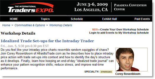
Join Corey at the LA Trader’s Expo in June
March 16th, 2009 by Corey Rosenbloom

I wanted to invite readers to join me at the Los Angeles Trader’s Expo from June 3-6 2009 - I’ll be speaking there in a seminar entitled “Idealized Trading Tactics for the Intraday Trader.”
For full details, visit the Los Angeles Trader’s Expo home page (for details and free registration) to see the full schedule and information.  Attending is free and it really is a wonderful time to meet speakers as well as many fellow traders and get to know others who share your passion for trading the markets.
I wanted to include the description/introduction to my session to give a little more detail:
“Do you feel like your intraday price charts resemble random squiggles of chaos? Join Corey Rosenbloom of AfraidtoTrade.com as he describes how to place intraday price action with trade set-ups into context and how to identify the day’s structure as it develops. Finally, learn how keeping an end-of-day “idealized trade journal” can enhance your pattern recognition skills, reduce stress, and improve real-time performance.”

I’ll be discussing some behind-the-scenes information on the background of my end-of-day “Idealized Trades” posts I detail frequently here on the blog.  I’ll also emphasize why keeping your own “Idealized Trade” Journal can help crystallize key intraday patterns and structure so you’ll be able to recognize then act upon them as they develop in real time.
I’ve always benefited from attending Trader’s Expo Conferences and strongly encourage anyone who’s able to do so to attend - it’s four days of information packed seminars, new product/software demonstrations, social activities, and other educational events designed to give a boost to your trading performance.
I’m excited about this opportunity and look forward to seeing you there!
6 Comments | add comment


Fibonacci Confluence and Projection on NIFTY Index
March 15th, 2009 by Corey Rosenbloom

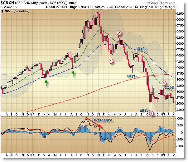
I thought I’d do something a little different in my weekly take of India’s “Nifty” Stock Index ($CNXN) and describe a Fibonacci Confluence Resistance Zone and also run a Fibonacci Price Projection Point as well.
“Nifty” Confluence Fibonacci Grid:

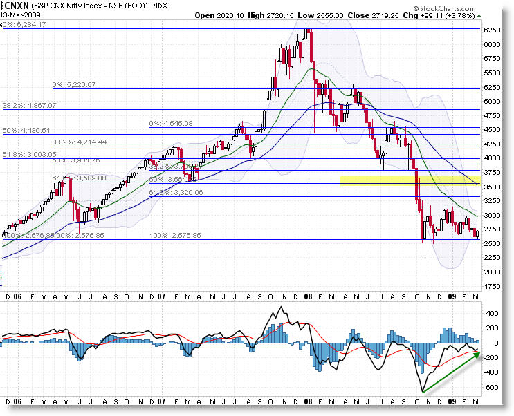
Without giving away too many of my secrets, or the method behind the madness, we see key Confluence Fibonacci overhead resistance at the 3,580 level which also corresponds currently with the falling 50 week EMA. Should price break-out above the current range and 20 week EMA (both of which could be extremely difficult), we would expect significant supply coming in at that level.
I was going to write another daily update, but the analysis is the same as last week, as price still remains in a consolidation.
Now let’s really do something interesting and try to make a Fibonacci Price Projection low using advanced Fibonacci methods.
“Nifty” Fibonacci Price Projection:

Fibonacci grids are drawn off the 6,300 truncated high down to key support levels in the past.  A confluence zone was identified and then the vertical distance was measured from the peak down to this confluence level, and then I came forward and projected this same vertical distance (the size of the rectangle is irrelevant) down (subtracted) from the confluence zone (at 4,100) to get a final price projection target of 1,970.
I’m not necessarily saying we’ll go down to that target, but if price begins to fall from here, the 1,970 level would be an excellent area to watch for advanced Fibonacci support.
In summary, we have Confluence Fibonacci Resistance at 3,580, and a Fibonacci Price Projection possible Low at 1,970.  It’s up to the market to determine which area it will test next, but - unless the trend and structure (via moving averages and swing lows and highs) changes, odds as I seem them are slightly more favorable that we break-down to test the 2,000 level.
As always, your comments and thoughts (and links to other sites) are welcome.
Corey Rosenbloom
Afraid to Trade.com
Follow Corey on Twitter:  http://twitter.com/afraidtotrade
Register (free) for the Afraid to Trade.com Blog to stay updated
8 Comments | add comment


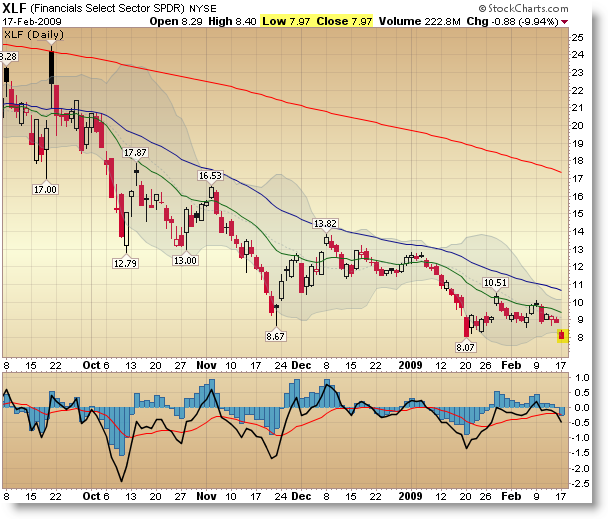
Which Sectors Outperformed Last Week?
March 15th, 2009 by Corey Rosenbloom

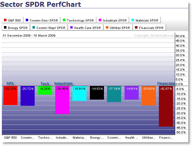
Let’s take a quick look at which key sectors outperformed all others last week - during a rally week where we saw all major sectors advance.
First, from StockCharts.com:

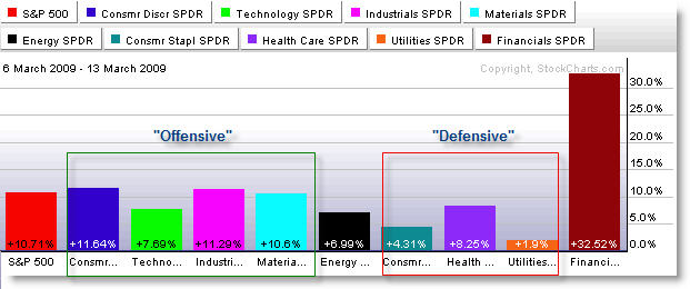
I separated the AMEX Sectors into traditionally “Offensive” or sectors that reflect market confidence and “Defensive” or sectors that generally hold their own during market pessimism and downturns.
The Financials should be grouped with the “Offensive Sectors” because strength there - and in Retail, Consumer Discretionary, Technology - show that investors and funds might be more confident in trying to put their money to work where they expect to get the biggest ‘bang for the buck.’
On the flip-side, investors try to ‘hide’ in Defensive Sectors like Health Care and Consumer Staples that should hold their own (though still decline slightly) during downturns.  Strength here reflects investor pessimism.
Seeing the strongest advance - 30% - in the Financials is a wonderful and welcome sign for belagured investors.  To envision any sort of Market Bottom, we would need to see continued strength in the Financial and “Offensive” (Discretionary/Retail) Sectors that have been punished the most.  For now, investors can be encouraged.
Let’s take a look at a similar chart on FinViz.com (Groups):

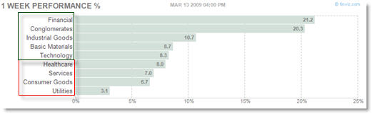
I also separated these by “Offensive” (green) and “Defensive” (red) Sectors (they classify things a little different than StockCharts.com).
Financials and (Large) Conglomerates were strongest, with Industrial goods advancing strongly as well.  The broader S&P 500 Index rose 10% last week (for comparison).
Utilities and Consumer Goods/Staples underperformed the market and all other sectors - that’s what you’d want to see if the market has any hopes of a sustained recovery.
Keep checking ‘under the market hood’ for additional clues.
Oh, and Adam Hewison released a video update on the current rally entitled:   “Bear Market Rally… or Serious Reversal” that goes into much more detail.
Corey Rosenbloom
Afraid to Trade.com
Follow Corey on Twitter:  http://twitter.com/afraidtotrade
Register (free) for the Afraid to Trade.com Blog to stay updated
2 Comments | add comment


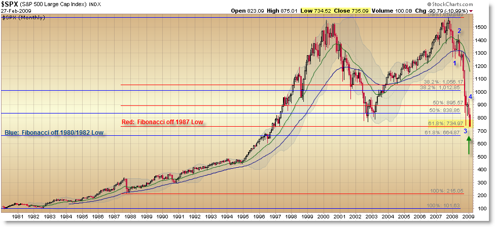
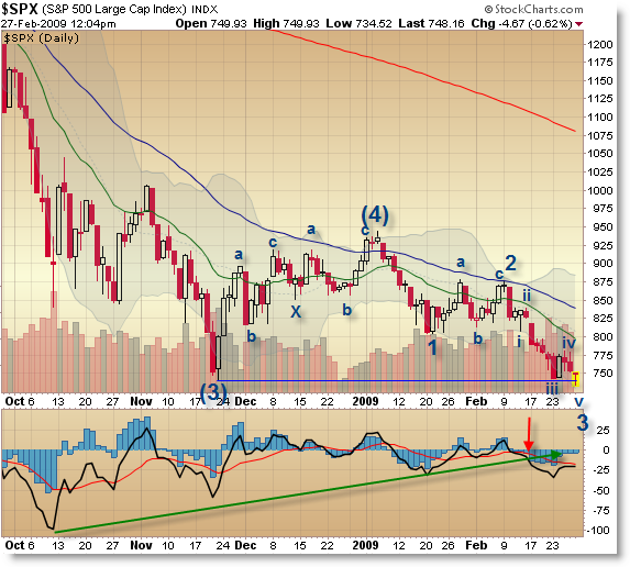
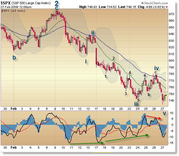
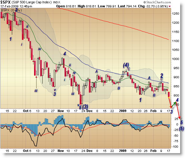
Update on the Two Competing SP500 Elliott Wave Interpretations
March 14th, 2009 by Corey Rosenbloom

In a much anticipated post, I wanted to revisit the “Which Elliott Fourth Wave are we in Currently?” debate that I mentioned last December.  I followed that post up with a mid-January update, “Two Competing Elliott Wave Counts on the S&P 500“.  This post reflects the mid-March update of the two interpretations and how they have both played out in the markets.

Let me summarize the interpretations.

1.  The Bullish Interpretation

States that We are Ending the 5-Wave decline that Began in 2007 (that we are in a Primary Wave 5 down… technically Wave (4) of circled 5.
I call this “bullish” because it means we just need one more swing down (in the Elliott Structure) to complete the 5-wave decline.

2.  The … Bearish Interpretation

States that We are Still in an Extended Third Wave off the 2007 High (that we are an a Primary Wave 3).

I call this bearish because it implies that we are close to finishing the Primary 3rd Wave before embarking on a large ABC up… then we will begin a 5-wave decline to take us to lower lows than we’re seeing now.  It’s also likely to trick so many people because the Primary 4th Wave rally is expected to be sharp (violent) and will lead so many people to believe we’ve put in a bottom… only to see price rip to new lows once the 4th Wave completes.

1.  The “Bullish” Scenario:


Summary: The circled waves reflect a Primary Degree and that we are just one more swing away from completing this 5-Wave sequence of a Major C Wave (reference monthly charts).

It states that we’re currently in (4) of circled 5 of Cycle C.

Ending target:  600 - 650 within two/three months.

2.  The “Bearish” Scenario


Summary:  We are STILL within Primary Wave 3, and need Primary Wave 4 (perhaps up to 1,000 or 1,100) and then will need to complete Primary Wave 5 (to take us down to 500… or less. I shudder to write those words).

It implies that we’re currently in Minor 4 of Intermediate (5) of Primary circled 3.  Of course, of Cycle C.

Ending Target:  500 or less by the end of 2009/beginning of 2010.

So which one is it?

It’s certainly open to debate, but we’ll know soon enough.  Rather than get caught up in the long-term forecast, I think it’s important to focus on the following:

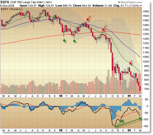
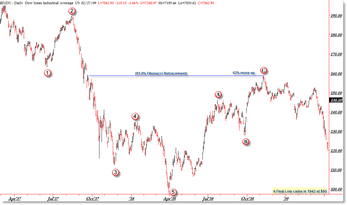
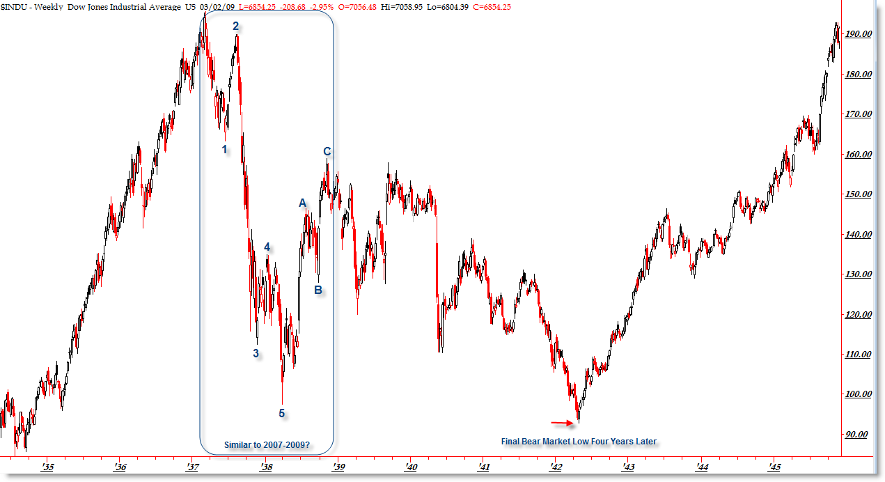
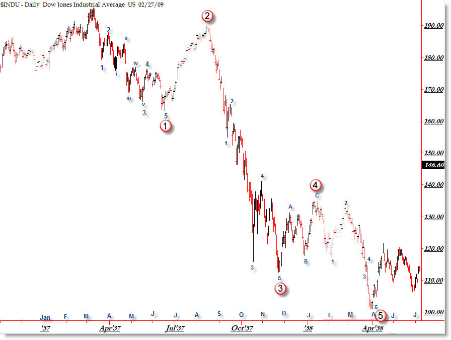
Both call for a test of the 666 low on the S&P for the next likely swing.

After that… things get murky.  Both call for an up-move of potentially powerful duration… so much so that Elliott Wave International founder Robert Prechter has made the rounds on Financial TV recommending that all short-sellers ‘cover their shorts’ in anticipation of a potentially large rally-up in the Stock market.

My stance is that it doesn’t matter right now - both counts are in alignment for the time being.  This will change as the strength/duration of the next up-move comes.  Start looking then at the internals and structure to assess the next likely path for prices *once we get there*.

Accuracy in financial forecasting isn’t what’s important - it’s trading properly and managing risk within your expected views.  Elliott Wave is one of many tools to help guide our analysis - we all know it’s never 100%.

I’ll do my best to keep you updated as more data comes in and the price structure forms itself clearer.

Until then, do the best you can with the information you have at your fingertips.

Corey Rosenbloom
Afraid to Trade.com

Follow Corey on Twitter:  http://twitter.com/afraidtotrade
Register (free) for the Afraid to Trade.com Blog to stay updated


19 Comments | add comment


« Previous PageNext Page »
金币:
奖励:
热心:
注册时间:
2006-7-3

回复 使用道具 举报

 楼主| 发表于 2009-3-22 16:52 | 显示全部楼层
Essentials of Trading FOREX Video
March 14th, 2009 by Corey Rosenbloom

Have you ever wanted a quick, 20-minute introduction to the basic information on getting started in the FOREX Market?  Bill Poulos and the staff at Profits Run released a sharp 20-minute introductory video that I was asked to share with you for those readers who might be interested in a quick run-down on FOREX Market Basics.

(Image opens to the video link page but does not launch the video)
Entitled “Essential FOREX Trading and Software Basics,” Mr. Poulos walks you through an auditory PowerPoint Presentation containing the following slides and topics:
FOREX Overview (4 slides)
FOREX Quotes (3 slides)
Leverage & Margin (2 slides - be aware that FOREX is riskier and highly leveraged)
Calculating Profits and Losses
Order Types (Market, Limit, Stop)
On the page, you’ll also find a link to download an 80 page PDF Document I referenced recently entitled FOREX Profit Principles.
Profits Run offers free educational content as well as more lengthy paid educational content presented in a similar medium as this video.  There is additional information for those interested on the launch page of the video.
As always, as an affiliate member, I wouldn’t be doing my job if I didn’t remind you that, although FOREX can be lucrative (I personally find some of the price patterns and trends to be cleaner in FOREX charts) it contains much higher risk, and as such, it can be more important to get a solid education before risking live capital in the FOREX markets, even though the barrier for entry (and account size) may be lower.
1 Comment | add comment


3x Bullish Fund Volume Surges
March 13th, 2009 by Corey Rosenbloom

A few readers have brought this to my attention so I wanted to share with you all the relative volume comparisons in FAS (3x Financials Bull), BGU (3x Large Cap Bull), and the - now seemingly puny - 1x DIA (you know, actual Dow Jones ETF).  Let’s see these three on the daily chart.
FAS (3x Financial Bullish):

I won’t give comments on the technical structure, but want you to focus on the volume in each of the three funds I’m displaying here.
Let’s start big - the FAS is the 3 times leveraged Financials Bullish vehicle traded 350 million shares today. Yes, you read that right.
What’s more, look at the trend of volume as more traders have caught wind and are sticking their toes into this highly leveraged product.  We saw 50 million shares average in late January which quickly stepped up to 100M later, then 200M in early March and now 350M a week later.  This is phenomenally amazing to me how quickly this product has caught on to the general trading community.
And I can see why - it’s a relatively cheap priced ETF that recently doubled in value this week.  Price moved from $2.50 to $5.00 in a week (the XLF Financial 1x ETF moved up roughly 33% on the week).  A 33% move up in the XLF translates to a 100% move up in the FAS.
What traders need to be aware - lest they get drunken with greed - is that a 10% decline in the XLF would wipe out 30% of the profits, and it gets worse as the XLF decline increases.  But that’s for another day.
Let’s move on to the BGU or 3x Large-Cap (roughly the Dow Jones) Bullish
BGU (3x Large-Cap Bullish)

Volume slightly trailed off after peaking Wednesday above 35M shares.  We traded just over 31 Million shares today - which may or may not seem like a large number to you.  The SPY (S&P 500) ETF traded just over 330 Million shares today.  That’s what you’d expect from a major market ETF.
Notice the trend in volume is clearly up on BGU as more and more funds/traders discover its utility - but hopefully they are also considering the risk, particularly as we are forming a countertrend retracement swing into EMA resistance… but I promised to keep the discussion here focused only on volume.
Finally, let’s compare both of these 3x funds to the DIA, which is the Dow Jones (proxy) ETF.
DIA (Dow Jones 1x ETF):

The DIA traded 20 Million shares today.  That is paltry when compared to the SPY (300M), QQQQ (150M), and of course FAS (shown above at 350M).
It’s possible there’s an industry trend of volume rotating away from the DIA (and Dow Jones in general) towards the S&P 500 and particularly leveraged and triple-leveraged funds.  Notice the trend of volume in the DIA is clearly down since peaking around February 10.
This is one of the reasons I’ll be shifting all my trading operations away from the DIA and towards - for now - the SPY.
Keep looking for volume clues in other index and leveraged funds.
For comparison of 3x bearish counterpart funds:
FAZ (3x Inverse/Short Financial) traded 30 million shares
BGZ (3x Inverse/Short Large Cap) traded 10 million shares
Corey Rosenbloom
Afraid to Trade.com
Follow Corey on Twitter:  http://twitter.com/afraidtotrade
Register (free) for the Afraid to Trade.com Blog to stay updated
11 Comments | add comment


NewsFlashr Editor Picks for March 13
March 13th, 2009 by Corey Rosenbloom

Each week I do an update on the “Editor’s Picks” Links from NewsFlashr’s Business Blog section and here are this week’s selections:
Mish takes a look at the changing attitudes of Baby Boomers as they face retirement with portfolios that have now declined 50% or more from their peaks. “Boomer’s Futures Went Down the Drain
Stock Trading to Go takes a look at the 1929 Crash and notes similarities to today’s bear market.
Andrew Horowitz of the Disciplined Investor asks “Was THAT the Bottom?” in a post and also tackles the question “Is the Market (S&P) Racing to 500 or 1,000 Next?” in his most recent Podcast.
Bill Luby of VIX and More shares some insights into the ’strange’ development where the higher volatility has actually resulted in a lower (than recent average) VIX. More Volatility + Less Fear = Lower VIX
Rob Hanna of Quantifiable Edges takes a historical look at prior 90% Up days and puts them in context and asks “Why Tuesday’s 90% Up Day Might NOT Be Bullish
Correct Call shares insights into Seven Ways to Protect Your Portfolio Right Now.
News to Use shares some behind the scenes fundamental valuation models to show that stocks may be near a bottom.
Bob shares some thoughts on the importance of choosing the right philosophy when starting an investment club during a bear market.
Corey Rosenbloom
1 Comment | add comment


Positive Sign from New High New Low Indicator
March 13th, 2009 by Corey Rosenbloom

In looking under the hood a bit at the last few months on the S&P 500, we see an interesting sign of life - that of a three-swing positive divergence in the Net New Highs - Net New Lows Breadth Indicator.  Let’s see it.
S&P 500 Daily:

What the bottom indicator shows is the NYSE Net New Highs minus Net New Lows.  On balance, we’re clearly under 0, meaning more new lows are being formed than new price highs (on securities that make up the NYSE index), which explains why price keeps making new lows.
However, if you look closely, you’ll see that the recent 665 price low on the S&P 500 (and Dow Jones) was made with fewer stocks making new lows than the previous two swing lows in October and November - this is potentially a sign of early strength (or at least an indication that fewer stocks are making new lows when compared to new highs).
It’s a little ‘under-the-hood’ metric that helps reveal broader participation, and it’s a good sign for the bulls to see this developing on the chart.  We’d still like to see price get above the 20 and 50 EMA before getting bullish though, and particularly break the 800 level for confirmation.
It doesn’t necessarily mean we’re at a bottom (though it would hint that), but it means that there’s a little more going on in the market than blatant puking of shares at low prices.
Corey Rosenbloom
Afraid to Trade.com
4 Comments | add comment


« Previous PageNext Page »
金币:
奖励:
热心:
注册时间:
2006-7-3

回复 使用道具 举报

 楼主| 发表于 2009-3-22 16:53 | 显示全部楼层
Thursday’s Most Perfect Trend Day Ever
March 12th, 2009 by Corey Rosenbloom

Granted - to be a “Perfect” Trend Day, I would have liked to have seen a strong opening gap to the upside (instead of an intial push down) but after that push completed and price broke back above the intraday EMAs, then the remaining action could be validly described as “The Most Perfect Trend Day Ever!”

Words would degrade the beauty of the sustained trend action of the day.
Price supported on every single test of the rising 20 EMA, and price formed the ideal “Railroad Tracks” pattern all the way into the close.
Once you suspect we have a trend day in force (admittedly, it took me until just before noon before I figured all the pieces had fallen into place), trading becomes simple (mechanically - but psychologically very difficult since we’re so used to being in ‘fade’ or retracement mode).
Buy any pullback to the rising 20 EMA and trail a stop beneath the rising 50 EMA.  That’s overly simplistic of course, but it works just as well if not better than complex methodologies in my opinion.  Trend Days are special occurrences where a new set of rules are needed.
Throw off oscillators and most indicators (they give false signals like false divergences and false overbought readings) and pay closer attention to moving averages (you don’t have to use the 20 and 50 - you can use your own combination) for entry and trade management signals.
I just wanted to do a quick intraday post highlighting the beauty of Thursday’s intraday price action.
Corey Rosenbloom
Afraid to Trade.com
Follow Corey on Twitter:  http://twitter.com/afraidtotrade
Register (free) for the Afraid to Trade.com Blog to stay updated
12 Comments | add comment


SP500 Daily Swing Goes Green
March 12th, 2009 by Corey Rosenbloom

As I mentioned in last night’s post “S&P 500 Color Bars,” the S&P needed a little more ‘push’ to switch the color rule green, and that signal has triggered just now.  Let’s take a mid-day look at the S&P 500 Index to see key overhead resistance points and see the “Green” Rule triggering on today’s action.

We got enough of a push off the 666 price lows from Friday to trigger the color rule function to switch to a green bar, meaning price has moved a sufficient multiple of the Daily Average True Range to trigger a signal.
Price formed a doji on Friday and then formed a semi-doji on Monday before price surged on Tuesday which led to the current official retracement swing we are seeing now.
There are two levels of overhead resistance that *might* produce problems for eager buyers, though if they are both overcome, it would show immense strength.
We’re sitting right now at confluence overhead resistance from the November price lows and the falling 20 day EMA (green).  It looks like we could overcome this level but it may be a big battle at the 750 price level.
Next, we have major overhead resistance at 800, which would be the January lows (and support level), “round number” support, the 50 day EMA, and unseen on this chart, the 50.0% retracement off the January highs and then the confluence 38.2% Fibonacci retracement off the November 2008 price high.  Watch the 800 level very closely if we get there.
There’s open-space to 800 if we break above 750, but the sellers might just step it up at these levels.
Corey Rosenbloom
Afraid to Trade.com
Follow Corey on Twitter:  http://twitter.com/afraidtotrade
Register (free) for the Afraid to Trade.com Blog to stay updated
6 Comments | add comment


New FOREX Profit Principles Download
March 12th, 2009 by Corey Rosenbloom

Bill Poulos of Profits Run just released his “FOREX Profit Principles” material for download, which provides information, reference material, answers to common FOREX questions, and the beginnings of developing a trading strategy for those interested in FOREX Trading.
I wanted to share this link with you and describe a little bit of what’s included for readers.
This is actually the first in a four-part series that will also discuss the following:
Trading and Software Basics
FOREX Risk “Shield”
FOREX Broker Scorecard
The following quotes are from the free download “Profit Principles” from Profits Run:
“Using too many indicators is counterproductive….
Using fewer indicators in unique ways can provide the right information for making trading decisions….
With the right indicators and patterns, you will be more likely to trade with discipline because you will  understand an objective set of rules.”
“Again, the key here is simple, but powerful. Use just a few indicators, applied in a manner that is not the usual textbook approach. That is what can give you an edge trading the markets.”
“In order to have an edge when trading the markets, a successful trader waits for conditions to develop that may signal a good trade opportunity. But when these conditions develop, which are usually called “setup conditions”, that oftentimes only means that the trader should be on alert to a trading opportunity.”
Poulos also answers the following popular ‘newbie’ FOREX Questions:
“Forex seems to be quite different from trading stocks. What are the benefits and risks in comparison and would a much bigger account be needed?”
“I am not able to dedicate the time it takes to day trade the markets. Is it possible to trade the Forex
markets on an end?of?day basis so I can take advantage of the market trends while working my regular job?”
“What are the attributes of a good Forex trading method?”
“How can I determine the initial stop loss, trailing stops, and exit points?”
Finally, here is one of the report images that gives a little background on the timing in the world-wide FOREX markets:

If you’re interested in learning more, Poulos’s resource is a great start.  Visit their site to gather additional information and to download the free report to get deeper insights into the FOREX market and to see if FOREX trading might be fore you.

Corey Rosenbloom

(Disclaimer:  I am an affiliate member of Profits Run and receive commission on sales, though not through email sign-ups to Profits Run.)
4 Comments | add comment


Ten Year Note Yield - At Weekly Resistance or Daily Support?
March 12th, 2009 by Corey Rosenbloom

What happens when a Security appears to be coming into resistance on the weekly chart and holding at support on the Daily Chart?  Let’s follow the Ten-Year Note Yield ($TNX) Chart to find out.
It’s almost like the question, “What happens when an unstoppable force meets and immovable object?”  Answer = Definitions Change.
Ten Year Note Yields ($TNX) Weekly:

It you take an objective look at the Yield chart (you interpret the ‘price’ as a percent, as in the “last” price was 28.95 which actually corresponds to 2.89% - just move the decimal one point to the left), then the analysis should leap off the chart to you - “It’s a Bear Flag into key resistance via the 20 week EMA.”  The current candle (which closes on Friday) is forming a shooting star - that’s even more bearish.
The weekly structure is in a downtrend as price has continued to make new lows and lower highs.  The moving averages are in the most bearish orientation possible.  It’s clear the 3.00% level is serving as key resistance.
So what is the lower-timeframe structure saying?
Ten Year Note Yields ($TNX) Daily:

I’m using a “Color Chart” just to give a different and perhaps more interesting perspective.
We still see the resistance about the 3.00% (30.00) level, but the picture doesn’t quite look as bearish.
In fact, price has broken above the 20 (green) and 50 (blue) EMAs, they have crossed bullishly (forming the “Cradle”), and price has successfully supported upon it.
In addition, price is forming a consolidation which may be described as an “Ascending Triangle” which traditionally has bullish implications.
The momentum oscillator is showing slightly negative readings.
So which will it be?!
A Bear Flag into EMA Resistance on the Weekly Chart or
An Ascending Triangle forming at Confluence EMA Support on the Daily Chart?
It may be best to stand aside and wait to see which pattern/structure fails and which succeeds.
Corey Rosenbloom
Afraid to Trade.com
Follow Corey on Twitter:  http://twitter.com/afraidtotrade
Register (free) for the Afraid to Trade.com Blog to stay updated
No Comments | add comment


« Previous PageNext Page »
金币:
奖励:
热心:
注册时间:
2006-7-3

回复 使用道具 举报

 楼主| 发表于 2009-3-22 16:54 | 显示全部楼层
SP500 Midweek Color Bars
March 11th, 2009 by Corey Rosenbloom

I wanted to introduce a new feature - that of “Color Bars” in our analysis.  Let’s get started with a Daily look at the S&P 500 Index.

Let’s do a quick introduction to the color bars and their logic.
The bars are based on an Average True Range function (credit to LBR Group) where the color changes based on how far price has traveled off a price low (or high) in terms of a multiple of its Average True Range of the period.
Without giving away the formula, let’s say a stock is trading at $50.00 per share and its daily ATR value is $2.00.  If a stock in a downtrend made a low at $50 then moved up $2.00, then the price moved up one ATR and the color would change perhaps to Yellow.  If the stock moved up $4.00 - which would be two ATRs - off its price low at $50.00, then the color would then switch to Green.
While there’s a lot you can do with this, you’re mainly looking to classify price ’swings’ as a function of the average true range, where a large enough move will change the color - and thus the intensity - of a swing.
Bottom line, in a downtrend, you’re looking for green bars to confirm shorting opportunities.  You’re also looking for red bars in an uptrend to confirm a buying opportunity - both retracement entries into an established trend.
You can see that the green bars in December and January - in the context of a downtrend - offered excellent shorting opportunities, as did the yellow bars in February - it’s a little counter-intuitive.
So this week’s move up hasn’t satisfied the criterion to ‘change colors’ or classify a swing yet - we’re still technically in a down-swing.  We’d need to move up a little higher to change the color to be in an official retracement.  It’s strange to say, but Tuesday’s big move up did not even move price one Average True Range off its lows.
Also, if you look at the 3/10 Oscillator, you’ll see we’re making an ever so slight Positive Momentum Divergence, which foreshadowed Tuesday’s rally to an extent.
It seems like there’s ‘open space’ above for price to retrace, though Wednesday’s doji close is not a strong bullish signal.
Keep watching price at these levels, as the expectation is for a move up as far as 800.  It sure ‘feels’ like there’s more up to go, but if sellers step in here and push us to new lows (meaning this is all the retracement we can get), I’m afraid the bulls will just call it quits and we’ll get a capitulation move that could do some serious damage to investors.
Corey Rosenbloom
Afraid to Trade.com
Follow Corey on Twitter:  http://twitter.com/afraidtotrade
Register (free) for the Afraid to Trade.com Blog to stay updated
7 Comments | add comment


Sector Returns Year to Date
March 11th, 2009 by Corey Rosenbloom

With the middle of March almost upon us, let’s take a look so far at the Sector Returns (AMEX Sector SPDRs) year to date to see what the Sector Rotation model might be telling us.

With little surprise, the Financials (XLF) grossly underperformed all other sectors year-to-date, losing 42% in just over a two-month period.  That is financial devastation.
Strangely enough, the Industrials are showing the second worst performance (losing 30%).
The Utilities, Consumer Discretionary, and the S&P 500 index itself came in next with a loss 20%.
Technically - for trivia buffs - the 20% decline in the S&P 500 year-to-date represents a full-bear market (historians often classify bear markets as a peak-to-trough decline of 20% in a major index).  That’s by no means encouraging, however.
Enough with the bad news.  Which sectors ‘held their own?’
As expected, it was the traditionally defensive sectors (Health Care and Consumer Staples), though they still lost money (they outperformed the S&P because they lost less money).
And another surprise emerged which is encouraging - the Technology Sector (XLK) was the #1 performer (relative) with a loss of “only” 9%.  This isn’t your expected type of behavior in a recessionary/bear market so that’s a sign of life.  It doesn’t mean they’re going to make you money if you buy them, but to see relative strength in technology traditionally is a good sign - but don’t read too much into that yet.
Unless you’re shorting, the only way most investors make money is when a sector (or stock) actually appreciates in value, rather than showing “Relative Strength” to a declining S&P 500.
Corey Rosenbloom
Afraid to Trade.com
Follow Corey on Twitter:  http://twitter.com/afraidtotrade
Register (free) for the Afraid to Trade.com Blog to stay updated
No Comments | add comment


Video Analysis in Crude Oil - Surviving $80?
March 11th, 2009 by Corey Rosenbloom

I’ve been watching Crude Oil closely as many of you have, and I wanted to share a new video by Adam Hewison on the Crude Oil market entitled “Can the US Survive $80 Oil?”
In a way, Hewison begs the question as to whether or not he sees a reversal up in Crude Oil (as I mentioned in a prior post entitled “Daily Look at Crude Oil Developing Reversal“. He goes a little further than I did and sets possible targets using Fibonacci Retracements and gives a little background on that tool.  He even goes beyond that and ponders what is likely to happen to the S&P 500 (and economy) if Crude Oil really does make it up to $80 per barrel - “Can we handle it?” - he asks.
Here is a chart from his video that shows not only the recently generated buy signal (from Market Club’s “Trade Triangle Technology”), but also an overlay of a Fibonacci retracement from the high to the low.

(Clicking the Chart opens the video to view)
Whether or not Crude Oil reverses from these levels, the risk/reward ratio is favorable, in that if Crude does go up to test a Fibonacci retracement, then it would yield much more profit than the obvious level to place a stop (beneath the price lows near $35 per barrel).
I always recommend the Market Club (I’m an affiliate member) because Adam (and staff) stays on top of real-time market developments and they provide members with commentaries, videos like this, education, and proprietary (mainly trend following) charting signals that combine multiple timeframes for the actual trading decision.
Always conduct your own analysis before making any trading decisions.
Corey Rosenbloom
Afraid to Trade.com
1 Comment | add comment


Stepping Inside Tuesday’s Powerful Trend Day
March 10th, 2009 by Corey Rosenbloom

We finally got that ‘oversold bounce’ we’d been anticipating - though that was an understatement!  Let’s step inside Tuesday’s “Trend Day” action to see how one could have profited from the intraday structure and managed risk accordingly.
DIA 5-min (March 10, 2009):

First, the daily structure (in terms of two dojis in oversold conditions at the bottom Bollinger Band) seemed to indicate we were due for a bounce.  Of course, that structure didn’t say how powerful today’s action would be, but that odds favored an up-move over a down-move.
The first clue comes from the pre-market action (where futures were markedly higher) which was confirmed by a large upside gap (greater than $1.00 in the DIA).  As the market opened, price ran still higher and no attempt whatsoever was made (by sellers) to fill the gap - by this time (around 10:00am) you should have been playing for a Trend Day (because of the large gap and drive off the open).
This meant you should have turned off your indicators and focused on your moving averages (whatever periods you use - I use 20 and 50 EMA intraday) to set-up trade entries (on pullbacks).
Strangely enough, Trend Days are the easiest days to trade (buy pullbacks, trail your stop beneath either the 20 or 50 EMA) though so many people have difficulty because they just can’t fathom the price going higher - they’re just always in counter-trend mode.  Granted most days aren’t trend days, but when they are, all other tactics (fading intraday highs; selling overbought oscillators) go out the window.
That being said, price consolidated into a rectangle (correction) into the 20 EMA and the Bollinger Bands “squeezed” price which preceded a huge surge up (further confirming the Trend Day structure) and then price formed a gentle ‘flag’ back to the 20 EMA.  I love to see dojis form at expected moving average support - they allow for you to use a tight stop and play for a large target (relative to your stop).
I drew an interesting trendline, which indicates how price resisted the level (around noon) but once it broke-out to the upside, it used the trendline as support.  Ultimately, price retraced to the rising 50 period EMA (not an unexpected development) which threatened stops (trailed beneath the 50) and gave aggressive traders fresh, low-risk entries (buys).
And as wished, the market headed higher and formed additional dojis at the 20 EMA before spiking back up and closing at its highs.
If you want an ideal or “Picture Perfect” Trend Day, study today.
Corey Rosenbloom
Afraid to Trade.com
Follow Corey on Twitter:  http://twitter.com/afraidtotrade
Register (free) for the Afraid to Trade.com Blog to stay updated
15 Comments | add comment


« Previous PageNext Page »
金币:
奖励:
热心:
注册时间:
2006-7-3

回复 使用道具 举报

 楼主| 发表于 2009-3-22 16:55 | 显示全部楼层
Stocks Overdue for a Rally
March 10th, 2009 by Corey Rosenbloom

That’s quite an ambitious headline, but it seems the US Equity Market is more than ready for a counter-trend retracement rally up.  Let’s look at the S&P 500 to see the structure and how far the rally might last.
S&P 500 Daily Chart:

Friday’s close and Monday’s close both resulted in dojis in deeply oversold conditions.  Dojis traditionally reflect ‘indecision’ between buyers and sellers and are often seen at key turning points in the market (reference early January 2009 and February 9th).  Like any signal, their forecasting is of course not 100% but they can indeed be powerful short-term (minor) reversal signals.
So we assume an upward retracement will build off these levels (if not, then bulls may throw in the towel which creates a capitulation move).  The first line of overhead resistance  may come in around 750, which was prior support and also reflects the falling 20 day EMA.  Should price break above this level, then the next zone to watch would be the 800 level, which reflects two Fibonacci confluence levels and the falling 50 day EMA.  This level also reflects prior support as well.
If price were to retrace higher than 800, it would call into question the fractal Elliott Wave Structure that may be developing, and an alternate count would be required.  At the moment, we have the structure in Wave (5) (whether it’s 5 of (3) or the final (5) of the entire 5-wave decline beginning in 2007 is still up for debate) and specifically in fractal wave 3 of (5).
Wave 1 of (5) began in early January with Wave 2 of (5) ending around February 9th which places this big swing down from there as a fractal Wave 3 which appears to be coming to an end as we inter counter-rally Wave 4.  This line of thinking would be invalidated if 4 entered the price territory of 1 at 800 so watch the 800 level very closely.
For the meantime, it appears like we’re getting this expected rally.  Keep watching price every day and be aware that this is a counter-trend play and so use extra caution as needed.
Join up with the Market Club for additional commentaries, trade ideas, education, scans, and signals.
Corey Rosenbloom
Afraid to Trade.com
Follow Corey on Twitter:  http://twitter.com/afraidtotrade
Register (free) for the Afraid to Trade.com Blog to stay updated
10 Comments | add comment


Surfing the Trend Channel on Monday
March 9th, 2009 by Corey Rosenbloom

What a day!  Monday’s (March 9th) intraday price action shows why it’s so important to go back and annotate the structure and “idealized trade set-ups” so you can recognize it quicker as it develops in real time in order to apply the most appropriate trading strategies early.  Let’s step inside Monday’s 5-min DIA action:

Let’s walk through the day step-by-step to pick up on its lessons and trading strategies.
The day opened with a downside gap just at $1.00 in the DIA which put it just on the threshold of successful odds of a fill… but this was perhaps one of the fastest ‘large-scale’ gaps I’ve ever seen fill.  Price filled the gap in about 20 minutes, and formed a doji at yesterday’s close (which often serves as resistance).
Instead of reversing down, price screamed higher and formed a negative momentum divergence and the intraday high (it’s surprising how many highs and lows are formed on divergences).
It seemed the doji at 11:15 which formed at the rising 50 EMA was a good buy - and it was from a risk-reward standpoint - but ultimately price failed to make a significant swing up off that proposed support level, and found resistance at yesterday’s close (which often serves as important support & resistance).
Price then broke above yesterday’s high, triggering thoughts of bullishness, but that wasn’t mean to be either.  We formed a quick as lightning Bear Flag into confluence EMA resistance, but you really only could have caught that if you weren’t taking lunch and were glued to your trading terminal - in hindsight, it looks great but the odds of capturing the profit (and target) in real time were very low.
Price rallied up off the bear flag price projection target and found resistance just above the “Cradle Trade” Zone (which also may have resulted in a stop-loss if you were playing to capture the Cradle).
By now, it became apparent to astute traders that a range had formed and the structure was developing a downward sloping consolidation, or more specifically, two descending parallel trendlines.  It takes four touches (or tests) to confirm a rectangle or parallel trendlines and we finally got that at 2:00 (making the 5th touch valid).
At this point, the trading strategy into the close favored playing the trendlines for support and resistance, which ultimately worked though price closed in the mid-point of the trendlines.
The more you analyze/study intraday structure, the better you’ll be at recognizing the day’s structure (trend day, rounded reversal, range day) as it develops and then adjusting your trading strategy (rely on indicators?  turn off indicators?  which indicators are the best given the proposed structure?) accordingly.
UPDATE: Reader Dominick mentioned a Measured Move (AB=CD) or Bull-Flag pattern and I wanted to show that on the blog.  There were actually two Measured Moves (AB=CD), one being comprised of the other.  Interesting view with all the indicators turned off!  Though I don’t show it, the 2nd AB=CD pattern contains a fractal AB=CD pattern.  The CD leg of the first AB=CD contains its on micro-pattern.  Like Elliott Wave, bear flags and Measured Moves can be fractal in nature.
For ease of mind, you can call all these Bear Flag patterns.

Corey Rosenbloom
Afraid to Trade.com
Follow Corey on Twitter:  http://twitter.com/afraidtotrade
Register (free) for the Afraid to Trade.com Blog to stay updated
(Note - odds are I will be switching my intraday focus to the SPY instead of the DIA soon.  Comments/suggestions are welcome)
18 Comments | add comment


A Daily Look at Crude Oil Developing Reversal
March 9th, 2009 by Corey Rosenbloom

I’ve been watching Crude Oil very closely to see if we’d ever get a reversal as expected off these lows.  Let’s take a look at the Daily Chart to see where we are and whether a possible reversal to the upside might be developing.

(Click for larger image)
Are we finally getting that reversal that seems so obvious to everyone?  Maybe.
Price is developing one of the most massive multi-swing positive momentum divergences I’ve ever seen and it appears that odds are decent that price will break-above the falling 50 day EMA here.
Price is just slightly above both the 20 and 50 day EMAs, but be aware that the moving averages remain in the most bearish orientation possible and any move up would by definition be a counter-trend move.
Price has found support above the $35 index level and resistance seems to be forming a price arc about the 50 day EMA as price has traveled to new lows.
Crude Oil certainly isn’t guaranteed to go up from here, but it is perhaps setting up a decent to excellent risk/reward ratio - that of strong support about the $35 level and wide-open space to run-up should we actually break and hold above $45.
Keep watching Crude for any signs of positive life and do further analysis on your own into this interesting but tricky commodity.
Corey Rosenbloom
Afraid to Trade.com
Follow Corey on Twitter:  http://twitter.com/afraidtotrade
Register (free) for the Afraid to Trade.com Blog to stay updated
15 Comments | add comment


ADX DMI Strategy Performance Test Results
March 8th, 2009 by Corey Rosenbloom

A reader recently asked me to look into the possible Edge or strategy performance results from using the DMI+ and DMI- crossovers (components of the ADX Indicator).  Let’s see the results, describe the strategy, and see how it performed.
The line of thinking goes that when DMI+ crosses above DMI-, then an uptrend is in place and that should give you an edge when trading akin to a Trend Following System.  For more information, visit StockChart.com’s page on the ADX Indicator.
The strategy expects to capture large swings from a big trend move and enter you in the direction of that trend.  The system I created (simply) for testing takes advantage of both sides of the market, in that it’s always in the market and goes long when DMI+ (Positive Directional Movement) Crosses Over DMI- (Negative Directional Movement) and then exits and reverses short when DMI+ Crosses Under DMI-.
No stops were used and no commissions were factored into the testing.  Testing runs from January 1998 to present.  The results you see are pure data from TradeStation.
Before looking at the results of randomly selected stocks (by me), let’s look at the strengths and weaknesses of this system on a chart:

(Click for larger image)
The system goes long when the Green line crosses above the Red line (indicator).  It’s expected to capture large swings or trend moves and indeed it does.  This is the DIA around 2004 Daily and it captured two big wins.
Unfortunately, the indicator crossed frequently from the period of June 2005 to September 2005, resulting in numerous whipsaws for small losses.  Are the profitable trades enough to overcome all the small, whipsaw losses?
Unfortunately, no.
I tested this across 8 randomly selected stocks including the DIA and SPY and the results are presented in the following table:

Again, here are the parameters:
1998 - 2009 daily bars; 1,000 shares per trade; no commissions.  Always in the market; no stops.
Over the 10-year period, 3 of the 8 stocks returned positive results, though that would have been eroded once commissions and slippage were factored in.
The Profit Factor… which is the Average Winner (Dollar Terms) divided by the Average Loser (Dollar Terms) is attractive, and in most cases, the Average Winner is at least two times larger than the average loser (giving us an average Reward/Risk ratio of about 2 to 1).
The problem with this strategy lies in the numerous small losses that erode the edge of the larger average winner to the smaller average loser.
The win-rate for these stocks all was less than 33%, meaning only 1 in 3 trades resulted in a profit.  A 2 to 1 reward/risk ratio cannot overcome a strategy with a win-rate of 33%.
Remember, these are just raw data, and if you’re interested, you can run  your own tests and try to include filters such as demanding the ADX must be over a certain value (to filter out choppy environments) or some other method to try to reduce the numerous whipsaws.
Corey Rosenbloom
Afraid to Trade.com
Follow Corey on Twitter:  http://twitter.com/afraidtotrade
Register (free) for the Afraid to Trade.com Blog to stay updated
2 Comments | add comment


« Previous PageNext Page »
金币:
奖励:
热心:
注册时间:
2006-7-3

回复 使用道具 举报

 楼主| 发表于 2009-3-22 16:56 | 显示全部楼层
March 8 View of India’s Nifty Index
March 8th, 2009 by Corey Rosenbloom

Let’s take a look at India’s Nifty Index both on a Weekly and Daily view and look at an alternate Elliott Wave count and vital support and resistance numbers.
$CNXN Nifty Weekly:

I’m going to use this post to explore some possibilities instead of giving an opinion on the likely direction due to the price consolidation.
The Nifty peaked on a negative momentum divergence just as 2008 began which was a few months after the US S&P 500 peaked in October.  Price then fell into the March lows forming the First Wave down as the Second Wave took price in line with the S&P 500 to peak just as May 2008 arrived.
At this point, the Elliott Wave count becomes open to interpretation, and I’ve labeled the two dominant interpretations here.  The most ‘bullish’ count - which I believe is the primary count until proven otherwise - is that the 3rd Wave ended at the October lows and the 4th wave is either a triangle (see daily chart) or ended just as 2009 began and that we are currently in the major 5th (circled) wave down with the expectation to make new lows or truncate (test) the Wave 3 low at 2,250.
Keep in mind the Nifty is showing relative strength to the S&P 500 as the Nifty has not broken its October/November lows.  The new momentum low (and new price low) in October hint that the actual price low is yet to come, and that it will - if it occurs - form on a positive momentum divergence.
The alternate count is far more ominous and bearish, which states that we are currently STILL in the major (circled) Wave 3 down and that we are in (or are missing) a Wave (5) down to complete the major (circled) Wave 3.  This count is shown with the blue “alt (1)” labels overlaid on the chart.
The same count and interpretation is open to the S&P 500 as well.
$CNXN Nifty Daily:

Again, on the Daily Chart, I’m showing more the theoretical and am exploring possibilities as to the alternate wave count.
This count has us fractalizing a major (circled) 4th Wave and showing an Elliott 5-wave triangle that took place during the recent price consolidation.  The implication is that we are in the (5)th wave currently and are expected perhaps to test the November lows.
What’s interesting is the major level of support at the 2,600 index level and the resistance at the 3,200 level.  Price has roughly traded within a 600 point range for the prior four months.  We certainly needed a consolidation period to digest the rapid down move into October, but price has built a base or value area around the 2,800 zone.
It’s really difficult to make any sort of prediction or assessment until price breaks above 3,200 or below 2,600.  It would seem to indicate that odds favor a downside break, but the downside break is by no means guaranteed.  In fact, because that is perhaps the widespread assumption, price could trick (trap) the majority by forcing an upside breakout.
The easiest way to look at the current structure - Elliott Wave aside - is to note that the Nifty is in a consolidation range and to consider playing the break for a possible range-expansion move once a breakout occurs in either direction.
Until we get that range break, trading could be difficult in such choppy conditions.
Corey Rosenbloom
Afraid to Trade.com
Follow Corey on Twitter:  http://twitter.com/afraidtotrade
Register (free) for the Afraid to Trade.com Blog to stay updated
12 Comments | add comment


March 7 Weekend Look at the SP 500 Index
March 7th, 2009 by Corey Rosenbloom

What a week we just endured in the markets.  Let’s take a step back now that the weekend is upon us to look at the Weekly and Daily Structure of the S&P 500:

It’s been an absolutely brutal and devastating past four weeks for investors - I cannot underscore this point enough.  The S&P has fallen 22% in the last four weeks which classifies for its own definition of a “Bear Market.”  There’s some good news though.
Within the (Elliott) Wave Structure, it appears that price is coming to the end of the final 5th Wave and that a rally may be expected to take place from here.  Also, we see a positive momentum divergence forming as price hits new lows not seen since 1996.  Fifth Waves often form on positive momentum divergences, so we are seeing this behavior conform to expectations.  Volume is also at relatively high levels into these price lows.
For a full image of the proposed Elliott Wave Count on the S&P 500, see this chart (link) or the blog post entitled Similarities in 1937 and Today.
Let’s drop down to the Daily Chart to see if we can get any insights there.
S&P 500 Daily:

Well, let’s start with the positive.  Price reached a new low beneath 700 on a Triple-Swing Positive Momentum Divergence (new low in October; New low in November; new low in March) which could arguably be classified as a “Three Push” pattern which is a type of reversal pattern.
Price also rallied sharply into Friday’s close which formed a Doji which is often seen as a short-term reversal pattern (technically, a doji represents “indecision” between buyers and sellers).  Also, we are at the bottom of the Bollinger Band… but have been so since mid-February.  In strong moves, price has a tendency to “Ride the Bollingers” up or down.
Volume is higher than average and certainly volume has been increasing as the year progressed… though that’s not necessarily a good sign, as we would see this as a ‘confirmation’ of lower prices through higher (trending) volume.  There does not seem to be a “blow-off” or capitulation volume spike that is frequently seen at bottoms (reference October 13 and November 23, 2008).
In the short-term Elliott Wave structure, we appear to be ending - perhaps - wave (3) of (circled) 5 which - if the interpretation is correct - hints that we have a wave (4) to the upside (which could begin as early as Monday next week) which could take us to EMA resistance near 750 before a final wave (5) takes us back to new lows (or a test of the lows) wherein we might get the volume surge/capitulation and surge in the $VIX and Put-Call ratio that appear to be lacking as we form these new lows.
In other words, from a sentiment standpoint, it seems like this is not yet the actual bottom (there’s no panic as indicated by classical sentiment measures).  We’d prefer to see a surge in the VIX, put-call ratio, and volume to feel like a bottom was put in place.
Let’s keep watching the structure develop, but it seems odds favor a retracement swing up beginning next week… but if we can’t even get that retracement… panic surely would set in.
Corey Rosenbloom
Afraid to Trade.com
Follow Corey on Twitter:  http://twitter.com/afraidtotrade
Register (free) for the Afraid to Trade.com Blog to stay updated
30 Comments | add comment


Johnson and Johnson JNJ Takes an Unexpected Turn
March 6th, 2009 by Corey Rosenbloom

One would think everyday consumer staples stocks would at least hold their own during a recession but Johnson and Johnson (JNJ), who make numerous household products we use every day, suffered a significant downswing in price over the last two weeks, hinting that not even “very safe” stocks (to hedge with, or for those who have to be long stocks) aren’t even safe… which is a troubling prospect.
Johnson and Johnson (JNJ) Daily Chart:


In all fairness, price has been in a steady downtrend since its mid-2008 highs, and price has been remaining beneath all three key moving averages, and these averages have been in the most bearish orientation possible.  It’s not *surprising* that a sudden down-draft in price happened, but it was harmful nonetheless to those who were trying to outperform the S&P by holding this stock in their portfolio as a safety stock.
Until the end of February, price had been supporting at the $54 level and had stayed in a relatively tight range (with around $58 as the high) which is exactly the behavior investors would expect from a ’safe’ consumer staples stock, particularly one as large as JNJ.
Perhaps in a bear market, no stock is truly ’safe,’ but then again, there are some (mutual) funds and accounts that are required to own stock.
Let’s see how JNJ has performed on its monthly chart, with a special focus on the 2007-present bear market.

From 2007, the going was steadily up with rhythmic swings driving price to stable yet higher levels… again, behavior one would expect from a solid, non-exciting, safe investment.  Price was supporting at the rising 20 month moving average and finding resistance above a key rising trendline.
In fact, in the middle of 2008 (before the October decline hit), investors had bid JNJ to new highs, breaking it out of the trend channel line and creating a large-scale buy signal.
Ultimately, that proved to be a devastating Bull Trap as price has fallen 30% from its break-out high.  Price has since broken all moving average support and formed a large monthly New Momentum Low.
Johnson and Johnson’s price action may teach us that very, very few stocks can hold their own in a recessionary environment or bear market, and that the reach and depth of this bear market is exceedingly great.
(As an aside, I could have also shown a chart of consumer staples stock Proctor and Gamble, which shows a similar pattern to JNJ, particularly on the monthly chart).
Corey Rosenbloom
Afraid to Trade.com
Follow Corey on Twitter:  http://twitter.com/afraidtotrade
Register (free) for the Afraid to Trade.com Blog to stay updated
4 Comments | add comment


SP 500 Stocks Under $10
March 6th, 2009 by Corey Rosenbloom

With the media discussing the six stocks that fell beneath $10 in the Dow Jones Average, let’s also compare that to the number and percentage of stocks that have fallen beneath $10 per share in the S&P 500 - you can also use this chart as a quick reference.
Stocks Under $10 on the S&P 500 Index (as of March 6, 2009):

(You’ll need to click to see the full list)
As of noon EST on March 6th, 120 - 24% - of the S&P 500 stocks traded less than $10 per share.  That’s almost 1 in 4 stocks are currently trading less than double-digits.
Big names AIG, eTrade Financial, Office Depot, and Citigroup comprise a list that trades less than $1.00 per share (technically, Citigroup traded at $1.02 at the time of the screen capture).
The three highest priced stocks in the index were the Washington Post WPO ($320), Google GOOG (just above $300) and CME Group ($179).  Only two more stocks traded above $100 (Autozone - AZO and Mastercard - MA) making 5 out of 500 stocks trading above $100 per share (1%).
How about the Dow Jones?

Six (out of 30) stocks now trade less than $10 per share, making that 20% or one in five.
No stocks trade above $100 per share, and the three top-priced stocks are IBM at $86, Exxon-Mobil (XOM) at $62, and Wal-mart (WMT) at $49.
Looking at lists of companies that comprise the popular indexes can give us a better perspective than index charts sometimes.
Corey Rosenbloom
Afraid to Trade.com
4 Comments | add comment


« Previous PageNext Page »
金币:
奖励:
热心:
注册时间:
2006-7-3

回复 使用道具 举报

 楼主| 发表于 2009-3-22 16:57 | 显示全部楼层
A Look Inside the Trend Day in Gold GLD
March 5th, 2009 by Corey Rosenbloom

While the Stock Market gave us a Trend Day Down, Gold gave us a powerful trend day up.  I thought it would be more appealing to look at an upward-sloping trend day than a down one, plus it shows that the “ideal” intraday concepts I frequently discuss using the DIA, actually work for all markets and stocks.
GLD (Gold ETF) 5-min chart:

The day began with an upside gap of just under $1.00 (the larger the gap, the lower the odds of it filling intraday) and we had a push back to the downside that found support at the “Cradle” or confluence crossing of the 20 and 50 EMAs (that’s my favorite zone, by the way).
Price formed a doji at 10:00 and began rallying back upwards off an “Impulse Buy” trade set-up into new highs.  Volume rushed in around 11:30 as price surged to new intraday highs, confirming the odds were quite high for a Trend Day to develop.  Price formed a New Momentum High and you should have been looking to buy the pullback to the 20 EMA which occurred just before 1:00 as price formed a picture-perfect doji at support.
Price then formed a tight band or rising rectangle, hugging the 20 EMA as support the whole way.  Toward the end of the day, the buyers swooped in to drive prices even higher into the close, completing a picture-perfect Trend Day Example.
Notice the powerful volume surges, most all of which occurred on “up” bars which - to an extent - is quite bullish.
Where does that leave us on the Daily Chart?

I chose specifically to do a post on gold last night, entitled “A Mid-week Look at Gold” because I felt odds were quite high we’d at least get a reaction bounce off the rising 50 day EMA which is exactly what happened.
Volume is dis-confirming the recent down-swing, which indicates sellers are less-aggressive to sell.  A downside volume non-confirmation hints at underlying bullishness (meaning, sellers are backing-off).
That could change if price finds resistance at the 20 day EMA, but for now, odds seem to favor at least some sort of upward rally/retracement, particularly given today’s powerful action on such a weak day in the stock market.
Keep watching gold and the interplay with the Stock Market for additional clues and possible opportunities.
Join up with the Market Club for additional commentaries, trade ideas, education, scans, and signals.
Corey Rosenbloom
Afraid to Trade.com
Follow Corey on Twitter:  http://twitter.com/afraidtotrade
Register (free) for the Afraid to Trade.com Blog to stay updated
4 Comments | add comment


Where Are We in the Wave Structure? Elliott Intro
March 5th, 2009 by Corey Rosenbloom

Andrew Horowitz of the Disciplined Investor asked me to do a guest post for his readers on a basic introduction to Elliott Wave and to describe where the Wave Principle might be telling us we are within the 5-wave structure.
Go over to Andrew’s site to see the full publication entitled “Where Are We in the Wave Structure?” and while you’re there, be sure to browse around his site and download some of his amazing Podcasts featuring interviews with big-time people in the investment, trading, and finance community.
I won’t spoil the post by giving away too much here, but I detail an intro to Elliott Wave, describe a bit of the characteristics of the 5-Wave structure (and why there’s 5 waves) and then walk through Apple (AAPL) showing a clear example of the principle before showing readers where we are currently in the 5-Wave decline on the S&P 500 that started in October 2007.
A special thanks to Andrew for allowing me this opportunity.
Corey Rosenbloom
3 Comments | add comment


Looking Back on the 1929 Stock Market Crash
March 5th, 2009 by Corey Rosenbloom

A reader asked me to revisit the 1929 Stock Market Crash through charts and the following chart of the Dow Jones reflects the period from 1922 to 1932 to show you the initial 1922 low and the final 1932 low and what happened in-between as seen on a weekly timeframe.

(Click for Larger Image)
The stock market (as seen through the Dow Jones) started the 1920s roughly at index value 100 then came off those levels into the lows in 1921.  From here, price mounted a remarkable 300% gain in the decade that took price to a final high of 386 before the Crash occurred and the onset of the “Great Depression.”
I’ve labeled a rudimentary Elliott Wave Count to show a powerful Wave 1 and extended Wave 3 without going into too much detail.
The actual price high formed on a Negative Momentum Divergence (not shown) as most 5th Waves have a tendency to do (our price high in 2007 formed on a Negative Divergence on many oscillators as well).
From this level, price began heading lower and then suddenly - literally - crashed in value in the middle of October 1929 to end the “Roaring 20’s”.
A Daily Chart shows the sell-signal up-close prior to the crash.

A Bull Flag formed which had its price-projection target near the highs at 380.  A  Flatline (equal swing) Momentum Divergence set-up at these new price highs, and then a quick negative divergence formed on the absolute price high.
Afterward, price retraced a larger than expected move to the downside, breaking both the 20 and 50 Exponential Moving Averages and forming two New Momentum Lows (new momentum lows often precede new price lows).  Price also broke beneath the most recent swing low at 340 to create a new price low.
After the downswing into 320 and New Momentum Low formed, the 20 EMA crossed ‘bearishly’ underneath the 50 day EMA, which set-up a bearish structure.   Price then rallied up into the confluence resistance area created by this cross - what I call the “Cradle” - and found resistance at this level (price could not close above the confluence level).
That was plenty of information to let you know that the structure had shifted to favor a more cautious approach, if not an aggressive short-selling entry (or at a minimum, long-liquidation).  However, despite as bearish as the structure was developing, it in no way forecasted the magnitude of the Crash.  After the Cradle Trade (and EMA Cross) formed, odds overwhelmingly favored a trend reversal… but the ensuing down-move - or crash - was perhaps more than anticipated.
Unfortunately, investors then did not have computers - or widespread access to charts - at that time.
Looking back at the past can help give us clues, or help us understand the present.
Corey Rosenbloom
Afraid to Trade.com
Follow Corey on Twitter:  http://twitter.com/afraidtotrade
Register (free) for the Afraid to Trade.com Blog to stay updated
9 Comments | add comment


A MidWeek Look at Gold Daily Chart
March 5th, 2009 by Corey Rosenbloom

Gold prices have been confounding both longs and shorts, particularly in a climate of economic uncertainty.  Let’s take a look at gold’s daily chart and see a basic technical analysis 101 pattern that’s currently containing the price structure in gold.
Gold Daily Chart:

(Click for large image)
Despite all the Elliott Wave, Fibonacci, Cycle, Indicator, and other chart work done on gold, we see gold prices have been contained nicely - so far - in an upward rising trend channel since November 2008.
It seemed all but certain that at least a pullback was due when prices challenged the $1,000 per ounce level, which is exactly what we got.  Notice the flat-line divergence that set-up as price challenged the $1,000 level.Price has now retraced and is challenging support at the rising 50 day EMA… and if the 50 fails at $900 (which also serves as round-number support), then gold prices should be expected to find support at the rising purple trendline around $880.  If gold cannot find support at $880, then odds would shift to favor a retest of the $720 level.
For the time being, odds seem to favor higher prices yet to come, as a new momentum high on the weekly chart has formed and gold is currently in a confirmed uptrend on the daily chart.  Holding above $880 is key to any bullish argument in gold.
For now, keep focused on these prices and let’s watch as the structure continues to develop.
Join up with the Market Club for additional commentaries, trade ideas, education, scans, and signals.
Corey Rosenbloom
Afraid to Trade.com
Follow Corey on Twitter:  http://twitter.com/afraidtotrade
Register (free) for the Afraid to Trade.com Blog to stay updated
13 Comments | add comment


« Previous PageNext Page »
金币:
奖励:
热心:
注册时间:
2006-7-3

回复 使用道具 举报

 楼主| 发表于 2009-3-22 16:58 | 显示全部楼层
Rounded Reversal Underway in Stocks
March 4th, 2009 by Corey Rosenbloom

I highlighted this possibility last night to a few people but now it appears confirmed that the US Stock Market - as described in the DIA - is completing a short-term (intraday) Rounded Reversal Pattern that appears to be setting up a counter-trend rally.
DIA 15-min:

If anything, this serves as an excellent example of the components that make up this pattern.
Price, in a downtrend, forms an initial positive momentum divergence (lower price low on higher low in the oscillator) and then comes back to form a support level as the momentum oscillator continues to rise.
Price then makes an upward thrust (into $68.50, or resistance via the 50 EMA) on a new momentum high, swing back to test support, and then completes a mirror image of the down-move that formed the pattern in the first place.
Price breaks above the key EMA resistance and then finally the averages cross bullishly.  The “Cradle Trade” I’m so fond of sets up as price comes down to test this EMA confluence (cross-over) level, setting up the highest probability buy point (because you have enough evidence of a possible reversal and also a very tight stop if wrong).
There’s no guarantee we’ll keep moving higher of course, but odds do seem to favor a counter-swing rally up which would likely form an Elliott fractal 4 Wave up in the larger (5) wave down.
But if Elliott isn’t your cup of tea, then odds seem to favor a retracement rally up perhaps to $72.50 or even - theoretically - as high as $80 (which would be a very big move) as the next likely swing.  A more realistic target would be near the $75.00 range.
Of course, any bullish case is defeated with a penetration of support at $67.00 (6,700 in the Dow Jones).
Join up with the Market Club for additional commentaries, trade ideas, education, scans, and signals.
Corey Rosenbloom
Afraid to Trade.com
Follow Corey on Twitter:  http://twitter.com/afraidtotrade
Register (free) for the Afraid to Trade.com Blog to stay updated
15 Comments | add comment


A Quick Chart Look at Apple AAPL
March 4th, 2009 by Corey Rosenbloom

Apple Inc (AAPL) has been holding its own throughout the recent market downswing from February, showing relative strength to the S&P 500.  Let’s look at Apple’s Weekly Structure (using basic Elliott Wave) and also a key support level on its Daily Chart.
Apple (AAPL) Weekly:

Apple is likely coming off an ABC Corrective Three-Wave phase into support about the $80 level.  The final 5th wave seems “iffy” but we’ll have to watch its development closely.
There’s a lengthy positive momentum divergence that has set in since October, which could have bullish implications if price can stabilize at this level, and moreso if Apple can break above $100 per share (which would reverse the short-term trend to up).
However, at the moment, price is beneath all three key moving averages, which shows structural weakness.  Aggressive traders might decide to enter here (as a tight stop can be placed beneath $80 or $85) but more conservative traders probably want to wait until Apple shows strength and confirms potential support at these levels.
Apple (AAPL) Daily:

Dropping down to the Daily chart shows us what it’s like “Inside the Divergence” that has been building.  Price has formed a tight coil or rectangle between $85 and $105 (technically $80 and $110) which has accounted for the positive indicator divergence.
The obvious price points to watch short-term are the $100 level (which is round-number resistance and the confluence of the 20 and 200 moving averages on the weekly chart) and $85 (which is multi-tested support).
It would appear that price could be more likely to challenge and break above $100, though if price broke beneath $85… and especially $80, then any bullish argument would come quickly into doubt.  A break above $100 could lead to a price expansion move up to the $130 level or beyond… but it’s probably best to wait for confirmation before taking a position within a market in balance (or price consolidation) as it’s always uncertain in which direction the break will occur.
Corey Rosenbloom
Afraid to Trade.com
2 Comments | add comment


A Look Back at US Steel
March 3rd, 2009 by Corey Rosenbloom

US Steel (X) was a grand beneficiary of higher commodity prices in general, but just as its share price ran up in the commodity bubble that ended in 2008, price fell to levels few thought possible.  Let’s take a look at the monthly chart - containing a near ideal Elliott Wave pattern - and more recently on the daily chart.
US Steel (X) Monthly:

Price began an initial move up off the 2003 lows which took price up 600% from $10 to $60 in a Wave 1 advance that gave way to a 50% correction into EMA support in 2005.  The powerful 3rd Wave advance began that took price from its $30 price up $100 to $130 before falling back into a second large (Wave 4) correction back down into support via the rising 20 month EMA.
Price retested this rising average three more times (giving good, simple buy/entry signals) as price climbed $100 again - this time from $90 to $190 before price peaked in a final 5th Wave advance as commodities peaked in mid-2008.  Since then, price has fallen an astounding 90% in almost a year’s time - astounding for such a steady company.
While eyes of investors have focused on the wealth destruction in the Financial sector, they may have missed a similar destruction of investor capital that has taken place in many stocks tied closely to commodities.
Let’s drop to the daily chart to see the structure.
US Steel (X) Daily:

Price fell in almost a steady waterfall decline after breaking the 200 period moving average - also known as the “Line in the Sand” - in September.  Generally, the 200 SMA is the last line of defense for buyers.
After falling 50% from $140 to $70 in just over a month, price began to form a positive momentum divergence, but this is a lesson that because we see a divergence does not mean we should be an aggressive buyer.
Price retraced back to the falling 50 EMA three times into the New Year, all of which set-up excellent short-sale trades… or long-liquidation zones for those who were trying to play counter-trend rallies.
Dojis - which often precede short-term price reversals - formed at each test of the 50 EMA.
The momentum oscillator recently broke a trendline in mid-February and price has fallen to a new low not seen since the beginning of its move up in 2003.
Studying the price action in US Steel (X) shows us that it doesn’t benefit us to seek to buy bottoms, and  that even solid, strong companies can suffer greatly (beyond what most people can imagine) in a down-market.
Corey Rosenbloom
Afraid to Trade.com
No Comments | add comment


Resolution of the 1937 Dow Bear Market
March 3rd, 2009 by Corey Rosenbloom

What happened directly after the Dow Jones Index completed its 5-Wave downwards pattern from 1937 - 1938?  And might the same thing unfold in today’s market?  Let’s take a look.

We had an ABC Up retracement that lasted about seven months that resulted in a 62% gain for the Dow Jones.  It also took prices up to the 61.8% Fibonacci retracement from the 1937 price high to the 1938 price low.
I’m certainly not saying this will unfold in mirror-image fashion today, but that an “ABC” corrective pattern is expected to follow 5-Wave Impulses so it’s certainly not out of the question or realm of possibilities in today’s market.
As great as a 62% gain is in seven months, was that the absolute price low?  Unfortunately no, as price actually peaked where I have drawn the “C” Wave (and blue line) and then began chopping around, never to exceed the 160 peak before breaking eventually to new lows in 1942 before the bottom was firmly in place and a massive rally began without looking back.
Let’s get some broader context and see what happened before and after 1937-1938:

(Click for full image)
I didn’t take the time to label each wave, because I wanted to show you the larger picture both before and after the specific 5-Wave structure in 1937 that seems to look eerily identical to today’s 5-wave decline off the October 2007 highs.
In this case, the 1938 low was wave (A); 1939 (or late 1938) high was Wave B; and finally the 1942 price low was Wave C.
The question now becomes IF history repeats itself, then the 5-Wave structure we are seeing might be part of a larger bear market… perhaps Wave 1 of the C wave (as in A=2000-2003; B=2003-2007; C=2007-20??).
I’m not ready to make that call yet, but I did want to reference the past for possible clues.  The key word is “possible” clues, or guidance from years past in the stock market.
We’ll have a better picture as more price data comes in, but for now, let’s take it day by day and try to manage risk and seek high probability (trading) opportunities as they develop within the unfolding structure as best we can.
Corey Rosenbloom
Afraid to Trade.com
Follow Corey on Twitter:  http://twitter.com/afraidtotrade
Register (free) for the Afraid to Trade.com Blog to stay updated
11 Comments | add comment


« Previous PageNext Page »
金币:
奖励:
热心:
注册时间:
2006-7-3

回复 使用道具 举报

 楼主| 发表于 2009-3-22 17:00 | 显示全部楼层
With SP500 at New Lows the VIX Has Room to Run
March 2nd, 2009 by Corey Rosenbloom

With the S&P 500 at new lows not seen since 1996 - clearly surpassing those lows made in October and November 2008, you would expect the Volatility Index - or VIX - to be making new highs as well.  It’s not.  Let’s look at the VIX and see what clues it might be telling us.

In such an environment of fear and new price lows, one would expect a spiking Volatility Index, indicating that volatility is at correspondingly high levels (and that put and call options are thus more expensive to provide protection).  This non-confirmation is odd.
The bottom line shows the S&P 500 and the three corresponding lows that occurred in October and November (along with today’s swing low).
The VIX is trapped in a sort of triangle or rectangle consolidation, hinting that a break (to the upside) would carry prices to higher levels after forming this base, but honestly what is it going to take to cause the VIX to spike up to levels one would expect it to do so?
Look closely - though the S&P closed lower in November than it did in October, the VIX failed to spike to a new high.  Are investors becoming complacent and just accepting that lower prices are here to stay?  Is the VIX about to spike to new highs?
Traditional thinking states that we won’t see a (short-term) bottom until the VIX spikes and fear takes over… and if that’s the case, then it clearly hasn’t happened yet which implies prices have further to fall to the downside.  One observes VIX spikes (or peaks) at market turning points (however short-term in nature) and it doesn’t appear we’re likely to get a reversal off the levels the VIX rests at currently.  A 14% single-day gain is impressive, but not enough to break us out of consolidation.
For more context, Bill Luby at VIX and More details the VIX Index and the S&P 500 over the last two years, with a special overlay of new events and how both the VIX and S&P reacted.
To learn more about the construction and specifics of the VIX, brush up on the Wikipedia Article on the VIX.
Bottom line:  If classic interpretation on the VIX still ‘works,’ then we’re set for lower S&P 500 prices in the short-term and need to see a spike up in the VIX (’fear’) before we put in any sort of price ‘bottom.’
Corey Rosenbloom
Afraid to Trade.com
Follow Corey on Twitter:  http://twitter.com/afraidtotrade
Register (free) for the Afraid to Trade.com Blog to stay updated
4 Comments | add comment


Amazing Similarities in Dow Jones 1937 and Today
March 2nd, 2009 by Corey Rosenbloom

In charting, sometimes past is prologue.  There is a distinctly eerie similarity in the 5-Wave decline from the October 2007 highs today with what happened - almost identically - as the Dow peaked in early 1937 and bottomed out in April 1938.  It’s something you probably should examine, as it could resolve the same way today as it did then.
Dow Jones Index Daily from 1937-1938 with Elliott Wave:

(click to enlarge)
Reference the prior blog post:  “Full Scale Wave Count on the S&P 500” which included this chart:

Looking at the charts side-by-side shows a chilling reflection of similar Wave structure progression that unfolded.
The structures contain the expected progression of 5-waves which properly subdivide into corresponding fractal waves as the big picture develops as the bear market progresses.
Keep in mind, there were no computers in 1937, no online brokerage accounts, no hedge funds, etc.  What’s stayed the same - arguably - is human psychology as investors’ fear and greed interact to create these patterns.  Also, Mr. Ralph Elliott almost certainly saw this 5-wave decline develop in the Dow during his time which perhaps was further confirmation of his “Wave Principle” he was developing at the time.
In the case of 1938, the circled 5 wave was the bottom (at 100) at that time before an ABC corrective rally launched.  If past is prologue, then we have yet to complete the final circled Wave 5 to complete the pattern, though we’re much closer now than we were.
What exactly happened after I cut-off the chart in 1938?  Stay tuned for an update!
Corey Rosenbloom
Afraid to Trade.com
Follow Corey on Twitter:  http://twitter.com/afraidtotrade
Register (free) for the Afraid to Trade.com Blog to stay updated
(A special thank you to reader Couns for bringing this similarity to my attention in the comment section)
13 Comments | add comment


Longterm View of Crude Oil since 1990
March 2nd, 2009 by Corey Rosenbloom

Crude Oil has come into a potential support area most traders might not be aware exists, but it’s evident from the long-term monthly chart.  Let’s see this structure and what might be in store for crude, barring any further unforseen developments.
Crude Oil Monthly Chart:

(Click for larger image)
Crude Oil ($WTIC as the benchmark index) has completed a seemingly perfect Elliott Wave pattern to the upside with a complete fractal 5-wave structure (not labeled) unfolding in the terminal 5th wave into mid-2008.  Price peaked at $147 a barrel and began a shocking plunge that took hedge funds and the general investing community by surprise (which was happily a boon to the economy in the form of lower gas prices).
Under this count, prices has completed a violent Wave A (correction) into a level of confluence support.  First, the rising 200 month moving average provided a floor that halted the downside pressure temporarily.  Second, this level - the $38 range - has served twice as key resistance (in 2000 and 2003) and according to the “Polarity Principle,” old resistance becomes new (future) support.  It’s possible that’s happening now.
In addition, the monthly close formed a bullish hammer candlestick on top of those support zones.  Is support certain to hold?  Absolutely not but Crude Oil is probably due some sort of counter-swing up perhaps to the $55 or higher level at a minimum.
Sometimes looking way back into price history can provide markers for possible support/resistance zones today.  Crude has the potential to do that from these levels.  Crude is experiencing sharp downside pressure today, so it’s possible the downtrend is just too much to overcome or that the economy is expected to be worse than expected… and it’s quite difficult to fight downtrends so do further analysis on your own.
Join up with the Market Club for additional commentaries, trade ideas, education, scans, and signals.
Corey Rosenbloom
Afraid to Trade.com
Follow Corey on Twitter:  http://twitter.com/afraidtotrade
Register (free) for the Afraid to Trade.com Blog to stay updated
5 Comments | add comment


Full Scale Elliott Wave Count on the SP500
March 1st, 2009 by Corey Rosenbloom

With more people focusing in on Elliott Wave as the current decline from 2007 conforms to an ideal Elliott Pattern, let’s take a look at a potential count that begins in October 2007 and is broken-down in respective subdivisions all the way to March 2009.
S&P 500 Daily Elliott Wave Structure:

(You’ll need to click to view the full picture)
I won’t go into much detail so as to let the proposed wave labeling speak for itself.
I’m relatively new to Elliott Wave and am stunned at how the Wave Structure has played out almost perfectly to the rules and guidelines developed by Ralph Elliott in the 1930s.
Impulse Waves subdivide into 5 Waves (in the larger trend) and Corrective Waves (labeled “ABC”) subdivide into 3 Waves.
The 3rd is never the shortest, but is oftentimes the longest wave (this plays out on almost all subdivisions).
What’s amazing me is that if you look closely, the October near-vertical downward plunge is located in the Wave Structure exactly where you would expect it to be, confirming the count:  Sub-Wave 3 of Fractal Wave (3) of Major Wave 3 down.  To me, that’s chilling.
It’s also known as the “Point of Recognition” where people begin to “catch on” that we’re in a bear market and they generally stop buying pullbacks.  Until then, it was feasible to some investors that things weren’t so bad… though October officially changed that all.
Now, it seems everyone’s a bear and people - even on TV - are saying we’re going to be headed down for a long time and there’s no bottom in sight…
But if you look at the Wave Structure, we need a Wave (4) up and then a Wave (5) down to finish off Circled (Major) Wave 5 before launching upwards into some sort of upwards ABC Correction.
For now, take a moment to study over the Price Wave Structure that began in October 2007 and try to internalize it - to me, it appears a textbook example in real life of the Elliott Wave Principle.
Join up with the Market Club for additional commentaries, trade ideas, education, scans, and signals.
Corey Rosenbloom
Afraid to Trade.com
27 Comments | add comment


« Previous PageNext Page »
金币:
奖励:
热心:
注册时间:
2006-7-3

回复 使用道具 举报

 楼主| 发表于 2009-3-22 17:01 | 显示全部楼层
Looking Inside Friday’s Intraday Reversal
February 28th, 2009 by Corey Rosenbloom

Friday was a monumental day in so many ways, primarily because the S&P 500 closed at a multi-year low.  Let’s step inside that intraday structure and see how the day developed and how we might have traded within the intraday timeframe.
DIA 5-min chart:

I’ll be honest - this was a very difficult day (at least for me) to trade.  The initial gap (and breaking of the November low on the S&P 500) led you to believe we could have a powerful trend day down (as bulls threw in the towel) so it made sense to try to short any sort of pullback to the 20 EMA, namely that of the 10:00 and 11:00 hour - neither of which gave satisfaction.
Next, the gap was slightly beyond the $1.00 threshold which meant the gap became a ‘large-scale’ gap and thus less likely to fade… but it wound up fading.
So as price made it back to fill the gap and find resistance at yesterday’s close, those were also excellent shorting opportunities, but price remained flat.  Some investors might have figured “bulls pushed prices back above the lows so maybe the so-called “Plunge Protection Team” stepped in and I should be buying/getting long.”  That failed as prices broke to new lows at the end of the day.
There was even a head-fake that trapped both sellers at 1:30 (triggering shorts) and buyers as the price turned quickly positive on the day (at 2:00).
The point is - this day whipped everyone around up and down and was quite difficult.
Oh, in hindsight, the picture is abundantly clear and the structure is obvious - we had an initial gap down which was gently filled and supply gently overtook demand as the day turned down, forming a type of “Rounded Reversal.”
I figured out the structure with 30 minutes to go in the trading day and managed to capture the end-of-day bear flag short-sell (into EMA resistance), but otherwise was chopped around as price consolidated and formed its range for the day.
And that’s exactly why I do these end-of-day “Idealized Trades” posts - because the more you work with price structure and highlight (to yourself) key trade set-ups, the more you’ll internalize these patterns, see the structure developing during the day, and act in real-time upon these opportunities.  I highly encourage you all (who trade intraday) to do the same in your end-of-day reviews.
Corey Rosenbloom
Afraid to Trade.com
16 Comments | add comment


SP500 Support and Fibonacci off 1980s Low
February 27th, 2009 by Corey Rosenbloom

It’s on the chart permanently now - the S&P 500 officially closed February beneath the 2002 Bear Market lows - but let’s look beyond that.  Did you know the S&P 500 is at a very critical potential long-term Fibonacci support level?  Let’s see it on a Monthly chart that dates back to 1980.

(You’ll definitely need to click on the chart to see the larger file)
Do you see something rather interesting?
Taken off the 1987 price low, a Fibonacci grid drawn from that level to the 2007 high price of 1,570 shows that the deep 61.8% Fibonacci Retracement comes in at roughly 735.  Today’s (and the month’s) closing Low?  735.
Perhaps there’s absolutely no significance whatsoever with that number, but it’s certainly worth observing and being aware of the possibility that buyers might swoop in at this level simply because of this development that might be taking many traders unawares.
Also, note the November lows found support 6 points above this level that formed the floor for a rally that took the index back to the 950 level.
If this Fibonacci support zone fails, then it’s likely the next possible zone of (Fibonacci) support would come in at 665, which would be the 61.8% Retracement of the Beginning of the Bull Market in 1980/1982 (when the S&P index was near 100).
Should this level fail, all bets are off.
Combining basic Elliott Wave and Fibonacci Retracements, we could certainly see a compelling argument for price to end Wave 5 and find support at the 655 level and finish off this bear market, or at least the ABC Retracement (with 2000-2003 being A; 2003-2007 being B; and 2007 - 2009 being C).
If you look objectively at the wave structure, you’ll see that we’re missing a little more room on the downside to complete the expected 5-Wave Downward Impulse that began in 2007… although technically with today’s new closing low, the expected 5-Wave structure has met the conditions to be considered ‘complete’ if price does begin to rally (which is perhaps why Mr. Robert Prechter, founder of Elliott Wave International, is doing the Speaking Circuit, encouraging investors to cover short positions immediately - links to CNBC Video).
Remember, although 5th Waves can ‘truncate,’ or find support at the 3rd Wave Low (November 2008), more often than not, 5th Waves make lows slightly beyond the end of Wave 3.  I’m not making the argument that stocks will fall to 665, but doing so would satisfy this requirement and the significance of the 1980/82 Fibonacci retracement.
My prior post this morning takes us deeper in the current structure, which seems to imply we’re missing at least one more swing to the downside to finish off the larger impulse.
Either way, at least according to the Wave Principle (as I understand it) and a potential Fibonacci support zone beneath us (or exactly upon us right now), we seem to be perhaps in the 8th or 9th inning of the initial downward move from 2007’s market peak.
Corey Rosenbloom
Afraid to Trade.com
20 Comments | add comment


Quick Elliott Wave Update on the SP 500
February 27th, 2009 by Corey Rosenbloom

Let’s take a quick look at the developing potential Elliott Wave Structure of the S&P 500, starting with the Daily Chart and then dropping to the 60-minute timeframe (mid-day update).
S&P 500 Daily Chart:

Without going into too much detail, price appears to be in Wave 3 of terminal Wave (5), with perhaps a few more swings to complete the pattern before launching into a larger corrective (up) pattern.
Within Wave (5), price formed fractal Wave 1 at the January Lows then formed an ABC Flat up to EMA resistance (and a doji) at Wave 2.
We are now in - or just completing - fractal Wave 3, which has now officially completed its 5-wave structure as the S&P hit a new low today.  Technically, the (5) wave could be complete because price has made a new low and the 5th could truncate here… but it feels like we’re missing the fractal 4 up and then final fractal 5 down.
I laid out this case in my February 17th post “SP500 View with Elliott Wave Projection to Start the Week” where the Wave Structure has played out almost perfectly to how I was interpreting the Wave Structure.
Also, reference back to my prior post in mid-January:  “We’re all set to Test or Break the November Lows.” You didn’t need Elliott Wave to tell you that the odds favored a test of the November lows once some key chart points developed.
Let’s break down this 3rd Wave we’re in right now on the 60-minute chart.
S&P 500 60-minute fractal wave Chart:

According to this count, it is conceivable that the Fractal 3rd (of (5th)) has ended and that a Fractal 4th ABC might be upon us… but it’s also possible - perhaps structurally more likely - that the v Wave needs a little further to go to complete itself and finish off the fractal 3rd wave (keep in mind impulse waves subdivide into 5 waves and corrective waves subdivide into 3 waves).
Laying aside the Elliott for a moment, we see price making new lows on multiple positive momentum divergences.  That’s a good sign for the bulls, but price is still in a long-since confirmed downtrend (since February 11th) and the EMAs are in the most bearish orientation possible and price is beneath them all.  Price just found resistance at the falling 50 EMA, confirming the downward trend.
There was an excellent short-sell signal yesterday as price retraced back (in ABC Fashion) to the falling 50 EMA on a negative momentum divergence - great trend re-entry (with low risk stop).
Keep the smaller structure in mind as it always constructs (or builds) the larger structure through the buying/selling waves (supply/demand imbalances).
Corey Rosenbloom
Afraid to Trade.com
22 Comments | add comment


Intraday Bear Flags Galore
February 26th, 2009 by Corey Rosenbloom

I’ve honestly never seen so many valid Bear Flag trades in a single intraday session.  Let’s see all these flags and view the intraday structure for February 26’s trading session in the DIA.

The day began with an initial gap, and though the first play perhaps should have been a gap fade, your trade was likely stopped out as the gap initially filled 50% before making a new high and then filling in such an awkward fashion.  For research purposes, the day will go down as a filled gap.
At 11:00, there was a prime shorting opportunity as price completed a “Three Push” Reversal Pattern (excellent example for future reference) on a Negative Momentum Divergence.  As if to make the trade clearer, a shooting star formed just after a doji - these tend to be high probability reversal patterns when other reversal signals confirm them.  Always use a tight stop when trading counter-trend.
Price then began its rather awkward descent into new lows, forming multiple bear flags back to EMA resistance.  Notice the dojis that formed on most of these patterns as price retraced back to the 20 or 50 EMA each time.
Perhaps the best trade of the day was the 12:30 reversal back to confluence resistance - the Cradle Trade - via the 20 and 50 EMA crossover.  The target was a measured move down which also corresponded with two other confluence points:  The 200 SMA and yesterday’s close (not a bad idea to put on a long trade to play the possible retracement back up… again with a tight stop).
Price floundered about this level before breaking sharply lower out of consolidation into the 3:00 hour.
Price ended the day on yet another large-scale bear flag into new lows.
I suggest printing off a copy of today’s intraday action - what an interesting day it was!
Corey Rosenbloom
Afraid to Trade.com
9 Comments | add comment


« Previous PageNext Page
金币:
奖励:
热心:
注册时间:
2006-7-3

回复 使用道具 举报

 楼主| 发表于 2009-3-22 17:02 | 显示全部楼层
A Weekly Chart Update on Apple AAPL
February 26th, 2009 by Corey Rosenbloom

Let’s take a moment to see some interesting developments on the weekly chart of Apple Inc (AAPL):

I’ve added a little possible Elliott Count, assuming the 2007 was the price peak for the time being before beginning a corrective phase down.  If this count is correct, then we’ve either reached the bottom for the time being, or we might not be that far away - provided the $90 per share level holds (we will need to re-assess any possible bullishness should $90 break).
It appears that the C Wave down has sub-divided into its own 5-wave structure, and perhaps the birth of a Wave 1 is underway… but it still might be too early to anticipate this.
Price came up into confluence resistance and formed a Doji on the weekly chart (which is a sell-signal no matter what your analysis shows) and we’re perhaps in the middle of that downward inflection.
The momentum oscillator has been diverging since October, much like that of many stocks and in fact the major US Equity Indexes.
To get super bullish on Apple, we’d need to see a break above the $100 per share level, and until then, the bias remains neutral to bearish until proven otherwise.
Price is still in a confirmed downtrend and is beneath all three key moving averages, and the 20 has just served as resistance at the $100 level.
Strength in Apple (AAPL) would be a boost in the overall market, as that could indicate consumer or at least investor confidence might be growing.
Keep watching this and other technology stocks closely.
Corey Rosenbloom
Afraid to Trade.com
4 Comments | add comment


NASDAQ Outperformance and Structure
February 26th, 2009 by Corey Rosenbloom

I tend to focus mainly on the Dow Jones and S&P 500 Indexes, but what’s perhaps going unnoticed is that the NASDAQ Index has outperformed them both, having held above its November lows and is showing relative strength.
Let’s take a look at the Daily NASDAQ Chart:

Keep in mind, the S&P 500 tested its 741 November low and the Dow Jones broke it, hitting a 12-year low (the S&P missed a 12 year low by 2 index points).  The NASDAQ held 100 points (about 7%) above its lows.  Also, the NASDAQ is about 20% above its 2002 lows at 1,100 - that alone shows relative strength over the last few years.
Technology giants such as Apple (AAPL) and Google (GOOG) are well-above their respective November lows which is adding strength to the Index.  Other technology companies are holding their own throughout the upward correction in the market since November - some even have confirmed uptrends on their daily chart with prices trading above their 20 and 50 day moving averages.
If we look at the Relative Strength Line (Bottom of Chart), we see that the NASDAQ underperformed the S&P 500 until December when the ratio line broke a down-trend line (signaling the beginning of outperformance) and that trend has continued to this day.
Pairs traders can take advantage of such performance by buying the QQQQs and shorting the SPYs (or equivalents) to try to take advantage of over/underperformance, but that’s a whole other strategy that may not be appropriate for newer traders.
Generally, it’s a good sign for the market when small-caps and technology companies outperform the S&P 500, but we should take nothing for granted in the current environment.
Keep an eye on the NASDAQ and its Relative Strength Ratio for additional clues going forward.
Corey Rosenbloom
Afraid to Trade.com
3 Comments | add comment


Sell Signal in Silver?
February 25th, 2009 by Corey Rosenbloom

Did price trigger an official sell signal in Silver this week?  Let’s view the weekly and daily charts for any clues.
Silver Weekly Chart:

We’re seeing possible resistance at these levels, which corresponds with an early 2007 high but not much else since then.  It’s close to a 50% Fibonacci retracement from the $21 peak to the $8 bottom, but not exactly.  Truncating the spike highs places the 50% retracement at $14.65 (to the low) while incorporating the spike high places it at $14.92 (both down tot he spike low in October 2008).
Anyway, there may be support via the moving averages, but it looks like odds favor some sort of pullback/retracement/reversal in silver (and gold) prices.  Let’s drop to the daily chart.
Silver Daily Chart:

What got me interested in looking at this further was the breaking both of the steeply rising trendline on the daily chart as well as the Arc (red) from the Rounded Reversal (which has played itself out perhaps).
Price is above all key moving averages and is in a confirmed uptrend, so any short at this level would be counter-trend (on the daily chart but in the direction of the weekly trend), but perhaps buyers might be tempted to take well-deserved profits at these levels which could add further downside momentum.
The momentum oscillator isn’t giving us any clues, other than the black line (3/10) broke beneath the Red Line (trend line) giving a sort-of aggressive signal.
Price formed a doji at the $14.50 level prior to the reversal, and the large down day (candle) Tuesday is a sell-signal.
Let’s keep an eye on silver and gold for clues of additional downside momentum, and as to whether this retracement is a simple pullback buying opportunity… or something more ominous.
Corey Rosenbloom
Afraid to Trade.com
3 Comments | add comment


The Dollar and Japanese Yen - FOREX Chart Video
February 25th, 2009 by Corey Rosenbloom

Might the US Dollar be the lesser of many evils?  Adam Hewison tackles this question in his latest public video “The US Dollar and Japanese Yen (USD/JPY):  What Does the Chart Show?”
Hewison shows multiple timeframe views of the currency cross and shows some of the latest trade signals and chart patterns that have set-up and then discusses what the possible direction of the pair going forward.

(Click the chart for a larger imaage - chart created by Corey with TradeStation)
Price has now crossed above the 20 and 50 day EMA, and these averages have now crossed ‘bullishly,’ setting up potential support.  In addition, the 3/10 Oscillator has been hinting at a lengthy positive momentum divergence which is playing out now.
In text introducing his video, Adam writes:
“Here we are going to hell in a handbasket in the US, yet everybody wants to own dollars.”
“I have to say that the dollar may be the lesser of all evils in the financial world. Here’s what I mean by that statement: I heard that a Chinese businessman who lives in Hong Kong said that the stimulus plan would not work in China, simply because there is so much corruption.”
This is an educational trading video to show you one of the most important technical chart formations and how to incorporate our “Trade Triangle” technology to come up with big winners.”

(Clicking the Image opens the video)
Thank you to Adam and staff for making this video available.  I always try to keep you updated on some of their videos, but members receive all videos (including non-promotional videos) and updates.  Check out the Market Club to see if you might benefit from their services.
Corey Rosenbloom
Afraid to Trade.com
3 Comments | add comment


« Previous PageNext Page »
金币:
奖励:
热心:
注册时间:
2006-7-3

回复 使用道具 举报

 楼主| 发表于 2009-3-22 17:03 | 显示全部楼层
Intraday Divergences Preceding Reversal
February 24th, 2009 by Corey Rosenbloom

Today’s DIA action featured a lengthy positive momentum divergence heading into the morning’s open which wound up being a valid pattern that gave ample warning of its developing structure.  Let’s view it both on the 15 and 5 minute intraday charts.
DIA 15-min:

A quick take at the structure shows a “Three Push” pattern completed on Friday which preceded the large spike-up into EMA resistance which failed to garner further upside, as the indexes broke to new lows.  Good example there.
We had a failed bear flag yesterday (in that it did not meet its measured move downside target) though price formed a positive momentum divergence going into this morning’s open which preceded the price reversal (counter-swing) back to the upside.
Notice that the end-of-day volume was a little lackluster, and could be a non-confirmation of today’s rally.
DIA 5-min:

The 5-minute timeframe offered interesting opportunities today.
We began the day with a gap-fade (price gapped then ran into EMA resistance, setting up an excellent short-sale trade back to yesterday’s close) which got its target literally to the penny before finding support (on a triple swing positive momentum divergence, just after a “Three Push” pattern completed into yesterday’s close).  The doji (dragonfly) at support offered perhaps the best trading opportunity of the day, second only to the Cradle (confluence) Buy just after 1:00 EST.
Price rose to an intraday high at 11:00am, forming a new momentum high which suggested that perhaps an actual high was yet to come - keep in mind the structure was still officially in a downtrend, though the structure was shifting at this point.
Price formed a bit of a flag-style retracement down beneath the EMAs (the 20 did not cross above the 50 at this time so the structure was still bearish and price was still in a downtrend) though when price broke above the resistance line, it also broke back above the 20 & 50 EMAs and pulled back to confluence support (The “Cradle Trade” as I so call it) which set-up a very high probability trade (with a stop just below the prior swing low at $71.40).
As you can see, others caught on to this trade idea (or at least demand overcame supply at this critical area… perhaps in part from shorts covering) and we had a massive rally to the upside which, as we took out the 11:00am swing high, officially reversed the trend of the 5-min chart to up.
The next high probability trade set-up came as we retraced back to the rising 20 EMA at 3:00, forming a type of bull flag (that fell just shy of its target).
Now, we have a new price high on a negative momentum divergence, and a weaker than expected volume reading (volume is supposed to increase at the end of the day due to the “Volume Smile” effect).  This, along with the negative divergence, is a technical non-confirmation in development.  Let’s see if it plays out.
There were lots of interesting things to take away from today’s trading session.  Annotate your own chart in your own style to see what else you can find.
Corey Rosenbloom
Afraid to Trade.com
17 Comments | add comment


Fibonacci Confluence Prices on Gold Weekly
February 24th, 2009 by Corey Rosenbloom

What might be potential Fibonacci Confluence Cluster zones for gold?  Let’s also take a quick look at the Weekly Chart Structure to see where we’ve come from and where we might be headed.
Gold Weekly (Fibonacci):

(You’ll need to click for large image)
The Fibonacci grid is drawn off the $1,000 level which does not necessarily imply resistance at the current level.  The grid is drawn to key lows to find possible support zones should there be a pullback.
The first such confluence zone comes in at the $840 level which held support for a prior small pullback to the 20 and 50 EMAs (great place to get long at the time, by the way to target the $1,000 area).
Though not technically a confluence zone, the second such support zone is situated at the $680 level (which also represents prior resistance… if gold ever makes it back to test that level).
Otherwise - looking at the chart beyond Fibonacci - it appears we could be in a 5th Wave up, with W1 being the 2006 peak, W2 being the pullback (ABC or mini-triangle) in mid-2006, W3 being the  $1,025 peak in early 2008, and W4 being the deeper pullback into the end of 2008.  If this is correct, then there could be further upside potential (though technically, Wave 5 could end in a truncation).
Beyond Elliott and Fibonacci, we have a clear picture of strength in gold going back actually to 2001 - the long-term trend is clearly up and the path of least resistance still appears to be to the upside.
Price is above all three key weekly moving averages, and all of them are in the ‘most bullish orientation possible.’
Price etched out a new momentum high recently in 2009 off the strength of the present rally, which further hints that higher prices may be yet to come.
The $1,000 per ounce level is obviously important, and price could find resistance there… or could break through.  It looks like odds favor a pullback/retracement off these levels in the short-term now.
One thing is for certain - either way, gold won’t stay at $1,000 per ounce for long.  It will either inflect down, consolidate, and perhaps make a new test back up, or it breaks through here and with gold through the $1,000 level, expect to see higher prices yet to come - particularly in such an unstable economic climate.
Join up with the Market Club for additional commentaries (particularly on gold and other commodities), trade ideas, education, scans, and signals.
Corey Rosenbloom
Afraid to Trade.com
No Comments | add comment


Something You Never Want to See as an Investor
February 23rd, 2009 by Corey Rosenbloom

You’ve read the headlines - turn away if you like - but the Dow Jones closed today at a level not seen since 1997, as price broke and closed beneath the 2002 index value low of 7,197.  Let’s see the carnage on the charts.
Dow Jones Monthly Chart:

Today’s closing low of 7,114 - and the intraday low of 7,105 - breached the 2002 bear market low and sent the index down to a 12-year low.  The same occurred on the S&P 500, though technically the S&P 500 missed making a fresh closing low by a mere 2 points.  It also closed beneath the 2002 bear market low, but technically the 741 intraday level set in November 2008 still holds… by a fraction (the S&P closed today at 743, with an intraday low of 742).
Let’s not get caught up in technicalities, though.  It means that investors have been devastated in the bear market plunge that began in October 2007.  Investors who bought stocks or mutual funds beginning in 1998 are officially underwater in their long-term investments (though dividends have helped).
Should February 2009 end on a negative note (close), then that would mark the 6th month in a row the Dow Jones Index declined on a closing basis.  We’re certainly due some sort of rally, but those buying into that belief have been hurt so far.
The old saying goes “In a bear market, you’re either short or out.”
Investor anxiety and panic may be setting in, and people have caught on now that odds favor lower prices.  However, bear markets end when everyone is convinced that prices will keep going down forever, and they end when everyone is bearish and has sold out of most/all positions (leaving no one left to sell).
There’s not much support left if we can’t hold these levels.  There is no more recent chart support (the last being the November lows which still are in tact for the NASDAQ and Russell 2000), but should all indexes break these levels, then we’ll have to go to Fibonacci Price Extensions off higher-level swings for forms of possible support.
The other saying goes “In bear markets, there is no floor (or support).”
I know - old sayings do nothing for those who have lost money in this environment, but experience is the best teacher.
Be meticulously careful out there.
Corey Rosenbloom
Afraid to Trade.com
12 Comments | add comment


The Market Remains Smarter than All
February 23rd, 2009 by Corey Rosenbloom

Gary Kaltbaum wrote an article for TradingMarkets.com that I wanted to share with you and highlight some of the key quotes and main ideas.
Entitled “The Market Remains Smarter than All,” Kaltbaum explains how calling a bottom - as most traders know but investors do not - in this market has been a fool’s game.  Despite how many times the TV people have used the word “Bottom,” there has been no bottom (yet) and those who have bet on it - or taken the advice of those who proclaimed a bottom - have lost money and wasted opportunities.
Here are a few quotes from Kaltbaum’s article:

The market is smarter than all of them…and very simply, my success in this most brutal of bear markets comes from simply reading the markets.”
Which would imply a “back to basics” approach to trend analysis.
He also shares some insights learned from prior bear markets:
In bear markets, the groups that lead the market down will go down farther than anyone could imagine.”
In bear markets, the market forces the hand and ignores all opinions.”
Companies that lose money will be the biggest losers. Very simply, in bear markets, the curtain comes down on those stocks that do not have earnings”
And when, exactly, does Gary state that a bottom will actually occur?
The final ingredient of a bear market…and especially of a bear market like we are going through now is…and read carefully …WHEN A BEAR MARKET LIKE WHAT WE ARE SEEING ENDS, NO ONE WILL BE CALLING A BOTTOM. NO ONE WILL BELIEVE IT. NO ONE WILL WANT IN.”  (emphasis his)
He shares a few more colorful phrases, but his ideas are solid.  It amazes me how many times I hear the word “bottom” on TV.  I’ve gotten to where I don’t watch the news as much as I used to, but even flipping channels during lunch-time, I hear the word “bottom” more than two or three times in various interviews.  It’s astounding.
Yes, we’ll hit bottom, but it will be when no one (or very few) suspects it but I state that the best play is to stop trying to call it.  Wait for the price on the daily charts - at least (if not weekly charts) - to break above the 20 and/or 50 period moving averages and for price to take out a prior resistance zone and/or prior swing high.  Let the market tip its hand.  Even better, wait for this to happen and for price to support ON one or both moving averages and form a true bottom process where we make a new swing high, drop down to form a higher low, and then TAKE OUT that newly formed higher high.
Bottom formations are a process - they’re not an exact price point.  The 2002-2003 ‘bottom’ occurred in three price swings to the downside that all found support… it took about a year to fully form.  Go back and study it.
Until then, you’re better off flat if you’re a newer investor/trader.  Let the market show strength and prove itself before you step back in… but after all, it’s your decision.
Join up with the Market Club for additional commentaries, trade ideas, education, scans, and signals.
Corey Rosenbloom
Afraid to Trade.com
6 Comments | add comment


« Previous PageNext Page »
金币:
奖励:
热心:
注册时间:
2006-7-3

回复 使用道具 举报

 楼主| 发表于 2009-3-22 17:04 | 显示全部楼层
Fibonacci Confluence in 10 Year Note Price
February 23rd, 2009 by Corey Rosenbloom

Let’s take a weekly look at the 10-Year Treasury Note Price and highlight an interesting Fibonacci Confluence Cluster price and note the recent action taking place.
US 10-Year Treasury Notes (Price):

(You’ll need to click on the image for large chart)
Price broke out of a lengthy downward sloping trendline (actually trend channel) in late 2007 and then broke out again in late 2008.  Price made a new high near $130 and has been in a retracement against the sharp run-up in prices at the end of last year.
Where might prices find possible support?
The first logical place would be the prior swing high at $122 (possible Elliott Wave 1) but price has already slightly breached that level, though it may yet prove to be support.
Another ‘hidden’ zone may come in at around $119, which represents a Fibonacci Confluence Cluster price off of two retracements to swing lows (look closely at the chart to find where the Fibonacci grids were drawn).
The Momentum Oscillator registered a major new momentum high in late 2008, hinting towards the possibility that higher prices are yet to come, perhaps in an Elliott 5th wave to challenge or exceed the $130 price high.
The moving averages are in the most bullish orientation possible and price is currently trading above all three, meaning we could also expect potential support on pullbacks to the rising 20 (or perhaps 50) weekly EMAs.
Continue to watch Bond and Note prices, and expect potential strength here should the US Stock Market falter to new lows.
Join up with the Market Club for additional commentaries, trade ideas, education, scans, and signals.
Corey Rosenbloom
Afraid to Trade.com
6 Comments | add comment


Weekly Nifty Indian Stock Exchange Analysis
February 22nd, 2009 by Corey Rosenbloom

Per reader requests, I’m going to analyze the “Nifty” (India’s Large-Cap Stock Index) for structure and possible price clues.  I did this last week with the “Elliott Count on India’s Nifty” and will be looking this week at the Daily Price consolidation and highlighting other sources of information.
As a disclaimer, I’m not an expert on India’s Stock Market, but am applying technical analysis of price trends to highlight structure and opportunities.
India’s Nifty Daily $CNXN Chart:

Before getting too deep, let me explain that I’ve tried to do something hopefully interesting - I’ve overlaid two possible Elliott Wave Counts on the same chart to show how the current structure can be interpreted one of two ways.
Under both scenarios, let us assume wave (3) ended with the October lows.
First, let’s assume all the price action from November until present has been part of a larger Wave 4 Triangle Correction, which is noted with the capital Black Letters (ABCDE).  If this is the case, then Wave 4 ended just shy of 3,000 and we are perhaps beginning Wave 5 to the downside but are currently testing support at the rising trendline that extends back to November 2008.
Second, let us assume that Wave 4 has already ended in early January 2009 where I have capital C labeled.  Under this count, the letters are in lower-case and are colored blue, and the difference is that the triangle “D” is actually wave 1 down with the E wave being corrective Wave 2 up into resistance.  If this is the case, then we are perhaps beginning Wave iii of 5 down - provided we break the triangle to the downside next week.
Both counts assume that price will break the October 2008 lows, and both counts would be officially invalidated with a break and close above 3,200 (which would break two prior swing highs and eject price out of the triangle to the upside.
Putting a discussion of Elliott aside, classic technical analysis states that we’re in a triangle consolidation and that price will move strongly outside the triangle - in either direction (but most likely the downside) once price cleanly breaks above 3,000 or below 2,700, which would be the current (estimated) extremes of the triangle move that has been occurring since November 2008.
The Momentum Oscillator is also showing this triangle consolidation and it is giving us no clues.  Look for a breakout to be confirmed both in price and the oscillator (both breaking the same trendline at the same time).
This would suggest not to take a position until a break occurs, and to wait until price breaks one way or the other before trying to trade in this consolidation environment.  I suspect we’ll get a resolution one way or the other this upcoming week, because the coil can’t be wound too much tighter before price expands out of consolidation.
For additional analysis, there are good blogs/sites dedicated specifically to analyzing the Nifty Index or India’s stocks, such as the following:
Indian Retail Investor (who also analyzes gold & stocks)
Indian Stock Markets (which focuses on short-term daily updates)
The Nifty Doctor (who publishes daily takes on the Nifty)
Stock Maniacs (focused on the Nifty including key daily support & resistance pivot levels)
Market Calls (who writes various quick updates on the Nifty)
Technicals for Dow Jones and Nifty (who publishes at-a-glance updates)
Bramesh Technical Analysis (who also discusses other markets as well)
Tryin2Trade (has good analysis on the Nifty as well)
I just surveyed a quick glance of Nifty-related websites so feel free to let me know if I missed a good resource.
Corey Rosenbloom
Afraid to Trade.com
10 Comments | add comment


Trader Tax Bill and Petition
February 22nd, 2009 by Corey Rosenbloom

A reader requested that I pass this information on to readers and encourage you to take action (call your Congressperson, sign the petition, make others aware) because your future as a trader just might be at stake.
On February 13th, Congressman Peter DeFazio introduced House Resolution 1068 which seeks to impose a 0.25% tax on all securities purchases including stocks, futures contracts, and options as an effort to force Wall Street to pay for the TARP Program.  Under the auspice “Wall Street got us into this mess - let Wall Street get us out,” Congressman DeFazio (and supporters) doesn’t seem to understand how this will affect our industry, particularly as retail/at-home traders who are trying to make a living trading the markets, not to mention the ramifications it will have beyond that (in terms of Mutual Fund expenses, retirement accounts, and other such ‘butterfly effects’ that will affect anyone who buys or sells stocks).
There is an online petition to sign which also explains more about the proposed legislation and describes how you might be affected.  Quoting from the petition:
“First, many hard-working Americans make their livings by running small businesses that trade stocks, options and other financial instruments. Many of whom will be put out of business due to the fact that their margins are often quite thin. In addition, those who work for or with these individuals will also lose their jobs.”
“Finally, such a tax will undoubtedly affect the number of shares traded on an absolute basis, thus reducing liquidity – a necessary ingredient in the effective pricing of assets.”
“The body of the bill suggests that such a tax would have a negligible impact on the average investor. I beg to differ. For example, a $10,000 trade (or approximately 100 shares of stock in Apple, Inc.) would increase the cost of a round trip transaction by $50.”
There’s a discrepancy in what the online petition states, and what the actual proposed bill states.  You can read the entire text of the proposed bill through OpenCongress.org’s page on HR 1068.  You can also read it at the Library of Congress site (link).
The actual bill states the following:
(a) Imposition of Tax- There is hereby imposed a tax (0.25%) on each covered securities transaction an amount equal to the applicable percentage of the value of the security involved in such transaction.CommentsClose CommentsPermalink

(b) By Whom Paid- The tax imposed by this section shall be paid by the trading facility on which the transaction occurs.
I’m not clear on whether the individual must pay the tax of the “trading facility” must pay the tax, or perhaps the trading facility would impose the tax on each client and then pay the tax.
Oh, and if you think this can’t happen, the bill states the following in its “Reasons” section:
(7) The United States had a transfer tax from 1914 to 1966. The Revenue Act of 1914 (Act of Oct. 22, 1914 (ch. 331, 38 Stat. 745)) levied a 0.2 percent tax on all sales or transfers of stock. In 1932, Congress more than doubled the tax to help overcome the budgetary challenges during the Great Depression.
And also from the Reasons Section:
(5) The easiest method to raise the money from Wall Street is a securities transfer tax, a tax that has a negligible impact on the average investor.
(6) This transfer tax would be on the sale and purchase of financial instruments such as stock, options, and futures. A quarter percent (0.25 percent) tax on financial transactions could raise approximately $150 billion a year.
Read the text of the entire bill (it’s not that long) and take action (write, call, email) if you feel it appropriate.
I cannot underscore how devastating this bill would be to most of the people in the active retail (at-home) trading community, other bloggers, and other ‘average investors’ (through the law of unintended consequences) if this bill passes and it does wind up costing 0.25% to buy and sell (or just even on one side of the transaction).
As a hypothetical, If you traded a $100,000 account (full dollar value) each day and assume the 0.25% tax would be levied on one side of the transaction (say, the buy), then you would have to pay $250 per day in tax, which is $1,250 per week, or $5,000 per month… which is $60,000 per year.
I don’t even need to tell you how quickly that would put you out of business and end your retail trading career.  You think you can make a 60% return on your $100,000 every year from here on out… just to break even?
Let’s make sure this doesn’t get signed into law.
Corey Rosenbloom
Afraid to Trade.com
Update:  Robert Green of “Green Trader Tax” tackled this issue on his website as well.
Tim Sykes - in colorful fashion - shared his thoughts in “Why Peter DeFazio’s Plan Stinks“.
Dr. Steenbarger also writes a post “Punishing the Wrong Group.”
John Lee’s take at Seeking Alpha:  “Trader Tax:  A Bad Idea”
15 Comments | add comment


Failed Rounded Reversal Example in CitiGroup
February 21st, 2009 by Corey Rosenbloom

The rounded reversal pattern is one of my favorite patterns because of the ease in recognition and edge characteristics inherent in the pattern… but of course not all patterns work to our expectations.  Let’s look at a large-scale (weekly) failed rounded reversal pattern in CitiGroup (C).
CitiGroup (C) Weekly Chart:

As Citigroup began making new lows in late 2007 (breaking beneath the 200 week SMA which served as key support), the momentum oscillator also began making new lows (not surprisingly).  The weekly EMAs formed the most bearish orientation possible in early 2008 and they have remained in that position ever since.
However, in the January, March, and June 2008 price lows, the momentum oscillator formed higher lows, signaling a multi-swing positive momentum divergence.  Price began to take on a ’rounded reversal’ shape and the $15.00 per share area became strong support.  Price even breached above its falling 20 week EMA and a powerful weekly candle bounced off support in September.
One could have placed a stop beneath $15 per share and played for an upper target of $25 or perhaps greater, should the Rounded Reversal come to pass.
However, it did not, and any long trades were (hopefully) stopped out as price breached… and then collapsed beneath support at $15 per share, invalidating the potential RR Pattern (notice also that the momentum oscillator broke a rising trendline at this time).
Although many people felt $15 would be the absolute bottom in Citigroup, alas it was not, and price closed the week beneath $2.00 per share.
What lessons can be learned?
1.  It is usually not a good idea to bet against a strong trend
2.  Patterns have ‘edge’ but no pattern works 100% of the time
3.  Proper use of stop-losses can save you in such environments
And many others I’m sure.  You can’t expect every pattern to play out in text-book fashion - that’s why we use stop-losses.  You can’t expect 100% accuracy from anything (doubt anyone who says you can).
Seek to trade price patterns that have edge, and know how and why they have edge (do they consistently produce more gains than when you are stopped out?  Is the pattern based more on accuracy or risk/reward edge? etc.).
Sometimes you can learn more from a winning trade than from a losing one.  Other times, you just have to realize pattern recognition trading - like any method - produces losses and there’s not much you can do about that.  In the end, we must know our edge, know the patterns, trade with risk-control parameters, and seek to deploy that edge whenever possible.
Corey Rosenbloom
Afraid to Trade.com
Register for free here to keep up with the Afraid to Trade.com blog.
Also, follow Afraid to Trade on Twitter:  http://www.twitter.com/afraidtotrade
1 Comment | add comment


« Previous PageNext Page »
金币:
奖励:
热心:
注册时间:
2006-7-3

回复 使用道具 举报

 楼主| 发表于 2009-3-22 17:05 | 显示全部楼层
Interesting Lessons from Friday’s Almost Trend Day Down
February 20th, 2009 by Corey Rosenbloom

Wow - what a day.  We had another surprise news rally that drove the market higher against the overwhelmingly bearish backdrop.  It was a near-repeat of February 12th, when all signs pointed lower though price rallied sharply into the close thanks to a news leak… but that’s not what’s important.  Let’s look inside the DIA 5-min chart to see high-probability trading insights and lessons from the intraday action.
DIA 5-min:

First of all, the day began - rather unsurprisingly - with a large downside gap that made a quick attempt to be filled, though price ran afoul of the falling 20 EMA, setting up good trend retracement entry trades with a short bias (with a target of the gap-opening low).  I generally do not recommend trying to fill (trade to fill) gaps greater than $1.00 in the DIA, but instead look to be - in this case - getting short in the direction of a gap.
Price actually made new lows at 11:00 am then formed a classic 45 degree angle retracement back to the falling 20 EMA (in an AB = CD corrective pattern itself) and formed two back-to-back dojis, which were your signals to get short again and play - this time - for a potential “Measured Move” of the prior impulse, as the price was potentially setting up a Bear Flag (or larger AB = CD pattern).  Price got its target into the 1:00 hour with new lows on the day.
Ironically, this was almost identical to the pattern on Thursday, February 12th when we had two fractal bear flags that achieved their target at exactly the same point… which launched a large-scale rally.  Once is coincidence.  Twice….?
Anyway, price began its upswing retracement back to the falling 20 which, by this time (remember we can’t see the big rally about to unfold), we should be anticipating or trading under the assumption we have a Trend Day on hand and thus should have been looking to short-sell the next pullback at 2:00 (perhaps with a stop above the 50).  Ultimately, this trade was slammed and the stop was taken out rather quickly as news of private capital injection (possibly) broke which sent the market surging on this news… again, ironcically just after 2:00.
Anyway, what I wanted to demonstrate was the Elliott Pattern that formed.  I actually was able to trade this successfully (buying the 4th Wave pullback in anticipation of the 5th, that is - I was stopped out as the rally broke).  I recognized the classic 1 and 2 wave and then saw the massive rally that I expected had to be some sort of 3rd wave and then waited to buy in on the next retracement, which actually took us almost down to confluence (cradle) support via the crossover of the 20 and 50 EMA (nice place to put a stop).
My minimum target was a new high but maximum target was yesterday’s close (which happened to coincide with the 200 SMA) so the price action gave me exactly what I was anticipating… which I felt made up for the stop-loss taken on the news break.  The market then went on to form an ABC retracement back down to work-off the gains.
For those familiar with Elliott, please refresh Wave Characteristics.
Wave 1 is often the “This is a countertrend rally only so let’s short it when it turns over” while Wave 2 is the “See?  I told you so.  We’re still in a downtrend.  Let’s short this thing to new lows” but Wave 2 ends above Wave 1’s starting point, confusing people and as Wave 3 emerges and takes out the peak of Wave 1, many short stops are taken out and others are buying the market, which is what creates the “thrust” “impulse” or “power.”
Wave 4 is known as the peaceful Profit Taking Rally (or “Surprising Disappointment”) while Wave 5 suckers people in to buy at the highs just as price has exhausted itself and is about to reverse.
Anyway, knowledge of these principles helped me turn in a nice profit towards the end of the day that I might not otherwise have realized without applying my growing knowledge and experience with the Wave Principle.
There are plenty of other insights from Friday’s trading action, so print off your charts, hand-annotate them, and see what you come up with!
Corey Rosenbloom
Afraid to Trade.com
Register for free here to keep up with the Afraid to Trade.com blog.
7 Comments | add comment


How Do I Create the 3/10 Oscillator?
February 20th, 2009 by Corey Rosenbloom

One of the most popular questions I get on the blog refers to the “3/10 Oscillator.”  I thought I’d take a moment and share how it’s constructed and some basics about the Oscillator.
The following chart shows the theory behind the construction of the Oscillator:

Definitionally, the 3/10 Oscillator is the Difference between a 3 and 10 Period Simple Moving Average.  Technically, what I show in StockCharts.com is NOT the classic 3/10 because I’m manipulating the standard MACD which uses Exponential Moving Averages.  The difference is minimal.  Linda Raschke is famous for popularizing the classic indicator.
To replicate the 3/10 Oscillator, type in “3, 10, 16″ in the settings of your MACD Indicator.
The BLACK (oscillating) line in the indicator is derived from taking the difference in a 3 period SMA and a 10 period SMA, which is then plotted as a line.
The RED (’trend’) line is derived from averaging the 3/10 Differential over 16 periods.  In essence, it ’smoothes’ out the 3/10 Differential and helps show a bit of insight into ‘trend.’
The ZERO-LINE refers to the crossover points between the 3 and 10 SMAs.  When the 3 SMA crosses above the 10 SMA (as occurred in late November 2008), then the Black (3/10) Line will Cross above Zero.  The 3/10 will cross beneath 0 when the 3 SMA crosses beneath the 10 SMA.
The HISTOGRAM is derived from the differential between the 3/10 (Black Line) Oscillator and the Red “Trend” Line.  When the 3/10 is ABOVE the Red Trend Line, then the Histogram will be above the 0-Line (vice versa for when the 3/10 is beneath the Trend Line).  The true 3/10 Oscillator does not use such a histogram.
A DIVERGENCE occurs when the differential between the 3 SMA and 10 SMA is larger at one point than it is at a second point.  Price makes a new low, but the difference between these averages is less, which has implications for analysis.  I have highlighted an example of the “insides” of a Divergence in the 3/10.  Although I’ve made price invisible, price did make a new swing low in November beneath the low of October (you can see this in the averages themselves).  Look at the dotted blue (horizontal) line to see how the divergence formed.
A NEW MOMENTUM LOW (or HIGH) occurs when the differential between the 3 and 10 SMAs is larger than it has been in the recent past (as in September and October 2008).  It also has short-term forecasting applications.
Here is an image of the actual 3/10 Oscillator at work from a chart (also of the DIA) I use in TradeStation:

Compare this construction to the above indicator in StockCharts.
Ultimately, most oscillators will show similar patterns, but I prefer the 3/10 Oscillator because I’ve become accustomed to its nuances and feel that one can use it as a “Three-in-one” Oscillator:  Momentum Oscillator, Swing Indicator, and Trend Indicator.
Corey Rosenbloom
Afraid to Trade.com
Register for free here to keep up with the Afraid to Trade.com blog.
16 Comments | add comment


The Dow Theory Sell Signal Given Today
February 19th, 2009 by Corey Rosenbloom

In another ominous sign to investors, the market gave an old-fashioned renewed “Dow Theory Sell Signal” Today.  What does that mean going forward?  Let’s take a look at the Dow Jones Industrial and Dow Jones Transportation Index for additional insights.
A modern Dow Theory Sell Signal is given when BOTH the Dow Industrials and Transports (formerly the “Rails” in Charles Dow’s day) confirm with a new swing (closing) low.  That happened today.
Dow Jones Industrials:

The Dow pierced the November 7,449 low intraday today (today’s low was 7,447), which doesn’t sound like much, but technically (chart-wise) it is significant.  Also - as was splashed all over the headlines and TV News today (they still managed to ask the question “Is THIS the Bottom?”), the Dow Jones Index closed today at its lowest level since late 2002, making a six-year low today (again, albeit by a small fraction).
To break the October 2002 low (and really give the bulls a headache), the Dow would need to breach or close beneath 7,197, a prospect that really doesn’t seem out of the picture now.
Keep in mind that Elliott Wave projections have us in terminal Wave 5, so we appear to be needing to complete a bit further to the downside to complete the Elliott Count.
For a monthly view of the Dow, see my earlier post today entitled “Trend Trading the Dow Jones.”
The Dow’s lower close today officially gives us a confirming signal from the Transports, which have already closed beneath their Novmeber 2008 lows.
Dow Jones Transports:

Not much detail to say here, other than we clearly and unmistakeably have broken the November 2,909 close and support that was generated off this level in January/February 2009.  These new lows - also in the Dow Jones - are coming off multi-swing positive momentum divergences, but in a strong trend, momentum oscillators can give off false signals.  Still, if I were a seller, I’d want to see new momentum lows confirming new price lows - this divergence might give pause to aggressive sellers.
Unrelated to Dow Theory, but very related to the broader market, the XLF (Financial Sector ETF) registered a new low today.  In this environment, most people believe that the price movement of the Financial Sector has more weight on the market (or influence) than the Transports, though today’s action and headlines (I heard it first on CNBC) regarding the “Dow Theory Sell Signal” might draw in a fresh round of sellers either panicking out, or shorts jumping in fresh positions, expecting more downside potential.
Continue watching the key sectors within the market for additional clues, and don’t be surprised if the other US Equity Indexes quickly test… or perhaps exceed… their respective November lows.
Corey Rosenbloom
Afraid to Trade.com
Register for free here to keep up with the Afraid to Trade.com blog.
No Comments | add comment


Trend Trading the Dow Jones
February 19th, 2009 by Corey Rosenbloom

We’ve heard dozens of times how “The Trend is Your Friend” but let’s take a moment to look at the chart in as simple terms as possible and reflect on why that one statment is so important to trading success.
Adam Hewison released an educational video entitled “The Trend is Your Friend - Dow Jones” that walks us through monthly and weekly charts of the Dow Jones and overlays them with their “Trade Triangle” Signals to describe why incorporating higher timeframes is important for overall analysis, and how confirming trend signals can give you higher probability, simplified trade entries.  He also explains how to filter out signals using their methodology (and one you can use for yourself) based on larger price trends (structures).
For now, let’s take a visual look at the Dow Jones Monthly Index:

If we think of the “Trend” as higher swing highs and higher swing lows (for an uptrend), then that is one of the easiest and most effective methods for classifying “Trend.”  If we overlay simple moving average analysis (as in whether price is above or beneath key averages, and fine-tune that by looking at how the moving averages relate to each other), then we get a more sophisticated method of “Trend.”
However you do it, I believe it is critical to assess the broader and then shorter-term “Trend” for any stock or market you are trading - it often tilts the odds in your favor, as the more powerful short-term swings often occur IN the direction of the larger/higher time frame trend.
It’s also generally safer - particularly for new traders - to bet WITH the trend rather than betting AGAINST it by trying to play divergences, reversal patterns or other methods of calling tops/bottoms.
Check out Adam’s video and see if membership to the Market Club would be beneficial to you in terms of having a trading community, daily analysis, stock scanning, proprietary signals, and a methodology to filter these signals.
Also, a reminder that the ETF Profit Driver program (promotion from Profits Run) is now available so be sure to check it out if you have not done so already.
Corey Rosenbloom
Afraid to Trade.com
No Comments | add comment


« Previous PageNext Page »
金币:
奖励:
热心:
注册时间:
2006-7-3

回复 使用道具 举报

 楼主| 发表于 2009-3-22 17:06 | 显示全部楼层
Of Banks and Beer Sales
February 19th, 2009 by Corey Rosenbloom

How can we tie a post about Banks and Beer Sales together?  Nate Silver of FiveThirtyEight.com posted two thought-provoking articles I wanted to share.
First, in “Beer is No Longer Recession Proof,” Silver shows us a chart (copied below from FiveThirtyEight.com) that compares Quarterly Percent Changes in Alcohol Sales (adjusted for inflation) plotted against Real GDP.

He notes that there’s no correlation (one would think alcohol sales would rise or hold steady during economic downturns) but what he’s most interested in showing readers is the steep, almost 10% plunge in percentage change terms for the most recent 4th quarter of 2008 (stats from US Commerce Department).
Silver notes, “This is absolutely unprecedented: the largest previous drop had been just 3.7 percent, between the third and fourth quarters of 1991.”
Further, “It’s not just beer, either. Sales of jewelry and watches were off by 7.2 percent in the fourth quarter, the third-largest drop ever recorded. Casino gambling receipts are down about 8.5 percent from a year ago, far and away the largest decrease ever over four consecutive quarters.”
Take a look at the full article to see a full explanation on this ’strange’ development.
On a related note, Nate posted his thoughts (editorial) on Banks in the article “Things I Think We Know About the Banking Crisis” in which he shares some interesting thoughts.
He shares 14 points about the Financial Crisis that span from the Stimulus Bill, Nationalization, capitalization, etc.
I wanted to call particular attention to his discussion of the “Trade-Offs” and considerations going forward from here… the solution will be a balance of:
a.  Minimizing taxpayer expenditures
b.  Minimizing time (working quickly)
c.  Minimizing Moral Hazard (of banks - not getting off easy)
d.  Minimizing Panic/Contagion (into healthy sectors)
e.  Maximizing Fairness
Of course, Silver adds a complex layer to the solution to all these by stating that Politicians will want to minimize political fall-out and so some decisions might be compromised by political expediency.
Sometimes it’s good to hear alternate perspectives which can be helpful in getting a larger picture of what’s facing us in the financial community.
Corey Rosenbloom
Afraid to Trade.com


No Comments | add comment


Silver Completing Textbook Rounded Reversal and Monthly View
February 18th, 2009 by Corey Rosenbloom

A reader asked me to comment on the chart of Silver, and it’s quite an impressive chart to behold.  Silver is close to doubling in price from the October 2008 lows to present.  Let’s take a look at the daily chart and also view the monthly structure as well.
Silver Daily:

Silver is showing us exactly what a textbook “Rounded Reversal” pattern should look like, from the slow shift from sellers to buyers which comes complete with a multi-swing positive momentum divergence.  Use this as a reference as to what the pattern should resemble.
Silver prices have increased roughly 70% from the October inflection point, and one can take advantage of price moves in silver potentially through the SLV Exchange Traded Fund (which shows an identical pattern).
The momentum oscillator is close to reaching a new high, but the price rise from mid-January has been almost consistently up every day in a comfortable, steady fashion.
From a more conservative standpoint, the trend was confirmed officially to “up” in mid-January when price took out the early January price high just after the 20 EMA crossed bullishly above the 50 EMA.  Price is now above all three key daily moving averages, having cleared the 200 this week.
Let’s see how this structure might fit in the larger, monthly chart picture.
Silver Monthly Structure:

I’ve placed a very simple Elliott Wave count, which shows that we have likely completed the ABC Corrective Phase (after a remarkable run-up from $5 to $20 which sent the price quadrupling in roughly 5 years).  Most likely, we are in early Impulse Wave 1, which means that - long term - silver could have even more upside potential yet to come.
Officially price is above all three key moving averages, and these respective averages are - despite the hideous 2008 plunge - still in the most bullish orientation possible.
Price is probably due for some sort of short-term correction to work off the recent strength, but by the same token, don’t doubt such a strong uptrend.  Keep watching silver (and gold) for additional clues.
Corey Rosenbloom
Afraid to Trade.com
Register for free here to keep up with the Afraid to Trade.com blog.
9 Comments | add comment


The Disciplined Investor Free Book Download from MSN
February 18th, 2009 by Corey Rosenbloom


From today until February 20th, Andrew Horowitz, author of the Disciplined Investor and host of a largely popular financial podcast series and blog, is making his book available for free through MSN Money Central.
The MSN Money Page also summarizes some of Andrew’s strategies for surviving in a down market and how you might protect your investments as well using strategies that can be beneficial in both bull and bear markets.  The page - including the download link (PDF) -is entitled “Three Ways to Make Money in a Downturn.
A description from MSN Money:

“Andrew Horowitz, The Disciplined Investor, wins the 18th round of the MSN Money Strategy Lab Stock Picking Challenge.  With this monumental success he will offer a limited time free download of his book, “The Disciplined Investor – Essential Strategies for Success” to MSN Money users. Despite market conditions and within a public forum Andrew managed to gain 14.5% in a market that was down over 34% in the past several months using his QuantaFundaTechna strategy. The book contains several tips and tricks that Horowitz used in developing the strategy and is a great resource for both the novice and more experienced investor.”
On a personal note, I was interviewed by Andrew for one of his Podcasts entitled “Making the Grade with Afraid to Trade” which was a fun and enjoyable experience.  We’ve kept in touch since then and I was able to have lunch with Andrew during my trip to the Money Show in Orlando and was quite impressed with him.
I asked why he was making his book available for free and his response was that he wanted to make basic investment education available to those who have been hit hard in the recent stock market downturn.
I really like the way he combines fundamental, technical, and quantitative strategies in a simple method to help improve investment choices and overall analysis.  In his book, he also discusses strategies beyond the stock and bond markets for investment alternatives which can give a more holistic approach to investing.
Go ahead and check out the book and be sure to drop Andrew a ‘thank you’ if you get a chance to do so.
Corey Rosenbloom
Afraid to Trade.com
(There is no required sign-up to MSN to receive the download).
No Comments | add comment


ETF Profit Driver Member’s Site Preview
February 18th, 2009 by Corey Rosenbloom

As an affiliate of Profits Run.com, I’m privileged to share with you short-term access to preview the member’s site, particularly for the revised “ETF Profit Drivers” six-module video course that is now available.
The Six Modules include the following:
M1:  Overview
M2:  Breakaway Strategy
M3:  Momentum Maximization
M4:  Trend Rebound
M5:  Trend Recovery
M6:  Bringing it All Together
The course is for sale, but you can see screenshots from every module, as well as get a quick video overview from instructor Bill Poulos.  This course allows you to see exactly what’s inside of it (screencap-wise) before deciding whether or not it is for you.
You can access the short-term preview through the following link:  ETF Profit Driver’s Member’s Site Preview using the following log-in information (shared with permission):
Log-in:  super
Password:  charge
(both in lowercase)
I’ve looked through each module and the course appears promising for newer and even experienced traders who are looking to learn specific strategies for trading or investing with Exchange Traded Funds.  Poulos shares back-to-basics price behavior strategies as well as provides information on how to evaluate ETFs and specific trading opportunities in a consistent methodology.
I’ll try to continue to make these opportunities available to you as they are made available to me.
Corey Rosenbloom
Afraid to Trade.com
(I am highly selective of affiliate membership opportunities - only permitting selected opportunities from MarketClub and Profits Run, and these keep the Afraid to Trade.com blog free for all readers so please support the blog by checking out these selected opportunities as you see fit.)
2 Comments | add comment


« Previous PageNext Page »
金币:
奖励:
热心:
注册时间:
2006-7-3

回复 使用道具 举报

 楼主| 发表于 2009-3-22 17:07 | 显示全部楼层
A Tale of Two Competing Head and Shoulders
February 18th, 2009 by Corey Rosenbloom

A very interesting development is taking shape on the daily US Equity Index Charts - there appears to be two distinct - and opposing - Head and Shoulders formations taking shape… and we’re at the break-out point of both patterns.  Let’s see these and what they might imply.
S&P 500 Daily:

I’ve never seen two such patterns form in the same price structure on the same timeframe - this is unique!
First, let’s start with the Inverse Head and Shoulders, which I’ve colored Green because it has bullish (upside) potential.  The formation is a slanted pattern, with current neckline around 825 to 850.  A break above that level would confirm the pattern… though we’re actually having a break (currently) in the opposite direction which is disconfirming the pattern.
The Left Shoulder (LS) formed in October with the Head (H) forming at the November Lows.  The final Right Shoulder (RS) formed with the January lows and I saw this pattern discussed across different blogs so I know a lot of people were looking at it… but currently the pattern is failing (for the moment).  If the pattern were to complete (reach its objective), the upside target (with a break above 825) would be about 150 points higher than the neckline, which would take us to around 1,000.  That’s the distance from the head to the neckline which is then added to the downward sloping neckline (not drawn).
However, a second Head and Shoulders pattern - a smaller pattern - has formed from the December Highs (LS), January highs (H), and February highs (RS).  This pattern’s neckline is also downward sloping and is currently around 775.  We seem to be testing that trendline (neckline) at the moment.  If this pattern is the dominant one, then we would expect a 125 (estimate) down-move off the neckline (at 775) which would take us down to 650.
Keep in mind these figures are very rough estimates - you’ll need to do deeper work to set your own possible (and more exact) targets.
The market is so tightly wound right now and there’s opposing methods of analysis that say we’re headed higher while others say we’re headed lower.  I think the strange simultaneous formation of two opposing Head and Shoulders patterns underscores this point.  For the time being, it seems the bias is still to the downside, but with the market so on edge, it’s probably best not to let a bias or viewpoint cloud your objective thinking.
Corey Rosenbloom
Afraid to Trade.com
Register for free here to keep up with the Afraid to Trade.com blog.
11 Comments | add comment


Dow Jones and XLF - A Test of New Lows
February 17th, 2009 by Corey Rosenbloom

File this under “In Case You Missed It.”  The XLF Financial SPDR ETF closed at all-time lows today, while the Dow Jones closed on its November 2008 closing low, which is now a mere 102 points away from shattering the November lows, which would be a six-year low in the Index.  Let’s take a quick look at these developments.
Dow Jones Index (Daily):

It seems almost common sense now that prices were destined to challenge the November lows to see if bulls can put in a bottom… or if they will lose that final line in the sand as well.  With the index only 100 points away from this critical level, a test (revisit) seems almost inevitable now.  Whether or not the buyers hold this level will serve as a critical marker as to whether this is the bottom (the TV Media seems to want it to be) or not (as Elliott Wave and many other forms of analysis including basic trend assessment) seem to be hinting to us).
Just like the S&P 500, the 3/10 Momentum Oscillator is currently unable (or unwilling) to give us any clues as to what’s about to happen, though if we do manage to make a marginal new low here, it would perhaps set up a large-scale, triple swing positive momentum divergence… but that’s just wishful thinking at the moment.
If the argument “The Financials Lead the Market” is true, then we are certain to break and exceed these lows.  Let’s turn now to see the XLF making a fresh low today… which damages the bullish argument.
XLF Financial SPDR ETF:

You’ll need to look closely, but in January, the XLF broke the November lows (perhaps ahead of the market) and today, the XLF broke the January lows, setting in an all-time closing low of $7.97 today.
Price is beneath all three key daily (and weekly) moving averages, and they are all in the most bearish orientation possible.  Price recently failed a test of the falling 20 EMA.
The 3/10 Oscillator has clearly set-up a three-swing positive momentum divergence, but that means very little in such overwhelming trend conditions.
Keep watching these developments - it’s possible we see some majorly volatile (expanding) price action soon… and it looks like it could be to the downside now that 800 is broken on the S&P 500 and the Dow Jones is so close to breaking fresh lows.  There are likely a lot of stop-loss orders beneath these important levels.
If you’d like to learn more about ETFs, be sure to download the latest free “ETF Profit Blueprint” from Profits Run.com.
Corey Rosenbloom
Afraid to Trade.com
Register for free here to keep up with the Afraid to Trade.com blog.
6 Comments | add comment


SP500 View with Elliott Projection to Start the Week
February 17th, 2009 by Corey Rosenbloom

Tuesday’s off to a horrific start for the bulls as the indexes are down over 3% mid-day.  Let’s see this in the broader context of the S&P 500’s Daily Chart and overlay a possible Elliott Wave Count complete with terminal projection and proposed pathway.
S&P 500:

This is my preferred count for the moment, which has us currently in fractal 3 of the final (5)th Wave to finish off - for the time being - this downside slide in the market.  I’ve mentioned before that we were possibly in the 3rd Wave but we got one more swing-up in February to challenge the declining 50 day EMA, but it looks like the strong downward momentum on Tuesday morning helps confirm that we are in the middle of a powerful move down which is most likely indicative of some sort of 3rd Wave - perhaps as drawn above.
The Elliott count is not drawn to scale and I am not making a price projection on this chart - only showing the potential form the price action could take if this count is correct.
Laying aside the Elliott Count, we have the following analysis:
Price is beneath all three key moving averages, and these averages are in the most bearish orientation possible.
The 3/10 Momentum Oscillator is signaling a price/momentum compression (as is the price itself), hinting that an expansion move up or down (down, most likely now) is yet to come (could be occurring currently).  It has yet to make a new momentum low but after today’s close is taken into account, it’s likely we’ll get that NML very soon.
Finally, there is absolutely no technical support underneath the market (now that we’ve broken 800) until we get down to the 741 price, which was the November lows in 2008.  The market is most likely going to test this level like a “Magnet Trade” now that support has been broken (assuming that we CLOSE beneath 800 at the end of today’s session).  At that point (once price reaches 741), there will likely be a battle for control (bulls/bears) but we’ll need to reassess once that level is tested… with the bears more likely than bulls to prevail.
This is quick, mid-day (lunchtime) analysis so we’ll need to re-address this after the close.  This is just a heads-up quick update.
Dr. Brett Steenbarger of TraderFeed updated us this weekend on his “Sector Update” Post, in which he also hinted we are quite likely to challenge the 741 November low soon.
Corey Rosenbloom
Afraid to Trade.com
Register for free here to keep up with the Afraid to Trade.com blog.
2 Comments | add comment


A Quick Large Scale Elliott Wave View of the US Dollar Index
February 16th, 2009 by Corey Rosenbloom

With a new week upon us and the broader markets finely balanced between key inflection points, I thought it might be a good idea to take a longer-term view, using Elliott Wave, on the US Dollar Index.
US Dollar Monthly:

(You’ll need to click for a larger view)
I’ve fractalized the count starting back with 1993 to present.  By looking backwards, we can glean a possible insight into what might be in store for the Dollar (from a technical standpoint).
The Index peaked in 2001 prior to a major slide that has carried us from $120 to $71 from 2001 - 2008.  All politics aside, the years of the Bush Administration years will be synonomous with a major decline in the US Dollar Index.  That benefits large-cap corporations and is beneficial for other reasons, but more often than not, a stronger currency is preferred to a weaker one.
Back to the charts, it looks like we’ve completed an ABC Zig-Zag pattern to the downside, with price forming a momentum divergence into the lows of 2008 which preceded the price reversal we’re experiencing currently.
Structurally, price is above the 20 and 50 month EMAs, though the EMAs officially are in the ‘most bearish orientation possible’ at the moment.
The momentum oscillator registered a new monthly momentum high, which is a sign of strength (and often occurs as price breaks to the upside in a possible Wave 1 Structure).
Speaking of Elliott, it seems the Dollar Index may be in one of two junctures:
First, it could be completing Wave 1 to the upside, where we should expect Wave 2 down yet to come or
Second, it could have already completed Wave 2 recently into the $80 price lows, and be getting ready to launch higher into the powerful 3rd Wave.
I’m not ready to make the official call yet so deeper analysis is required on your part.
Leaving Elliott aside, there would likely be strong support beneath price as the key 20 and 50 EMAs should be expected to provide support should there be any further downside in the Index (that’s the $80 to $82.50 levels).
From an Educational standpoint, notice the two momentum divergences that formed the “Three Push” pattern (triple momentum swing divergence) in 2000 - 2002 and then from 2003 - 2005.  It’s quite interesting to see two back-to-back examples of this concept on the same chart.
(Technical note - the Circled “A” Wave should actually have been placed beneath the “5″ in 2004, denoting a more proper location for when the “A” Wave ended, which would make the “B” Corrective Wave an “Expanded Flat.”)
Corey Rosenbloom
Afraid to Trade.com
Register for free here to keep up with the Afraid to Trade.com blog.
2 Comments | add comment


« Previous PageNext Page »
金币:
奖励:
热心:
注册时间:
2006-7-3

回复 使用道具 举报

 楼主| 发表于 2009-3-22 17:08 | 显示全部楼层
ETF Profit Blueprint
February 16th, 2009 by Corey Rosenbloom

Bill Poulus of Profits Run.com recently released a free, educational report on Exchange Traded Funds (ETFs) including strategies and explanations you might find helpful, whether you’re just getting started in ETFs or have been trading them for some time.
Entitled “The Underground ETF Profit Blueprint” (I call it the “ETF Blueprint” for short), Poulus describes different strategies that one could use with a longer term portfolio, IRA accounts, or even active trading accounts.
He also describes methods to scan and filter ETFs using different selection criteria to find opportunities for potential profit across various markets and sectors, and how to leverage this analysis using selected ETFs as trading vehicles.
You’ll have to provide an email to receive the file, but otherwise it is free.  As a new affiliate of Profits Run, I hope to keep you informed of some of the educational opportunities available and selected resources for your benefit.
Thank you to Bill and staff for making this available.
Corey Rosenbloom
Afraid to Trade.com
2 Comments | add comment


Netflix NFLX Challenges New High with Elliott Count
February 16th, 2009 by Corey Rosenbloom

Who saw this coming?!  Video/DVD by mail company Netflix (NFLX) is just over $2.00 away from challenging an all-time high at $40.90.  Let’s take a look at the Weekly and Daily charts to see just how this happened and overlay a possible Elliott Wave Count.
Netflix (NFLX) Weekly:

Look beyond the strange numbers and letters if you don’t “speak Elliott,” as I’ll first start by discussing what’s here in the price data.
Price made an all-time high in early 2008 at $40.90, which is likely to serve again as some resistance, but the point is that if NFLX breaks above this high (which it might very well do so), odds are strength will beget strength and the stock could go higher (Adam Hewison of the Market Club set a target of $48.00 per share in his recent video on Netflix).
After forming the 2008 high, price scurried down (in corrective waves) down to the October 2008 lows of $18.00 per share before launching into a stratospheric and very bullish rally that has taken us into 2009.
Structurally, price is in an uptrend (higher swing highs and lows) and volume seems to be confirming the higher prices.  The momentum oscillator just registered a New Momentum High and actually appears to have just exceeded (slightly) its oscillator peak in 2008, which is quite bullish.  The weekly moving averages are officially (now) in the most bullish orientation possible.
In Elliott Speak, we’re perhaps in Wave 5 of an up-impulse, though as you’ll see from the Daily chart, we might have a little more ways to go in this 5th Wave.
Netflix (NFLX) Daily:

The Daily Chart shows us just how powerful the advance from late 2008 has been.  Just like the weekly chart, price is in a confirmed uptrend and the moving averages are in the most bullish orientation possible.  Volume is rising (trend) which seems to be confirming the higher prices.
The momentum oscillator isn’t sharing in the rosy bullish picture, having diverged into early 2009 and recently tied the late 2008 momentum peak - I’d be more comfortable seeing new momentum highs accompany new price highs.
I’ve shown (with arrows) different points where price retraced back to the rising 20 day EMA which set-up low-risk buy opportunities.
Applying basic Elliott Wave, there’s a couple of ways to count the current structural waves, though each way leads to at least one (if not more) up-swings yet to come.
I’ve chosen this count to represent perhaps a portion of a larger fractal wave, and was careful not to label a “3rd Wave” as being the shortest (which seems tempting to do in a couple of counts).
If this count is correct, then I have us in Fractal 3 of final Wave (5), which means we have two more possible ‘pushes’ to the upside which could take us to Hewison’s $48 target (he bases his target on the recent support or ‘consolidation pattern’ sort of like an Inverse Head and Shoulders basing formation.
In fact, Hewison’s video is entitled “More Upside for Netflix?” and he writes, “This stock has been acting very well lately as it seems to be able to shrug off all the negative news that we have been bombarded with lately.”  He also goes a little into the news/fundamentals of the stock.  I would recommend the video to see alternate methods for stock analysis.
Continue to study this stock for additional insights.
Corey Rosenbloom
Afraid to Trade.com
Register for free here to keep up with the Afraid to Trade.com blog.
No Comments | add comment


A Weekend Look at the XLF Financial Sector
February 15th, 2009 by Corey Rosenbloom

Since all eyes seem to be on the Financial Stocks, let’s take a brief look at the XLF Financial Sector SPDR to see if we can gather any clues from its technical structure.
XLF Financial SPDR:

(Click to Zoom-in on a larger than normal chart)
One of the first things we notice is the power and strength of the current downtrend.  Price really hasn’t made any meaningful bullish moves since two exhaustion gaps in September.  Though price may have made impressive percentage gains at some points, they were all erased and more, particularly as the XLF made fresh new lows in January.
The moving averages are in the “most bearish orientation” possible and price is currently beneath all key averages, most notably finding resistance via two tests of the falling 20 EMA (forming dojis at those averages).
Price appears to be forming perhaps a symmetrical triangle at the moment as the market has swung back and forth, trying to digest the news of the week regarding the Bail-Out and proposed Mortgage Relief plans.  Headline (News) Risk is high both for longs and shorts, as one false (or correct) move by the government or an agency could send the market up or down sharply, leaving little chance to adjust if you’re caught on the wrong side of the move.
There is a multi-swing positive momentum divergence in place, but as I’ve discussed before, sometimes it’s best to turn off indicators when there is a strong, prevailing (powerful) trend in place and focus instead on moving average analysis (particularly pullbacks and EMA structure).
The feeling is that because XLF made a new 2009 low, then the US Stock Market will also make a new 2009 low under the idea “Financials Lead the Market.”  Watch carefully in the coming week(s) to see if this indeed plays out as people expect it to.
Keep watching the financials and particularly leading banks/institutions within them for signs of further weakness or developing strength, and what that might mean for the broader market.
Corey Rosenbloom
Afraid to Trade.com
Register for free here to keep up with the Afraid to Trade.com blog.
1 Comment | add comment


Elliott Wave on the Indian Stock Exchange
February 14th, 2009 by Corey Rosenbloom

A reader asked me to look at India’s Stock Exchange (”Nifty”) and I’m seeing an interesting potential Elliott Wave Count that may be setting up clearer than the S&P 500 Index.  Let’s see the Weekly and Daily Structure.
India’s Stock Exchange (S&P CNX “Nifty” Index - $CNXN) Weekly:

I’m not an expert at India’s Stock Exchange, but let’s see what the charts might be hinting to us.
Clearly, we’re in a downtrend and the moving averages have just crossed into the most bearish orientation possible.  Price is beneath all of them and we’re coming off a New Momentum Low that formed in October.  Price retraced back to the falling 20 week EMA (fell just shy of it) and appears to be inflecting downward to make possible new lows.  The entire bearish analysis will be invalidated if we get a move up here to close above 3,200, which would invalidate the Elliott Wave Count and also break above the falling 20 week EMA.
Speaking of Elliott Wave, the easiest count I have us here is in the final 5th Wave of the massive 3rd Wave Down.  Officially, I have us ready to begin the third wave of the 5th wave.  I’ve drawn a possible pathway price might take (which again will be invalidated with a close above 3,200).
Look closely at the Wave Count to see if you have a different interpretation you would like to share.  I have the 3rd Wave Sub-dividing into its own large-scale 5 wave pattern, and if that is correct, then we’re missing the Final Fifth Wave to complete the pattern.  Afterwards, we would expect a large-scale “ABC” circled 4th Wave (major) to take us back to 3,500 or perhaps 4,000.
Let’s drop to the Daily Chart to see this massive potential 3rd wave in action.
India’s Stock Exchange (S&P CNX “Nifty” Index - $CNXN) Daily:

If you don’t understand Elliott Wave, side-step the numbering to look at the orientation of price to the key moving averages and what happened in the past when price formed Divergences (or other momentum readings).
I have the Corrective 4th Wave completing in January as price formed a “Bull Trap” (at the same time the S&P 500 did so) before price began its descent into February.  Price has actually shown relative strength to the S&P 500.  I have us forming a triangle on the momentum oscillator and - in terms of Elliott - completing the c Wave of 2 which means - if this is correct - then we’ll soon be breaking down from these levels.
One force counter-acting that currently is the EMA structure - which is actually in the most bearish orientation possible, though price is currently supporting above these averages.  Watch this closely for additional clues.
A second way to interpret the Elliott Count would be to place the entire structure (after Wave 3) into an ABCDE Triangle, with the November high = A; Nov Low = B; January high = C; January Low = D; and current price = E.  If this is the dominant count, then it would imply a downside break is imminent to plunge us into the first wave of the final 5-wave structure down.  This also would be invalidated with a close above 3,200.
If you have further interest, watch this chart closely to see if we break to the upside… but if we break down from here, we’ll know the Elliott Count and resolution is the most likely outcome of the current structure, which would mean new lows will be realized likely in March.  Same goes for the US S&P 500 as well.
Corey Rosenbloom
Afraid to Trade.com
Register for free here to keep up with the Afraid to Trade.com blog.
18 Comments | add comment


« Previous PageNext Page »
金币:
奖励:
热心:
注册时间:
2006-7-3

回复 使用道具 举报

您需要登录后才可以回帖 登录 | 立即注册

本版积分规则

本站声明:MACD仅提供交流平台,请交流人员遵守法律法规。
值班电话:18209240771   微信:35550268

举报|意见反馈|手机版|MACD俱乐部

GMT+8, 2025-7-22 05:01 , Processed in 0.091802 second(s), 10 queries , MemCached On.

Powered by Discuz! X3.4

© 2001-2017 Comsenz Inc.

快速回复 返回顶部 返回列表