Trading Rising and Falling Wedges
February 6th, 2009 by Corey Rosenbloom
Rising and Falling Wedges are one of the most interesting patterns in technical analysis. What distinguishes them from triangle consolidation patterns is that price forms an upward or downward sloping coil that leads to the price move.
Here are two examples of the Rising Wedge Pattern, with the first being an Idealized Representation while the second is a real-world example.
Idealized Pattern:

“Real World” Pattern (with stock name and price removed):

What characterizes the Wedge pattern is the converging slope of both trendlines. The trendlines converge to meet at the Apex, though price is expected to eject out of the pattern prior to reaching the full apex (point at which the trendlines converge).
Classic Technical Analysis states the following:
- Rising Wedges are Bearish Reversal Patterns
- Falling Wedges are Bullish Reversal Patterns
While this is not always the case, it is the classic interpretation of the pattern, which gives a possible pathway (expectation) and yields excellent risk-reward when traded.
How to Trade the Wedge Pattern
For this example, let us assume we have a rising wedge that forms after a lengthy price advance. Let us assume the pattern is a bearish reversal pattern and we are expecting a market top.
A rising wedge needs at least four ‘touches’ or tests of a trendline to confirm the pattern. Remember, a trendline needs at least two points to confirm it as valid. Generally, upon the fourth touch (or test), we would want to be waiting to enter on a breakdown of the lower trendline and place a stop above the upper trendline.
For a more aggressive method of trading rising wedges, you can enter short inside the consolidation inside the 5th swing in price to try for a better execution price. For falling wedges, you would buy on the 5th swing inside the converging trendlines and place a stop beneath the lower trendline.
Most wedges will break-out of the consolidation range anywhere from 66% to 80% of the way to the apex, though some wedges can wait until price reaches the apex for the actual breakout to occur.
For trivia’s sake, the wedge is comparable to an Ending Diagonal (5-wave impulse pattern) in Elliott Wave.
Volume Confirmation
The wedge is a consolidation pattern, and as such, we would expect to see the volume trend decline (reduce) as either the Rising or Falling Wedge pattern develops, and then expand as price breaks outward from the pattern. Your confidence is decreased if we see volume surging during the formation of a suspected wedge.
We would expect volume to increase, or perhaps surge, as price breaks out of the trendline and gathers momentum to the downside (or upside).
I scanned various charts and timeframes to find clean examples of this pattern and it was a difficult task, and from my experience, these patterns aren’t all that common. However, they can be quite powerful if you recognize them developing in real time and act accordingly.
Corey Rosenbloom
Afraid to Trade.com
Keep up-to-date with the Afraid to Trade Feed.
Follow Afraid to Trade on Twitter: http://twitter.com/afraidtotrade
6 Comments | add comment
Gap Fade Stats for All of 2008
February 5th, 2009 by Corey Rosenbloom
2008 was a record-setting year in many ways. Volatility reached extraordinarily high levels and the broader US Equity Indexes lost 40% in a single year as the Credit Crisis spread to the broader economy. Let’s focus in on Gaps for the moment and form composite stats to see how the Gap-Fade strategy fared in 2008, looking at raw gap-fill percentage data.
For this simple study, we’ll be looking at raw overnight price changes and using the DIA (Dow Jones ETF) as our proxy as we have done all year. For deeper analysis, it would be better to compare percentage gaps but from a trading perspective, it can be easier to look at raw price changes in terms of setting up trades, stops, and targets.
We will define a gap as an open that is $0.25 or greater up or down from the prior close (that’s roughly 25 Dow Points). We’ll look at a few more parameters but $0.25 will get us started. We will define a successful “Gap Fill” as occuring when price - at ANY point in the trading day - equals yesterday’s closing price. This does not take into account stop-losses, trailing stops, or any other strategy. We need to start at the raw data to see if the strategy has potential edge than can be developed further into a profitable strategy through using fixed stops, trailing stops, time stops, or any other strategy. I’ll let you develop that on your own.
Here is the Excel data for all trading days in 2008 having a gap greater than $0.25:
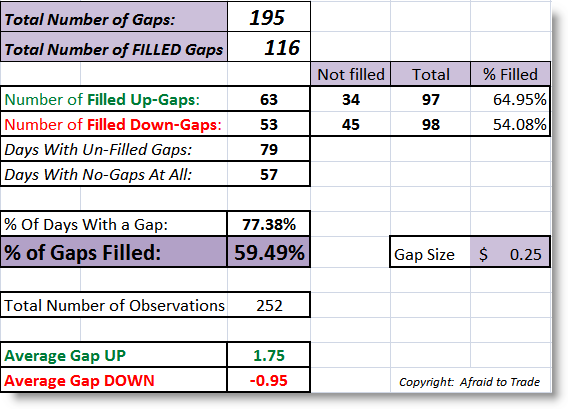
Of the 252 trading days in 2008, 195 of them saw some sort of gap, meaning 77.38% (over 3/4) trading days had an overnight change of at least $0.25.
Of these 195 days, 116 resulted in an intraday gap fill, giving us an ultimate gap fill percentage of 59.49%, or roughly 3 out of every 5 gaps filled intraday.
The edge was slightly greater in up-side gaps that were filled, meaning price initially gapped up but then declined to trade equal or beneath yesterday’s close. This is what we would expect in a down-market of 2008. By the same token, fewer down gaps (54%) had price rising to fill the gap intraday.
There were roughly an equal number of up (97) and down (98) gaps, so there was no significant difference there.
However, we see something interesting which is oddly characteristic of Bear Markets. The average upside gap was $1.75 while the average downside gap was $0.95, meaning making money in 2008 was clearly not as easy as “get short, get rich.” Bears (sellers) had to contend with extreme volatility both up and down. There were times in 2008 when we’d make a record percent or point loss day… only to be followed right up with a record point or percentage UP day. Though there were some strong down-moves, there were a good number of “shockers” which ripped the stops out from short-sellers. Remember that Short-Selling on financial stocks was banned for a period in 2008, creating some massive upside gaps.
Let’s define our gap more stringently. Let’s record the morning action as a gap ONLY if it’s greater than $0.50 from the prior close. Let’s see if that gave us an ‘edge’ greater than 50% (random chance):

We still see the ‘edge,’ but it’s reduced. If you do any sort of study on gaps, you’ll find logically that the larger the gap is, the less likely it is to be filled.
In this case, there were 138 (or 252) days which had a gap greater than $0.50, and of those, 73 gaps filled which returned a gap-fill percentage of 52.90%.
Strangely, there was a ‘flip’ in the percentage of up and down gaps. There were 81 down gaps to 57 up gaps (remember they were equal at $0.25). Now, more down-gaps than up-gaps filled which is interesting.
If we raise the criterion to $1.00…
The edge drops to less than random. There were 72 gaps (up or down) greater than $1.00, and of these, 33 gaps filled intraday, giving us a gap-fill percentage of 45.83%, losing the edge of the strategy.
Remember, odds of a successful gap fill drop off as the size of the gap increases. Think of it logically - which is more likely to fill… a gap of $0.10 or a gap of $2.00 (in the DIA)? Just by random volatility, a $0.10 gap is more likely to be filled than a $2.00 one. Often, large gaps (that go unfilled) are the precursors to “Trend Days” so keep that in mind.
It’s unlikely that 2009 will be as radically volatile as 2008 but there’s certainly no guarantees that it won’t. Keep this in mind when developing your trade ideas and specifically when employing the gap-fade morning trade.
Corey Rosenbloom
Afraid to Trade.com
Keep up-to-date with the Afraid to Trade Feed.
Follow Afraid to Trade on Twitter: http://twitter.com/afraidtotrade
2 Comments | add comment
Gap Fade Stats for January 09
February 5th, 2009 by Corey Rosenbloom
The start of February means it’s time to examine the raw statistics on the monthly “Gap Fade” numbers in the DIA (Dow Jones ETF). Remember, we consider a ‘gap’ to be at least $0.25 in the DIA and define a ‘gap fill’ as an opening greater than $0.25 up or down when the price equals yesterday’s close at ANY point in the day. Stop-losses are not factored in - you’ll need to develop your own strategy for that.
Let’s see the gap fading chart for January 2009:
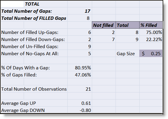
Of the 21 trading days in January, 17 days produced a gap at least $0.25 in the DIA. Of these 17, 8 gaps were filled intraday, which gives us a sub-50% statistic at 47.06%. For 2008, every month but August produced a gap-fill percentage greater than 50% (or random chance).
If you look closer, the failure gaps came to the downside. This means that if the market gapped down, it was less likely (22%) to fill downside gaps (by rising higher on the day) than it was to fill upside gaps (by trading lower on the day). This makes sense as January saw the market shave 10% off most of the major US Equity Indexes. It was quite a weak month.
There were 8 upside gaps and 6 of these filled (with price going lower on the day), giving us a 75% fill rate.
There were 9 downside gaps and only 2 of these filled (rising on the day) producing a 22% fill rate.
January was more in line with expectations (in terms of gap volatility) as the average up-gap was $0.61 while the average down-gap was $0.80.
By the way, if we increase our criteria of “gap” to include all gaps greater than $1.00, we would see that there were 8 gaps greater than a DIA $1.00, and of these, only 3 filled, which gave us a paltry 37.50% fill-rate. This is in line with the assumption that it’s generally not best to fade DIA gaps greater than $1.00.
For a look-back at all of 2008, follow the links on my previous “Gap Stats for December 2008” post.
Stay tuned for the statistics for all of 2008!
No Comments | add comment
Sector Rotation and Performance in January
February 4th, 2009 by Corey Rosenbloom
January did not get 2009 off to a great start. Let’s break down the S&P 500’s 10% loss by sector and see what clues the Sector Rotation performance in January might be offering us.
Sector Rotation (AMEX Sectors) absolute performance in January:

We’re seeing a negative picture across the board - not one major Sector increased in value in January. Financials lost almost 30% while the ‘best’ performer was the Utilities which managed only to lose 2%. We saw the biggest hits in the two key sectors that will be critical for any sort of recovery - Financials and Consumer Discretionary/Retail. I cannot underscore how bad a sign this is for the broader market. We actually saw Industrials underperform Consumer Discretionary which adds to the negativity.
The “Defensive” sectors held up the best in terms of Health Care, Utilities and - to an extent - Consumer Staples (which lost almost 10%). This is absolutely the opposite picture you’d want to see to be bullish.
Let’s switch from absolute returns to performance relative to the S&P 500.
Sector Rotation (AMEX Sectors) Relative performance in January:

Again, the Sectors that outperformed the S&P 500 by the largest margin were the “Defensive” sectors of Health Care and Utilities. Surprisingly, Technology and Energy outperformed the S&P 500 but by only 4%.
The Financial Sector underperformed by 15% - a devastating development. Check out some stocks such as Regions Financial (RF) which notched a negative close almost every single day in January (falling from $9 to $3 per share in a single month).
Keep watching Sector Performance, as it should give us clues to where we are and where we’re likely to be headed. Look for any signs of strength in Financials and Consumer Discretionary. Until then, talk of the word “Bottom” is premature.
For now, I can see no hope for the bulls with these results.
Corey Rosenbloom
Afraid to Trade.com
Keep up-to-date with the Afraid to Trade Feed.
Follow Afraid to Trade on Twitter: http://twitter.com/afraidtotrade
No Comments | add comment
« Previous Page — Next Page » |
 [复制链接]


 楼主
楼主