- 金币:
-
- 奖励:
-
- 热心:
-
- 注册时间:
- 2006-7-3
|
|

楼主 |
发表于 2009-5-14 06:52
|
显示全部楼层
Monday, December 19, 2005The Bulls Will Fail
With each passing day I like this market more and more.
The sneering, smirking bulls, with their obsession over "Dow 11,000", keep failing to do it. They just can't. No matter what favorable news blows their way, and no matter how many millions of people are falling all over themselves to push the market higher, it's not working. The market's not going up.
What's cool is that every morning they try again, and they fail again. As I've said in the past, this is exactly what we want to see. The market opens, they stamp their little hooves and push the market 30, 50, 70 points higher.....and it stalls. And starts slipping. And spends the rest of the day giving those gains back and, more often than not, closing lower for the day.
There are now just eight trading days left in the year. At this point, for the entire year, the Dow has gain 53 points. I am hopeful that minuscule gain will be wiped out and replaced with a loss before the year is over so we can throw this decennial pattern in the garbage where it belongs.
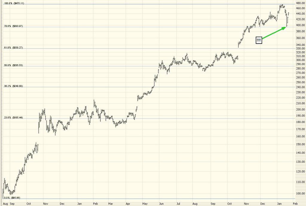
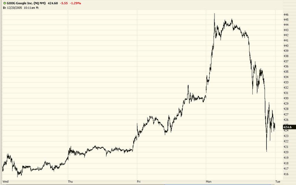
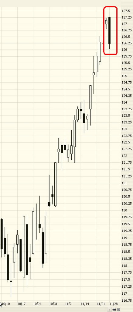
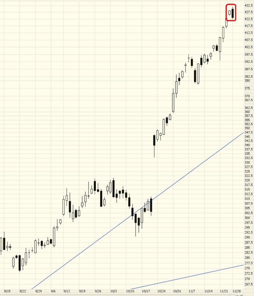
Now let's take a look at the current insanity, Google. About a week ago or so, in an attempt to outdo other analysts, one stock analyst made a projected price target of $500 for Google. What's this thing with big, round numbers? Does this guy really get paid this much to just dream up a big round number? Is there actual analysis behind it? What about $600? Or $700? Why not a good old 1990s $1,000 price target?
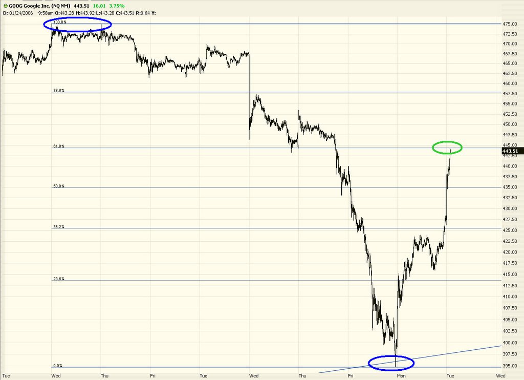
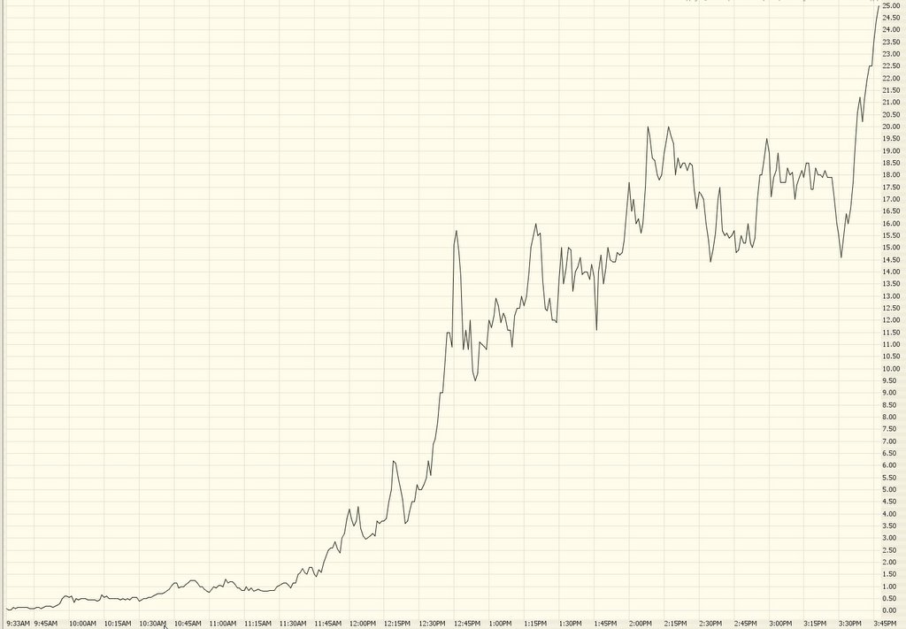
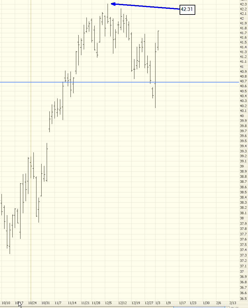
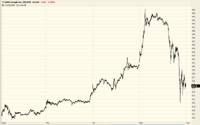
Well, anyway, Google shot out of the gates today because they look close to catching some of that AOL magic (take a good look at the dog TWX stock to see how much life is left there). It was up $17 or so, blasting to another lifetime high. And it stalled. And started sinking. It finally closed down nearly $6 for the day. A daily range of something like $25. I actually had bought puts on it near the top but chickened out. Just look at this insane intraday chart (below is about the past 5 days).
I am hoping 2006 will put us in a position where the bears really take charge. We're sort of gently tapping the bulls away at this point. I'm wanting to rip a few thousand points out of the Dow and see real blood in the streets. 2006 could be the year for that kind of action. Below is a list of all my current puts and shorts. All of them are already deeply profitable, and I'm counting on many gains to come. Let the games begin!
at 12/19/2005 9 insightful comments
 Links to this post Links to this post
Thursday, December 15, 2005Bulls Still Struggling
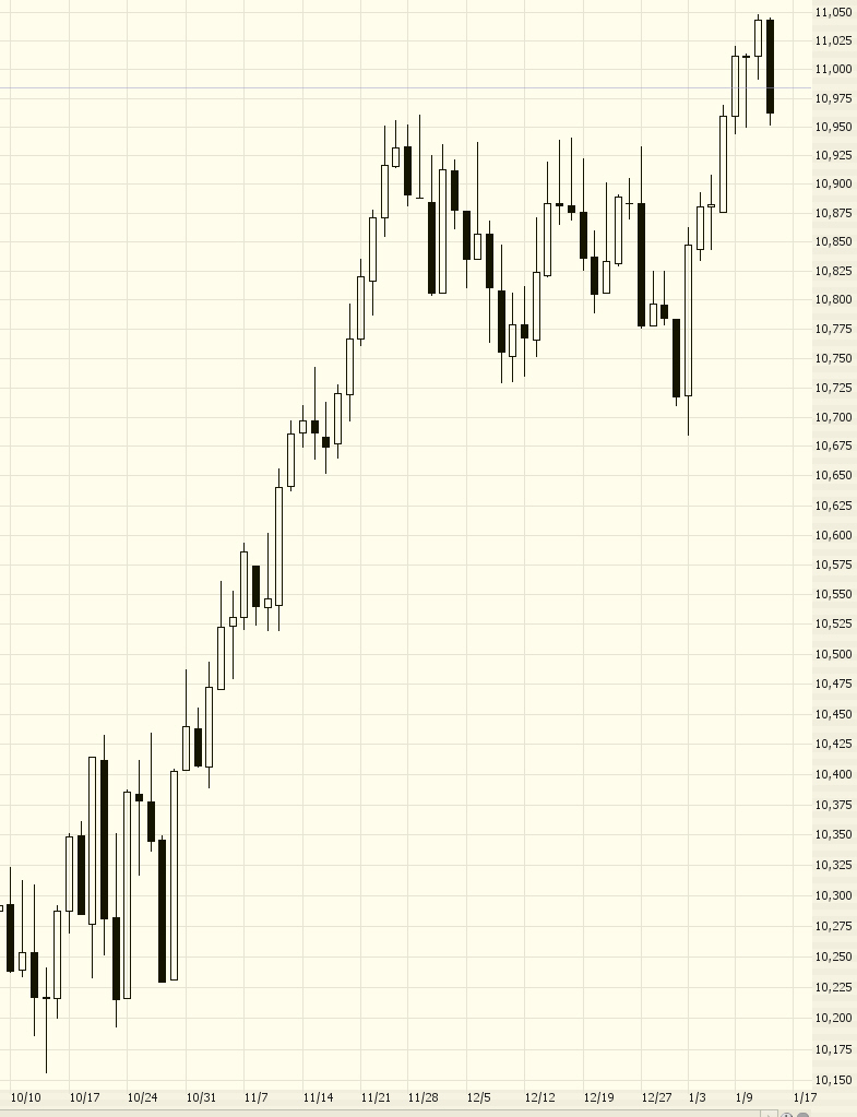
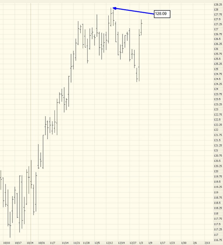
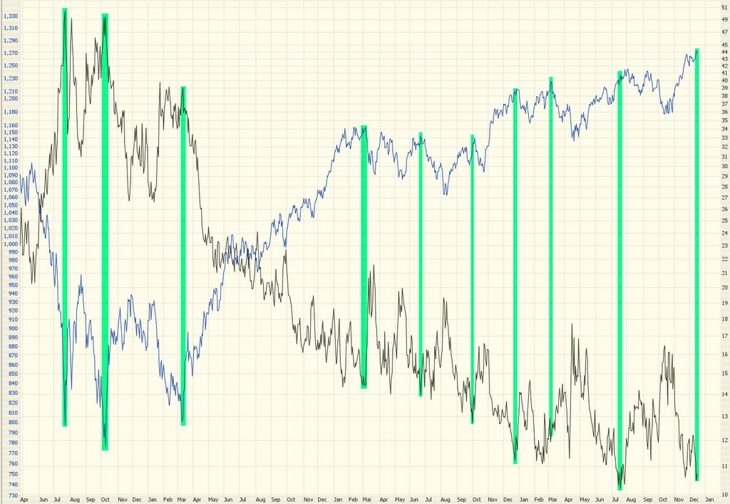
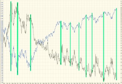
Here's a chart showing the VIX (black line, right scale) versus the S&P 500 (blue line, left scale) over the past 3 1/2 years. As always, click on the image to make it larger so you can see it better. Look at the picture and judge for yourself what this chart might be telling us. I've put some green highlights to ilustrate how these two charts are often "mirror images".
at 12/15/2005 0 insightful comments
Links to this post
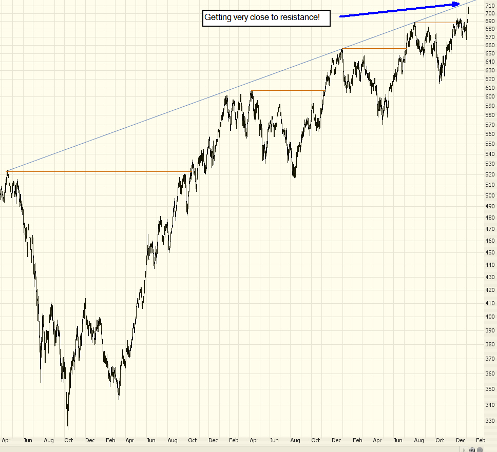
Tuesday, December 13, 2005Breakout........or Failure?
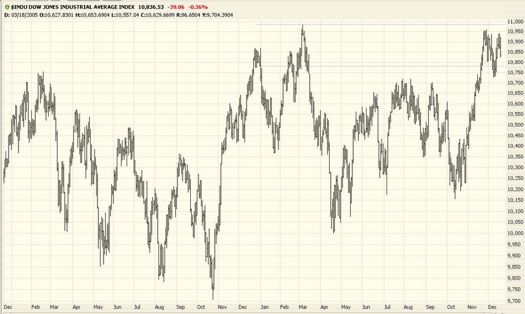
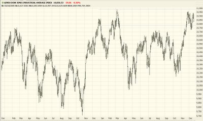
Today, for the 13th time in a row, the Fed increased interest rates. Perversely, the market rallied on the news (supposedly because there was a suggestion that perhaps the rate hikes would stop). It wasn't that many years ago there was a saying about "three steps and a stumble" (in other words, three rate hikes in a row preceded a bear market). I guess even 13 hikes haven't done the trick yet.
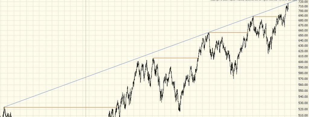
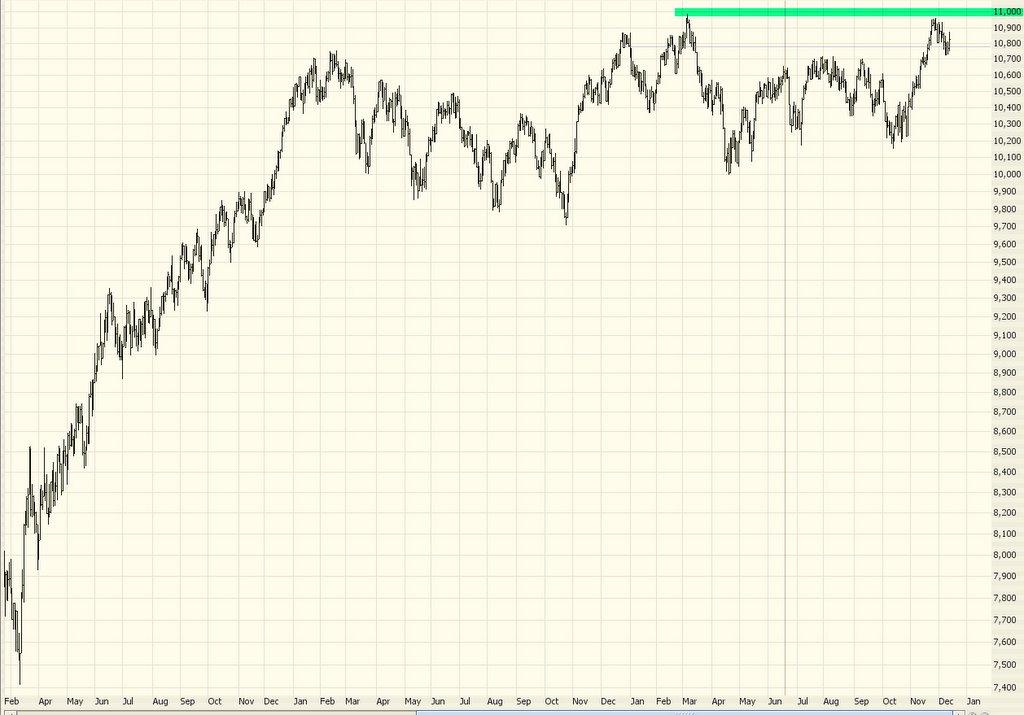
The market has been going nowhere for a long, long time. The flip side of this, however, is that when the market does finally decide to go somewhere, the move will be substantial. Even I, Mr. Bear, concede that if the Dow breaks 11,000 in a meaningful way, the market is going to rally strongly. There is simply too much pent up energy to hold it back. Conversely, if the market keeps failing to penetrate 11,000, as it has done repeatedly already, the market will finally succumb and wilt downward.
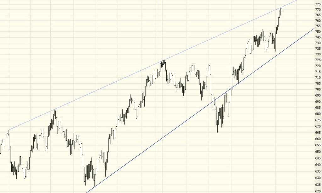
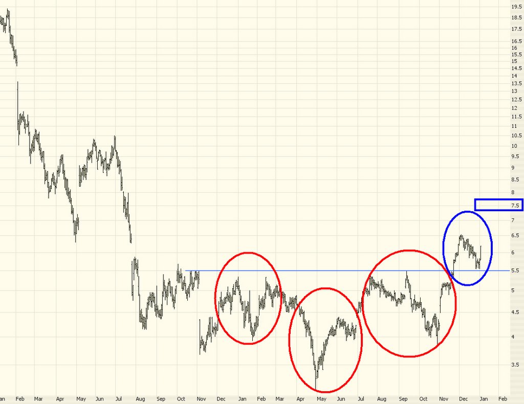
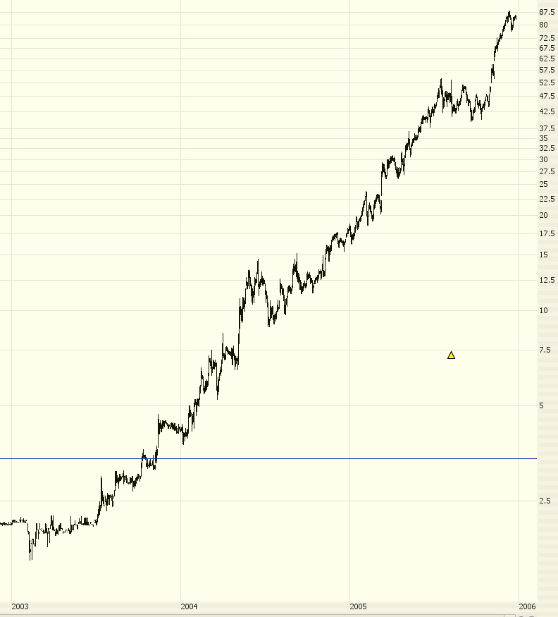
Take a look at the past couple of years of the Dow 30; notice where I have marked the 11,000 threshold:
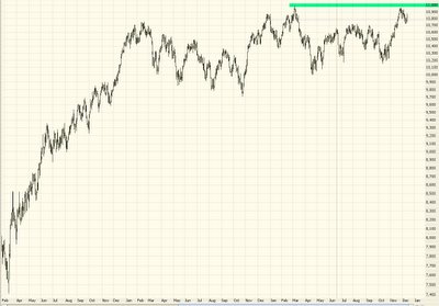
There have been two earnest attempts to pierce 11,000. If it can't "punch through", the bear market I've been yacking about all year will finally start to take hold. Until then, everyone - including me - is in wait-and-see mode.
The market will either have the strength to push itself past the resistance that's been holding it back for many months, or it will finally throw in the towel as people rush for the exit doors and take profits as quickly as they can.
at 12/13/2005 3 insightful comments
Links to this post
Newer Posts Older Posts Home |
|
|
 [复制链接]