Vol. 9, No. 8
for the week of 3/30/09 |
Vol. 9, No. 7
for the week of 3/23/09 |
Vol. 9, No. 6
for the week of 3/16/09 |
Vol. 9, No. 5
for the week of 3/2/09 |
Vol. 9, No. 4
for the week of 2/9/09 |
Vol. 9, No. 3
for the week of 2/2/09 |
Vol. 9, No. 2
for the week of 1/26/09 |
Vol. 9, No. 1
for the week of 1/19/09 |
Vol. 8, No. 38
for the week of 12/15/08 |
Vol. 8, No. 37
for the week of 12/8/08 |
Vol. 8, No. 36
for the week of 12/1/08 |
Vol. 8, No. 35
for the week of 11/17/08 |
Vol. 8, No. 34
for the week of 11/10/08 |
Vol. 8, No. 33
for the week of 11/3/08 |
Vol. 8, No. 32
for the week of 10/27/08 |
Vol. 8, No. 31
for the week of 10/6/08 |
Vol. 8, No. 30
for the week of 9/22/08 |
Vol. 8, No. 29
for the week of 9/15/08 |
Vol. 8, No. 28
for the week of 9/8/08 |
Vol. 8, No. 27
for the week of 8/25/08 |
Vol. 8, No. 26
for the week of 8/18/08 |
Vol. 8, No. 25
for the week of 8/11/08 |
Vol. 8, No. 24
for the week of 8/4/08 |
Vol. 8, No. 23
for the week of 7/28/08 |
Vol. 8, No. 22
for the week of 7/14/08 |
Vol. 8, No. 21
for the week of 7/7/08 |
Vol. 8, No. 20
for the week of 6/30/08 |
Vol. 8, No. 19
for the week of 6/23/08 |
Vol. 8, No. 18
for the week of 6/16/08 |
Vol. 8, No. 17
for the week of 6/9/08 |
Vol. 8, No. 16
for the week of 6/2/08 |
Vol. 8, No. 15
for the week of 5/19/08 |
Vol. 8, No. 14
for the week of 5/12/08 |
Vol. 8, No. 13
for the week of 5/5/08 |
Vol. 8, No. 12
for the week of 4/28/08 |
Vol. 8, No. 11
for the week of 4/21/08 |
Vol. 8, No. 10
for the week of 4/7/08 |
Vol. 8, No. 9
for the week of 3/24/08 |
Vol. 8, No. 8
for the week of 3/17/08 |
Vol. 8, No. 7
for the week of 3/3/08 |
Vol. 8, No. 6
for the week of 2/25/08 |
Vol. 8, No. 5
for the week of 2/11/08 |
Vol. 8, No. 4
for the week of 2/4/08 |
Vol. 8, No. 3
for the week of 1/28/08 |
Vol. 8, No. 2
for the week of 1/21/08 |
Vol. 8, No. 1
for the week of 1/7/08 |
Vol. 7, No. 43
for the week of 12/31/07 |
Vol. 7, No. 42
for the week of 12/24/07 |
Vol. 7, No. 41
for the week of 12/17/07 |
Vol. 7, No. 40
for the week of 12/3/07 |
Vol. 7, No. 39
for the week of 11/26/07 |
Vol. 7, No. 38
for the week of 11/19/07 |
Vol. 7, No. 37
for the week of 11/5/07 |
Vol. 7, No. 36
for the week of 10/29/07 |
Vol. 7, No. 35
for the week of 10/22/07 |
Vol. 7, No. 34
for the week of 10/15/07 |
Vol. 7, No. 33
for the week of 10/8/07 |
Vol. 7, No. 32
for the week of 9/24/07 |
Vol. 7, No. 31
for the week of 9/17/07 |
Vol. 7, No. 30
for the week of 9/4/07 |
Vol. 7, No. 29
for the week of 8/27/07 |
Vol. 7, No. 28
for the week of 8/20/07 |
Vol. 7, No. 27
for the week of 8/13/07 |
Vol. 7, No. 26
for the week of 8/6/07 |
Vol. 7, No. 25
for the week of 7/30/07 |
Vol. 7, No. 24
for the week of 7/16/07 |
Vol. 7, No. 23
for the week of 7/9/07 |
Vol. 7, No. 22
for the week of 7/2/07 |
Vol. 7, No. 21
for the week of 6/25/07 |
Vol. 7, No. 20
for the week of 6/18/07 |
Vol. 7, No. 19
for the week of 6/11/07 |
Vol. 7, No. 18
for the week of 5/14/07 |
Vol. 7, No. 17
for the week of 5/7/07 |
Vol. 7, No. 16
for the week of 4/30/07 |
Vol. 7, No. 15
for the week of 4/23/07 |
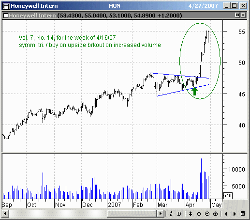
Vol. 7, No. 14
for the week of 4/16/07 |
Vol. 7, No. 13
for the week of 4/9/07 |
Vol. 7, No. 12
for the week of 4/2/07 |
Vol. 7, No. 11
for the week of 3/19/07 |
Vol. 7, No. 10
for the week of 3/12/07 |
Vol. 7, No. 9
for the week of 3/5/07 |
Vol. 7, No. 8
for the week of 2/26/07 |
Vol. 7, No. 7
for the week of 2/12/07 |
Vol. 7, No. 6
for the week of 2/5/07 |
Vol. 7, No. 5
for the week of 1/29/07 |
Vol. 7, No. 4
for the week of 1/22/07 |
Vol. 7, No. 3
for the week of 1/15/07 |
Vol. 7, No. 2
for the week of 1/8/07 |
Vol. 7, No. 1
for the week of 1/3/07 |
Vol. 6, No. 43
for the week of 12/18/06 |
Vol. 6, No. 42
for the week of 12/4/06 |
Vol. 6, No. 41
for the week of 11/20/06 |
Vol. 6, No. 40
for the week of 11/13/06 |
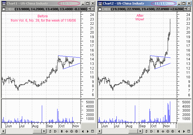
Vol. 6, No. 39
for the week of 11/6/06 |
Vol. 6, No. 38
for the week of 10/30/06 |
Vol. 6, No. 37
for the week of 10/23/06 |
Vol. 6, No. 36
for the week of 10/16/06 |
Vol. 6, No. 35
for the week of 10/2/06 |
Vol. 6, No. 34
for the week of 9/25/06 |
Vol. 6, No. 33
for the week of 9/18/06 |
Vol. 6, No. 32
for the week of 9/11/06 |
Vol. 6, No. 31
for the week of 8/28/06 |
Vol. 6, No. 30
for the week of 8/21/06 |
Vol. 6, No. 29
for the week of 8/14/06 |
Vol. 6, No. 28
for the week of 8/7/06 |
Vol. 6, No. 27
for the week of 7/31/06 |
Vol. 6, No. 26
for the week of 7/24/06 |
Vol. 6, No. 25
for the week of 7/10/06 |
Vol. 6, No. 24
for the week of 7/3/06 |
Vol. 6, No. 23
for the week of 6/26/06 |
Vol. 6, No. 22
for the week of 6/19/06 |
Vol. 6, No. 21
for the week of 6/12/06 |
Vol. 6, No. 20
for the week of 6/5/06 |
Vol. 6, No. 19
for the week of 5/22/06 |
Vol. 6, No. 18
for the week of 5/15/06 |
Vol. 6, No. 17
for the week of 5/8/06 |
Vol. 6, No. 16
for the week of 5/1/06 |
Vol. 6, No. 15
for the week of 4/24/06 |
Vol. 6, No. 14
for the week of 4/10/06 |
Vol. 6, No. 13
for the week of 4/3/06 |
Vol. 6, No. 12
for the week of 3/27/06 |
Vol. 6, No. 11
for the week of 3/20/06 |
Vol. 6, No. 10
for the week of 3/13/06 |
Vol. 6, No. 9
for the week of 3/6/06 |
Vol. 6, No. 8
for the week of 2/27/06 |
Vol. 6, No. 7
for the week of 2/20/06 |
Vol. 6, No. 6
for the week of 2/13/06 |
Vol. 6, No. 5
for the week of 2/6/06 |
Vol. 6, No. 4
for the week of 1/30/06 |
Vol. 6, No. 3
for the week of 1/23/06 |
Vol. 6, No. 2
for the week of 1/16/06 |
Vol. 6, No. 1
for the week of 1/2/06 |
Vol. 5, No. 46
for the week of 12/19/05 |
Vol. 5, No. 45
for the week of 12/12/05 |
|
Vol. 5, No. 43
for the week of 11/28/05 |
Vol. 5, No. 42
for the week of 11/21/05 |
Vol. 5, No. 41
for the week of 11/14/05 |
Vol. 5, No. 40
for the week of 11/7/05 |
Vol. 5, No. 39
for the week of 10/31/05 |
Vol. 5, No. 38
for the week of 10/24/05 |
Vol. 5, No. 37
for the week of 10/17/05 |
Vol. 5, No. 36
for the week of 10/10/05 |
Vol. 5, No. 35
for the week of 10/3/05 |
Vol. 5, No. 34
for the week of 9/26/05 |
Vol. 5, No. 33
for the week of 9/12/05 |
Vol. 5, No. 32
for the week of 9/6/05 |
Vol. 5, No. 31
for the week of 8/29/05 |
Vol. 5, No. 30
for the week of 8/15/05 |
Vol. 5, No. 29
for the week of 8/8/05 |
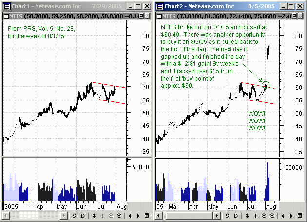
Vol. 5, No. 28
for the week of 8/1/05 |
Vol. 5, No. 27
for the week of 7/25/05 |
Vol. 5, No. 26
for the week of 7/18/05 |
Vol. 5, No. 25
for the week of 7/11/05 |
Vol. 5, No. 24
for the week of 7/5/05 |
Vol. 5, No. 23
for the week of 6/27/05 |
Vol. 5, No. 22
for the week of 6/20/05 |
Vol. 5, No. 21
for the week of 6/13/05 |
Vol. 5, No. 20
for the week of 6/6/05 |
Vol. 5, No. 19
for the week of 5/23/05 |
Vol. 5, No. 18
for the week of 5/15/05 |
Vol. 5, No. 17
for the week of 5/2/05 |
Vol. 5, No. 16
for the week of 4/25/05 |
Vol. 5, No. 15
for the week of 4/18/05 |
Vol. 5, No. 14
for the week of 4/4/05 |
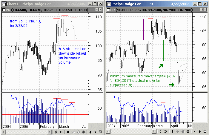
Vol. 5, No. 13
for the week of 3/28/05 |
Vol. 5, No. 12
for the week of 3/21/05 |
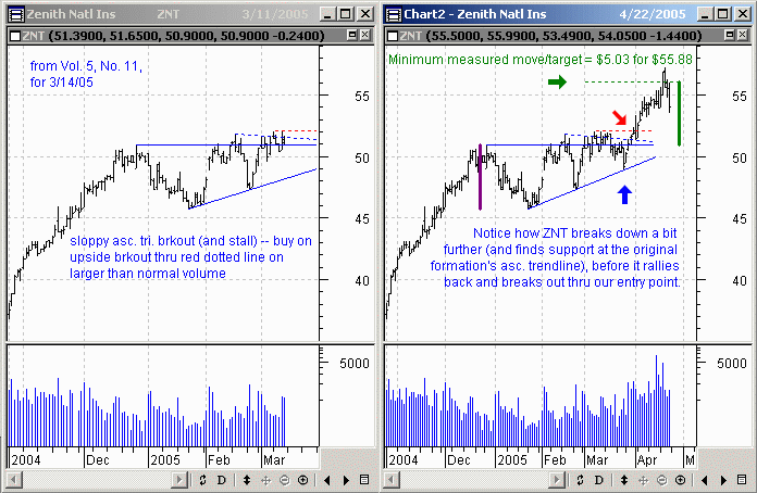
Vol. 5, No. 11
for the week of 3/14/05 |
Vol. 5, No. 10
for the week of 3/7/05 |
Vol. 5, No. 9
for the week of 2/28/05 |
Vol. 5, No. 8
for the week of 2/22/05 |
Vol. 5, No. 7
for the week of 2/14/05 |
Vol. 5, No. 6
for the week of 2/7/05 |
Vol. 5, No. 5
for the week of 1/31/05 |
Vol. 5, No. 4
for the week of 1/24/05 |
Vol. 5, No. 3
for the week of 1/17/05 |
Vol. 5, No. 2
for the week of 1/10/05 |
Vol. 5, No. 1
for the week of 1/3/05 |
2005 Market Outlook
(Indices) 12/27/04 |
Vol. 4, No. 42
for the week of 12/20/04 |
Vol. 4, No. 41
for the week of 12/13/04 |
Vol. 4, No. 40
for the week of 12/6/04 |
Vol. 4, No. 39
for the week of 11/22/04 |
Vol. 4, No. 38
for the week of 11/15/04 |
Vol. 4, No. 37
for the week of 11/8/04 |
Vol. 4, No. 36
for the week of 11/1/04 |
Vol. 4, No. 35
for the week of 10/25/04 |
Vol. 4, No. 34
for the week of 10/18/04 |
Vol. 4, No. 33
for the week of 10/11/04 |
Vol. 4, No. 32
for the week of 10/4/04 |
Vol. 4, No. 31
for the week of 9/20/04 |
Vol. 4, No. 30
for the week of 9/13/04 |
Vol. 4, No. 29
for the week of 9/6/04 |
Vol. 4, No. 28
for the week of 8/30/04 |
Vol. 4, No. 27
for the week of 8/16/04 |
Vol. 4, No. 26
for the week of 8/9/04 |
Vol. 4, No. 25
for the week of 8/2/04 |
Vol. 4, No. 24
for the week of 7/26/04 |
Vol. 4, No. 23
for the week of 7/12/04 |
Vol. 4, No. 22
for the week of 6/28/04 |
Vol. 4, No. 21
for the week of 6/21/04 |
Vol. 4, No. 20
for the week of 6/14/04 |
Vol. 4, No. 19
for the week of 6/7/04 |
Vol. 4, No. 18
for the week of 5/24/04 |
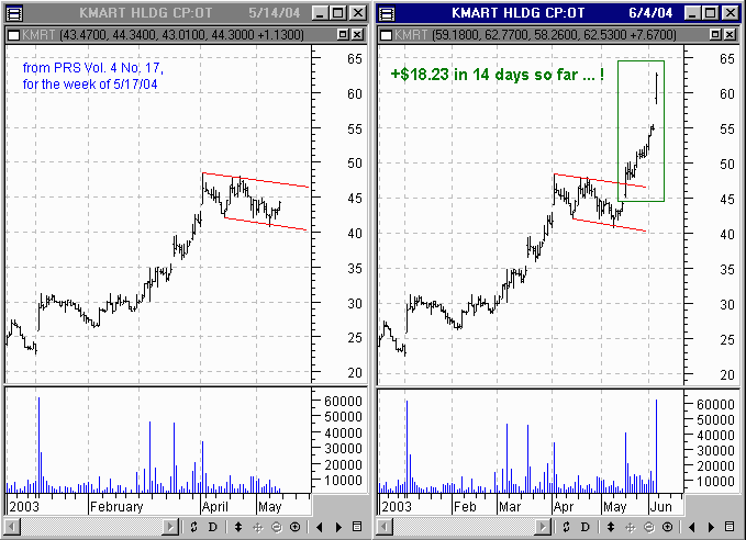
Vol. 4, No. 17
for the week of 5/17/04 |
Vol. 4, No. 16
for the week of 5/10/04 |
Vol. 4, No. 15
for the week of 5/3/04 |
Vol. 4, No. 14
for the week of 4/26/04 |
Vol. 4, No. 13
for the week of 4/19/04 |
Vol. 4, No. 12
for the week of 4/5/04 |
Vol. 4, No. 11
for the week of 3/29/04 |
Vol. 4, No. 10
for the week of 3/22/04 |
Vol. 4, No. 9
for the week of 3/15/04 |
Vol. 4, No. 8
for the week of 3/1/04 |
Vol. 4, No. 7
for the week of 2/23/04 |
Vol. 4, No. 6
for the week of 2/9/04 |
Vol. 4, No. 5
for the week of 2/2/04 |
Vol. 4, No. 4
for the week of 1/26/04 |
Vol. 4, No. 3
for the week of 1/19/04 |
Vol. 4, No. 2
for the week of 1/12/04 |
Vol. 4, No. 1
for the week of 1/5/04 |
Vol. 3, No. 44
for the week of 12/29/03 |
Vol. 3, No. 43
for the week of 12/22/03 |
Vol. 3, No. 42
for the week of 12/15/03 |
Vol. 3, No. 41
for the week of 12/8/03 |
Vol. 3, No. 40
for the week of 11/24/03 |
Vol. 3, No. 39
for the week of 11/17/03 |
Vol. 3, No. 38
for the week of 11/10/03 |
Vol. 3, No. 37
for the week of 11/3/03 |
Vol. 3, No. 36
for the week of 10/27/03 |
Vol. 3, No. 35
for the week of 10/20/03 |
Vol. 3, No. 34
for the week of 10/6/03 |
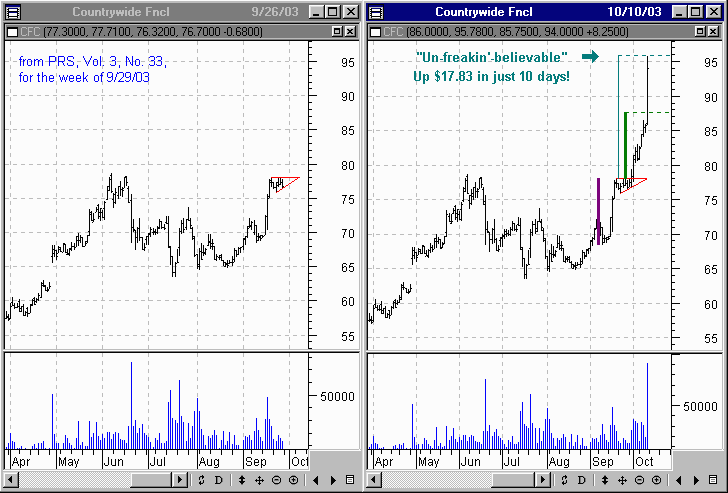
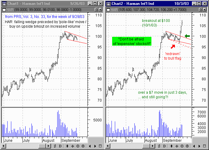
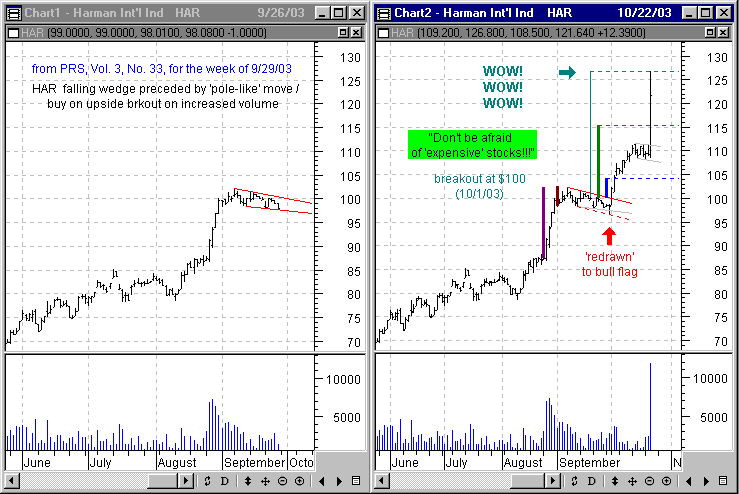
Vol. 3, No. 33
for the week of 9/29/03 |
Vol. 3, No. 32
for the week of 9/22/03 |
Vol. 3, No. 31
for the week of 9/15/03 |
Vol. 3, No. 30
for the week of 8/25/03 |
Vol. 3, No. 29
for the week of 8/18/03 |
Vol. 3, No. 28
for the week of 8/11/03 |
Vol. 3, No. 27
for the week of 8/4/03 |
Vol. 3, No. 26
for the week of 7/28/03 |
Vol. 3, No. 25
for the week of 7/21/03 |
Vol. 3, No. 24
for the week of 7/7/03 |
Vol. 3, No. 23
for the week of 6/23/03 |
Vol. 3, No. 22
for the week of 6/16/03 |
Vol. 3, No. 21
for the week of 6/9/03 |
Vol. 3, No. 20
for the week of 6/2/03 |
Vol. 3, No. 19
for the week of 5/26/03 |
Vol. 3, No. 18
for the week of 5/19/03 |
Vol. 3, No. 17
for the week of 5/12/03 |
Vol. 3, No. 16
for the week of 5/5/03 |
Vol. 3, No. 15
for the week of 4/28/03 |
Vol. 3, No. 14
for the week of 4/14/03 |
Vol. 3, No. 13
for the week of 4/7/03 |
Vol. 3, No. 12
for the week of 3/31/03 |
Vol. 3, No. 11
for the week of 3/24/03 |
Vol. 3, No. 10
for the week of 3/17/03 |
Vol. 3, No. 9
for the week of 3/10/03 |
Special Report
The Dow, 3/4/03 |
Vol. 3, No. 8
for the week of 3/3/03 |
Vol. 3, No. 7
for the week of 2/24/03 |
Vol. 3, No. 6
for the week of 2/17/03 |
Vol. 3, No. 5
for the week of 2/10/03 |
Vol. 3, No. 4
for the week of 2/3/03 |
Vol. 3, No. 3
for the week of 1/20/03 |
Vol. 3, No. 2
for the week of 1/13/03 |
Vol. 3, No. 1
for the week of 1/6/03 |
Vol. 2, No. 47
for the week of 12/30/02 |
Vol. 2, No. 46
for the week of 12/23/02 |
Vol. 2, No. 45
for the week of 12/16/02 |
Vol. 2, No. 44
for the week of 12/9/02 |
Vol. 2, No. 43
for the week of 12/2/02 |
Vol. 2, No. 42
for the week of 11/25/02 |
Vol. 2, No. 41
for the week of 11/18/02 |
Vol. 2, No. 40
for the week of 11/4/02 |
Vol. 2, No. 39
for the week of 10/28/02 |
Vol. 2, No. 38
for the week of 10/21/02 |
Vol. 2, No. 37
for the week of 10/14/02 |
Vol. 2, No. 36
for the week of 10/7/02 |
Vol. 2, No. 35
for the week of 9/30/02 |
Vol. 2, No. 34
for the week of 9/23/02 |
Vol. 2, No. 33
for the week of 9/16/02 |
Vol. 2, No. 32
for the week of 9/9/02 |
Vol. 2, No. 31
for the week of 9/3/02 |
Vol. 2, No. 30
for the week of 8/26/02 |
Vol. 2, No. 29
for the week of 8/19/02 |
Vol. 2, No. 28
for the week of 8/12/02 |
Vol. 2, No. 27
for the week of 8/5/02 |
Vol. 2, No. 26
for the week of 7/29/02 |
Vol. 2, No. 25
for the week of 7/22/02 |
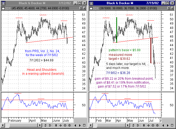
Vol. 2, No. 24
for the week of 7/15/02 |
Vol. 2, No. 23
for the week of 7/8/02 |
Vol. 2, No. 22
for the week of 7/1/02 |
Vol. 2, No. 21
for the week of 6/24/02 |
Vol. 2, No. 20
for the week of 6/17/02 |
Vol. 2, No. 19
for the week of 6/10/02 |
Vol. 2, No. 18
for the week of 6/3/02 |
Vol. 2, No. 17
for the week of 5/27/02 |
Vol. 2, No. 16
for the week of 5/20/02 |
Vol. 2, No. 15
for the week of 5/13/02 |
Vol. 2, No. 14
for the week of 5/6/02 |
Vol. 2, No. 13
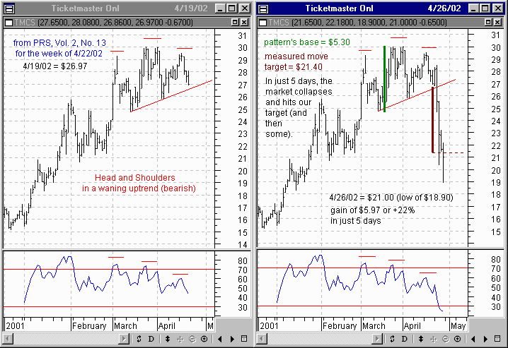
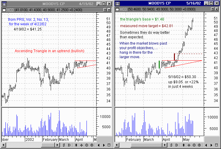
for the week of 4/22/02 |
Vol. 2, No. 12
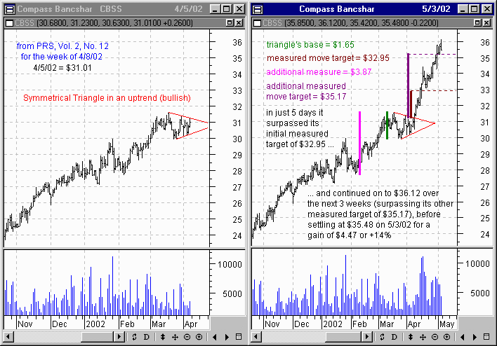
for the week of 4/8/02 |
Vol. 2, No. 11
for the week of 4/1/02 |
Vol. 2, No. 10
for the week of 3/25/02 |
Vol. 2, No. 9
for the week of 3/18/02 |
Vol. 2, No. 8
for the week of 3/11/02 |
Vol. 2, No. 7
for the week of 3/4/02 |
Vol. 2, No. 6
for the week of 2/25/02 |
Vol. 2, No. 5
for the week of 2/18/02 |
Vol. 2, No. 4
for the week of 2/4/02 |
Vol. 2, No. 3
for the week of 1/21/02 |
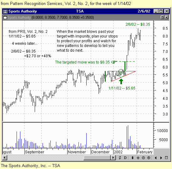
Vol. 2, No. 2
for the week of 1/14/02 |
Vol. 2, No. 1
for the week of 1/7/02 |
Vol. 1, No. 9
for the week of 12/31/01 |
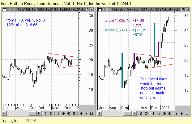
Vol. 1, No. 8
for the week of 12/24/01 |
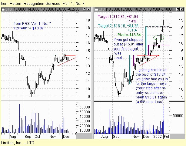
Vol. 1, No. 7
for the week of 12/17/01 |
Vol. 1, No. 6
for the week of 12/10/01 |
Vol. 1, No. 5
for the week of 12/3/01 |
Vol. 1, No. 4
for the week of 11/26/01 |
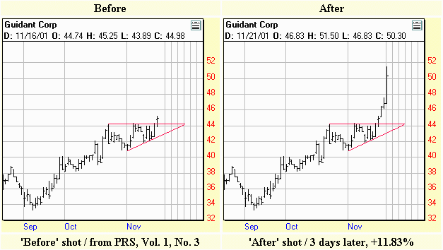
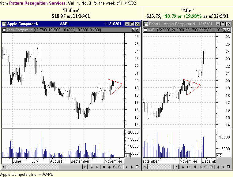
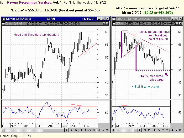
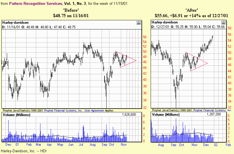
Vol. 1, No. 3
for the week of 11/19/01 |
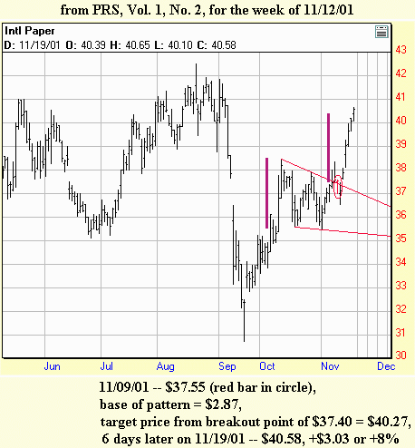
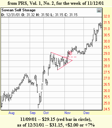
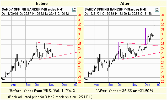
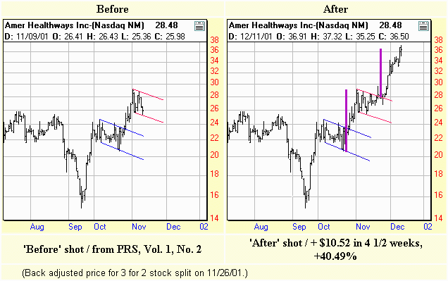
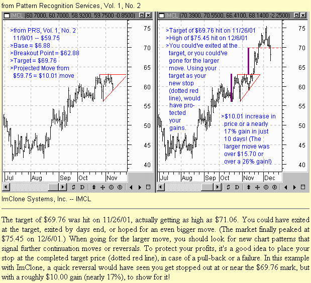
Vol. 1, No. 2
for the week of 11/12/01 |
 [复制链接]


 楼主
楼主