May 01, 2004CHART OVERLAYS COMING THIS WEEK By Chip Anderson
Site News
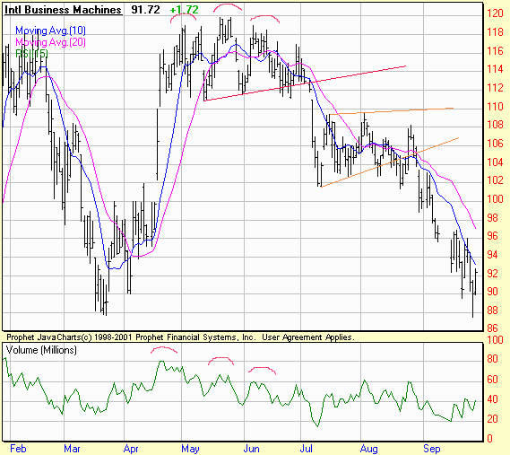
MURPHYMORRIS.COM TRANSITION COMPLETE - We have moved all of the MurphyMorris.com content from that website into the "John Murphy" section of StockCharts.com now. Subscribers to the Murphy Market Message should now click on the "John Murphy" tab at the top of our pages to see John's latest market commentary. John's charts look better (see above for two examples) and we've added a calendar of John's upcoming appearances as well. Look for us to add more features and specials to the Murphy area in the coming months.
LOOK FOR CHART OVERLAYS LATER THIS WEEK - We're putting the finishing touches on a major new feature of our new SharpCharts2 charting engine right now - Chart Overlays. This feature allows you to place two charts "on top of each other". For example, you could place a plot of a stock's MACD indicator behind the actual candlesticks of the stock itself so you could directly compare the MACD's signals with the stock's turning points. Or, by using our new "Price" indicator, you can plot one stock's price onto of another stock's chart! Here's an example of that using the Nasdaq and the VIX:
The key to using this new feature will be a new choice in the "Position" dropdown box for each indicator. Right now, you can choose to place an indicator "Above" or "Below" the chart. Soon, you will also be able to place an indicator "Behind" the chart as well!
We expect to have this new capability available later this week when we update the SharpCharts2 Beta page with the "Beta 4" version. Watch the "What's New" section of the web site for the official announcement.
PREPARING FOR A NEW DATAFEED - I wanted to tell you about a behind-the-scenes change that we are about to make that - hopefully - will be invisible to everyone. Our data vendor, Thomson Financial, is replacing our current data feed with their new "top-of-the-line" data feed called "ThomsonOne". ThomsonOne is faster, more reliable, and more comprehensive than the data feed we are currently using and so ultimately, this change will result in much better charts for everyone. Thomson and StockCharts have been working for over a year getting ready for this change and trying to make sure that it occurs smoothly, however experience tells us that no matter how much we prepare, minor glitches may still happen during the transition period. We apologize in advance for any inconvenience this change may cause and promise that we will be working very hard to find and fix any and all issues that arise as quickly as possible. We expect the transition to occur gradually between now and the end of June. I'll keep you updated on our progress in future newsletters.
Posted by Chip Anderson at 4:02 PM in Site News | Permalink
May 01, 2004A-D LINE TURNS DOWN By Chip Anderson
John Murphy
LOWEST LEVEL IN MONTHS... It's been awhile since we've talked about the Advance-Decline lines in the various markets. The two charts below show why we're showing them now. The NYSE Advance-Decline line has fallen to the lowest level in four months. This is its weakest showing since the market rally started last March. The Nasdaq AD line looks even worse and has broken its 200-day moving average. That confirms that most of initial technical damage came from the Nasdaq. Trouble is it's now spreading to the rest of the market. All the more reason to be defensive at this point.
Posted by Chip Anderson at 4:01 PM in John Murphy | Permalink
May 01, 2004Hello Fellow ChartWatchers! By Chip Anderson
Chip Anderson
Rolling over. The short term technical picture shows the markets rolling over right now into a new down leg. The key test will be when the Nasdaq tries to move below 1900 this week. Right now, most technical signals point to much lower prices if that occurs. John Murphy and Arthur Hill have more on the possibilities later on. But first...
SCANNING FOR CHANNELS - TAKE 2 Last issue, I showed you several techniques for creating scans that find stocks that have been moving sideways in a channel between two fixed price levels. But what about stocks that are moving sideways between other price levels? If you're scan is looking for stocks that are stuck between 30 and 40, you won't find stocks that are moving sideways between 80 and 90. Depending on what kind of trading you want to do, that can be a big problem.
The solution is to use percentage-based channels instead of fixed-price channels. A percentage-based channel scans looks for stocks whose maximum high is within a certain percentage (5% for example) of its minimum low for a given period of time. For example, using our Standard Scan interface, you'd create a scan that looks like this:
Notice the "1.05" in the Multiplier field? That's how we indicate that we want to find stocks that have been moving within a 5% channel. If we wanted to use a 2% channel instead, we would enter "1.02" into the Multiplier field.
While that scan will do the job, there's still a problem. It turns out that lots of very low volume stocks get returned by percentage-based channel scans. To eliminate those stocks from the scan, we can add another filter that ensures the Minimum Volume for the same period is greater than zero. Here's the final version of our scan:
THE "WITHIN" PROBLEM Scan Engines are designed to find charts with a specific set of technical criteria on a specific date. Occasionally, we get a question from someone who is trying to use the scan engine to find stocks with a specific set of technical criteria over a range of dates. We call this the "within" problem since they are looking for something that happened "within" a certain time period. For example, "Show me all the stocks that had a MACD crossover within the past month." The reason our scan engine doesn't support these "within" scans is because you cannot use them in a real-world trading environment. From a high-level perspective, the purpose of scanning is to develop scans that can help you decide which stocks to buy or sell "soon" - i.e. before the data used in the scan changes significantly. The standard scenario is to run your scans after the market closes in preparation for placing orders early the next day. While some of the results from a "within" scan may still be valid, others results may have become invalid by the time the scan is run and, what's worse, you cannot easily tell which is which. We strongly recommend refining a "within" scan so that it refers instead to "today". For example, take the scan above and turn it into "Show me all the stocks that had a MACD crossover today." You can then use the "Starting" field (at the top of our scan interface pages) to see the results of the scan on any previous day you choose. Again, the message here remains the same - when scanning, start simple, follow the examples, and experiment. Learning to use scans effectively is not that hard, but it does take time and effort. The rewards can be substantial however so stick with it and let us know how it goes!
Posted by Chip Anderson at 4:00 PM in Chip Anderson | Permalink
April 17, 2004NASDAQ AND OBV By Chip Anderson
Arthur Hill
On Monday we were focused on the pennant consolidation with support at 2038 and resistance at 2080 (gray oval). While these are typically bullish continuation patterns and an upside breakout was expected, it was prudent to wait for confirmation. Instead of the expected, the break came to the downside and the index has moved into corrective mode. A 50-62% retracement of the prior advance (1896 to 2080) would extend to the 1970-1990 area and broken resistance turns into support around 2000. A move below 1970 would be more than just a normal correction and suggest that a bigger decline may be ahead.
On Balance Volume (OBV) was developed by Joe Granville in the 70’s and is as simple as it gets. Volume is added on up days and subtracted on down days. The concern here is the relatively high volume on down days and the relatively low volume on up days over the last few months. With the decline from late January to late March, OBV moved below its December, September and August lows (red arrow) as selling pressure intensified significantly. The late March/early April bounce is a start, but it would take a move above the early April high to get OBV back on the bullish track.
This was an excerpt from the TDT Report, published every Friday. The remainder includes a primer on measuring relative strength, an application of relative strength to the HealthCare SPDR (XLV), a look at gold/XAU with the US Dollar Index, Elliott Waves applied to the S&P 500 and a Model Portfolio update.
Posted by Chip Anderson at 4:05 PM in Arthur Hill | Permalink
April 17, 2004RYDEX PRECIOUS METALS FUND NET CASH FLOW SPELLS TROUBLE AGAIN By Chip Anderson
Carl Swenlin
DecisionPoint.com tracks net cumulative cash flow of Rydex mutual funds as a way of estimating sentiment in various sectors. The theory is that money 'ought' to follow prices, more or less. In the last several months this indicator has been rather helpful in identifying problematic price moves by the appearance of price/cash divergences.
On the above chart of Rydex Precious Metals Fund, I have highlighted the first divergence with red circles. Note how there was virtually no cash flow supporting the advance into the January price top. An indication that the advance would fail. Next the blue circles show a blowoff move in February. Lots of money moved into the fund, but prices failed to respond positively enough. Again, an indication that the advance would fail.
Now we see a precipitous drop in prices, highlighted by the green circles; however, note that a proportionate amount of cash has not yet fled the sector. To me this indicates an unrealistic optimism, and my conclusion is that prices will have to drop farther in order to increase bearish sentiment to appropriate levels.
Posted by Chip Anderson at 4:04 PM in Carl Swenlin | Permalink
April 17, 2004ROTATION FROM TECH TO HEALTHCARE SECTORS By Chip Anderson
Richard Rhodes
This past week brought in "clear view" the under the surface rotation that has been occurring from the technology sector into the healthcare/pharmaceutical sector - and thus we think it important to look at the Pharmaceutical/Semiconductor RATIO. That said, this "repositioning" is extremely important in our overall equity viewpoint; in the past it has coincided with significant shifts in the overall sentiment of stocks to defensive or negative - as a change in risk aversion develops.
This point is quite clear at the Sept-1998 peak, at the Feb-2000 low, and at the Sept-2002 high - each corresponding with a change in trend for the stock market. Hence, we find it extremely important at this point given it is nearly universally thought that stocks correcting to move higher. If this pattern holds, and it still is not clear - then a topping pattern of proportion is developing...that could last several years if past patterns hold.
The bottom line - if you are long - you want to be cautious and consider defensive issues; and if you are inclined to be short...then technology rallies are to be sold, and to be sold aggressively.
Posted by Chip Anderson at 4:03 PM in Richard Rhodes | Permalink
April 17, 2004MURPHYMORRIS.COM CLOSING By Chip Anderson
Site News
MURPHYMORRIS.COM CLOSING SOON - Sometime in the next couple of days, we expect to complete the transition of John Murphy's tools and commentary from the "Members" tab on the MurphyMorris.com website to the "John Murphy" tab on the StockCharts.com website. For sometime now, the same content has been available on both sites - soon it will only be available on the StockCharts.com website. If you've been using the MurphyMorris.com website to access John's materials, you'll need to update your bookmarks once that transition is complete. Why not do it now?
At the same time, we'll be rolling out a better design for John's materials on the StockCharts.com site. Market Message Members have raved about how much better John's newsletter looks on the StockCharts.com site (here's a sample). Soon, all of John's pages will have that clean, neat look. Stay tuned...
Posted by Chip Anderson at 4:02 PM in Site News | Permalink
April 17, 2004THE DRG/SOX RATIO By Chip Anderson
John Murphy
DRG/SOX RATIO IS RISING... Earlier in the year I did an analysis of the DRG/SOX ratio as a way to try to measure the mood of the market. The ratio divides the Drug Index (DRG) by the Semiconductor (SOX) Index. The idea is that when investors are confident they buy chips and sell drugs. That pushes the ratio lower. That's what happened during October of 2002 when the market bottomed (see green circle). The downtrend in the ratio continued until last November when it started bouncing (blue circle). Its been trading sideways since then as the market rally has stalled. When investors turn more cautious, they sell chips and buy the more defensive drugs. That pushes the ratio higher. The DRG/SOX ratio is approaching the top of its six-month range and is close to moving above its 200-day moving average for the first time since last spring. The ratio has already broken its eighteen-month down trendline. An upside breakout in the DRG/SOX ratio would, in my opinion, signal a significant shift to a more defensive market mood. The two main reasons for that are rising energy prices and rising interest rates. That also explains why investors are selling rate sensitive stocks and buying energy. None of these rotations are good for the market as a whole.
Posted by Chip Anderson at 4:01 PM in John Murphy | Permalink
April 17, 2004Hello Fellow ChartWatchers! By Chip Anderson
Chip Anderson
All-in-all, last week was a down week for the major market averages. While the Dow managed to eek out a tiny gain, the other indices fell with the Nasdaq (-2.79%) leading the way. So far this year, the energy-heavy Amex Composite (+5.64%) and the Russell 2000 (+4.75%) are outpacing the other markets with the Nasdaq off 0.38% and the Dow essentially where it began the year.
"Change" appears to be the theme for this week's edition. John and Richard both look at changes that are underway in the sector picture, Carl has indications that change is coming to the Precious Metals sector, and Arthur looks at changes in the Nasdaq's OBV chart. But first, I hope to "change" your approach to scanning...
SCANNING FOR CHANNELS In the past, I've written articles on scanning for Divergences, Cross-Overs, and P&F Signals. This week I'd like to demonstrate how one goes about scanning for Channels. A Channel is a pattern where a stock has been moving sideways within a given range for a given period of time. In the example below, DELL has been moving sideways between 30 and 40 for over 6 months.
In order to scan for stocks in a channel, you have to decide up front what the upper and lower bound of your channel will be along with minimum the length of time that a stock has to remain within that range. Let's see if we can find other stocks that have been bouncing within the same 30-40 channel that DELL has been in for at least 6 months. We can use the Standard Scan Interface for this (I recommend always using the Standard Scan Interface whenever possible). The "secret" to creating this kind of scan is to use the "Max. High" and "Min. Low" functions. Each one takes a single parameter which is the number of periods (days or weeks) to look back. Here's what the completed scan looks like:
The key lines are in the "Additional Technical Expressions " section. The first line makes sure that we only look for stocks that have not risen above 40 during the past 6 months (= 6 x 4 = 24 weeks = 24 x 5 = 120 days). The second line checks to see that we only find stocks that have not fallen below 30 during those same 6 months.
I can run this scan and then use the CandleGlance technique described in my article "Visual System Development" to verify that the results returned by the scan are correct. Right now (Saturday, April 17th), the scan is returning 63 stocks including DELL (of course), YUM, and even QQQ!
SCANNING FOR CHANNEL BREAKOUTS AND BREAKDOWNS It's a simple matter to enhance the scan above so that it finds stocks that have just broken out of a channel. Simply add a 1 period offset to the "Max. High" and "Min. Low" criteria lines and then check to see if "today's" close is above/below the limits of the channel. For example, here's a scan that finds all of the stocks that have just moved above the top of the 30-40 channel we've been using:
Right now, only one stock meets that criteria - SSI. Is SpectraSite breaking out? There are several positive developments on its chart:
As always, successful scanning requires you to carefully review these examples, experiment with them until you are comfortable with how they work and then carefully incorporate them into your analysis work. Since scans can be used (and mis-used) in so many different ways, YOU need to invest time and effort in learning all about them first but I guarantee you that it is time and effort well spent. Hopefully, this article (and the previous ones I linked to) will help you get off on the right foot.
Posted by Chip Anderson at 4:00 PM in Chip Anderson | Permalink
April 03, 2004$XAU LAGGING GOLD BULLION By Chip Anderson
Arthur Hill
The Philadelphia Gold Index, $XAU, is usually a better predictor of gold than gold is of $XAU. The top chart shows $XAU relative to gold or the "price relative". Notice that XAU performs best when the price relative rises ($XAU outperforming gold) and the price relative can be used to confirm or not-confirm strength in $XAU.
$XAU advanced from 73.41 to 112.75 (mid July to early Dec) and outperformed gold over this period. While $XAU went to a new reaction high at 113.41, the price relative formed a lower high for a bearish divergence (red arrow). This was a clear sign that $XAU was underperforming gold and led to the double top.
More recently, gold moved to a new high and $XAU failed to follow suit. $XAU managed to find support at 95 and break above 105, but the index remains well below its January high. $XAU is underperforming gold and this should be a concern to gold/XAU bulls.
Posted by Chip Anderson at 5:05 PM in Arthur Hill | Permalink
April 03, 2004NEW DECISION POINT INDICATOR: PMM By Chip Anderson
Carl Swenlin
Does the world really need another indicator? Well, this is one we have been collecting data on for years, but we just recently started charting it because we discovered it presents a good picture of internal market strength or weakness.
Our Price Momentum Model (PMM) is a simple but effective mechanical model that we apply to all the stocks, indexes, and mutual funds we track. The PMM is always on a buy or sell, and it generates new signals when: (1) price moves 10% in the opposite direction of the signal extreme and (2) crosses the 200-EMA. For example, if the model is on a buy signal, a sell signal will be generated when the price index drops 10% from the highest price recorded during the buy signal and crosses down through the 200-EMA. (See http://www.decisionpoint.com/Glossary/PriceMomentumModel.html to learn more about the model.)
Since we track every stock in the Dow, Nasdaq 100, and S&P 500, we can calculate the percentage of the stocks on PMM buy signals. The resulting indicator is similar to the Bullish Percentage Index, which uses point and figure buy signals, but our PMM indicator tends to be a bit less volatile because a PMM signal change is harder to generate.
Currently, the indicator for the Nasdaq 100 (NDX) shows that considerable damage was done to the stocks in the index during the correction, as our indicator dropped below 50%; however, it is bouncing back nicely.
When the Percent PMM Buy index is above its 32-EMA, we generally consider the market environment to be positive because it shows a persistence in stocks being able to generate PMM buy signals. When it is below the 32-EMA, more caution is warranted, although it is possible for a market index to advance with only half its components participating (on PMM buy signals) because most indexes are capitalization weighted.
I think this indicator is most useful in evaluating the validity of major bottoms. If it can't move above its 32-EMA, it says the rally is not broad and is being led by a few large-cap stocks. Note how participation rose to over 90% within the first months of the 2003 bull market advance. This was also the case with the S&P 500, Dow, and the 112 Dow Jones US Sectors (which moved to 99%!).
Posted by Chip Anderson at 5:04 PM in Carl Swenlin | Permalink
April 03, 2004LOOKING AT THE RUSSELL 300 "GROWTH VS. VALUE" RATIO By Chip Anderson
Richard Rhodes
In terms of gauging the current substantial rally, we should look at the relative performance of the "growth" and "value" components thereof. In effect, if we are bullish, then we want to be long that which is outperforming. This is fairly simple.
Thus, when we look at the Russell 300 "Growth vs. Value" Ratio - we find the longer-term pattern is a confirmed "bearish wedge" continuation pattern, which augurs for lower lows than that seen during June/July 2002. However, a good short-term level in which to become sellers or buyers happens to be the 60-day moving average. In fact, Friday's sharp rally in the growth stocks has taken prices right back to this now important resistance level. If prices break above it - then one obviously wants to be long growth stocks over the next several weeks. But, if resistance proves its merit...then growth stocks will lag, and one could reasonably become short selected growth shares. In any event - any growth rally will be short-lived given the bearish wedge interpretation...which should translate into lower equity prices overall.
Posted by Chip Anderson at 5:03 PM in Richard Rhodes | Permalink
April 03, 2004CALENDAR CONTROLLERS By Chip Anderson
Site News
CALENDAR CONTROLLERS ADDED TO SC3 BETA - We aren't rolling out lots of new features this week like we have in weeks past, however we did manage to add two very neat icons to the "User-Defined" Duration section of the SharpCharts2 Beta page. Clicking on either of the little calendar icons will display a pop-up calendar control that you can use to quickly set the starting or ending date for your chart. The control compliments our existing dropdown boxes and you can use whichever you prefer. Check it out and let us know what you think!
Posted by Chip Anderson at 5:02 PM in Site News | Permalink
April 03, 2004RISING RATES HURTS BANKS AND HOMEBUILDERS By Chip Anderson
John Murphy
10-YEAR YIELDS SOAR OVER 4%... While today's surprisingly strong jobs report was good for stocks, it was very bad for bonds. Bond prices fell more than two full points. The 10-year T-note, which rises when prices fall, surged all the way to 4.14%. That certainly seems to confirm the idea that long-term rates are finally starting to move higher. There's good and bad news in that. It's good for economically-sensitive stocks that do well in a stronger economy. It's bad for rate-sensitive stocks that are hurt by rising rates. In time, rising rates can be a bad thing. Over the short-run, however, rising rates are viewed as confirmation that the economy is getting stronger and the job picture is finally improving. This week's sector rotations showed a more optimistic market. The top sectors were technology, materials, and industrials. The weakest were financials, energy, utilities, and consumer staples. That rotation is reversing the more cautious mood of the market during the first quarter when consumer staples and energy were the leaders and technology was the laggard.

Posted by Chip Anderson at 5:01 PM in John Murphy | Permalink
« Previous | Next » |
 [复制链接]


 楼主
楼主


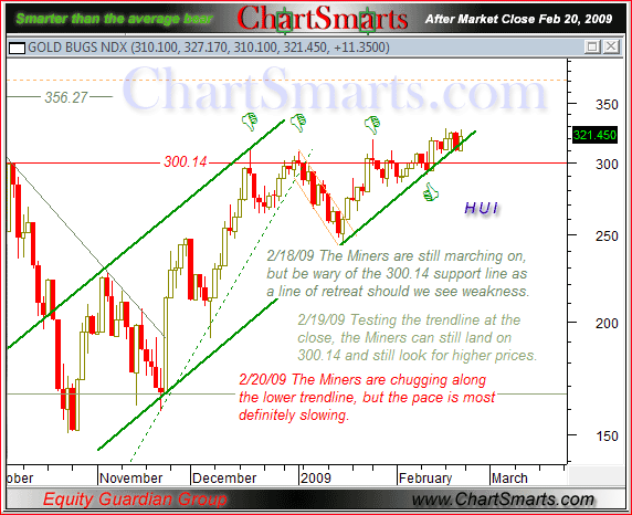


 ***Financials Lag*** Once again, I will highlight three key financial ETFs as they stall at resistance. He who hesitates is lost. Well, the financial ETFs are hesitating near resistance. The Financials SPDR (XLF) stalled the six days with resistance just above 10. This stall started with a big dark cloud cover pattern last Thursday. The Regional Bank HOLDRS (RKH) surged above last week's high on Monday, but stalled with inside days on Tuesday, Wednesday and Thursday. The long white candlestick and three inside days form an extended harami. The Broker Dealer iShares (IAI) also surged above last week's high with a long white candlestick on Monday and then stalled the last three days. I still think the odds favor a correction or consolidation as all three remain overbought and at resistance.

 ***A Record Three Weeks*** According to my data, the current three week rally is the largest in over 40 years for the S&P 500. The next biggest surge was August 1982, when the index surged almost 13% in three weeks. This surge kicked off a bull market that lasted until the 1987 crash. The chart below shows the current surge relative to the 2002 surges. The S&P 500 bottomed in July 2002 and surged 22% in 4-5 weeks (green arrows). After this momentous surge, the index embarked on a 38 week trading range and tested the July low twice. Bottoming is a process, just like healing. As in July 2002, stocks became too oversold in early March 2009. The current rally alleviated these oversold conditions and the healing process has begun. The March low may hold for some time to come, but we are very likely to see a significant pullback that will allow a second chance to partake with lower risk.
  ***Major-index ETFs*** ***Medium-term Trend*** Despite another surge, there is not much change in the medium-term analysis. Over the last 13 days, SPY is up 22%, QQQQ is up 22% and IWM is up 29%. IWM also led the way higher during the Nov-Dec surge. The advance over the last three weeks is impressive – no doubt. However, IWM and SPY are still overbought and within resistance zones. The 62% retracement line (blue) cuts right through the middle of the last consolidation (late Jan- early Feb). QQQQ surged into its resistance zone from the January-February highs. I under estimated the strength of this rally, but I am still not going to chase the market when the major-index ETFs are overbought and at resistance.

 ***Short-term Trend*** The recovery started late Wednesday and continued on Thursday. QQQQ, SPY and IWM held Monday's gap and surged to new highs for the move. Technically, the short-term trend is up as the major-index ETFs forge higher highs and higher lows. Thursday's gap turns into the first support level to watch for signs of weakness. Even though I run the risk of being a stopped clock (correct twice a day), I will remain short-term bearish because of overbought conditions and resistance on the daily charts. The risk is that end-of-quarter window dressing further fuels the rally. However, I still think the odds favor a pull over the next 1-3 weeks.

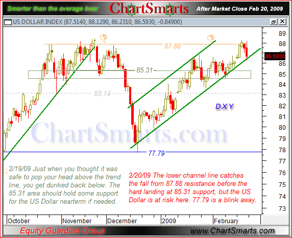
 ***Inter-Market Charts*** ***Dollar*** The Dollar continued to shrug off the frivolous global currency debate and edged higher on Thursday. There is not much change in the technical picture. The US Dollar Bullish ETF (UUP) found support near the 62% retracement mark and moved higher the last five days. Even though the advance looks like a potentially bearish rising flag, the bulls have the short-term edge as long as it rises. Support remains at 25 and a break below this level would signal a continuation lower. As long as the flag rises, I expect a move towards broken support around 25.9-26. The Euro ETF (FXE) became overbought after the surge above 137 and met resistance at the 62% retracement mark. In contrast to the Dollar, FXE sports a potentially bullish falling flag with resistance at 136.6. A break above this level would be bullish. However, as long as the flag falls, the bears have the edge and I expect a move towards broken resistance around 129-130.

 ***Gold*** If the Dollar bounces back to broken support, then gold could come under pressure in the coming days. The Gold SPDR (GLD) surged last week, but never followed through on this big move off support. After this surge, GLD pulled back to the Oct-Nov trendline and firmed over the last three days. On this daily chart, a break below 90 would be most negative and I would then expect a decline into the low 80s. On the 30-minute chart, the bounce over the last three days looks like a rising wedge, which is potentially bearish. GLD broke the lower trendline yesterday and further weakness below 91.5 would argue for a continuation of the prior decline. This would be the early signal to expect a more important support break at 90.
 ***Oil*** There is still no change in the United States Oil Fund ETF (USO). The ETF remains in a short-term uptrend and medium-term downtrend. The advance over the last few weeks looks like a rising flag, which is potentially bearish. USO became short-term overbought as RSI(2) moved above 90 on Monday. In addition, USO is trading near resistance from the upper trendline of the rising flag. Looks like time for a pullback. On the 30-minute chart, USO has been edging higher the last four days. First support is set at 31 for top pickers.
 ***Treasuries*** The Treasury market is perking up. The 20+ Year T-Bond ETF (TLT) opened weak and closed strong for the second day running. Overall, the ETF remains within a trading range. However, TLT is trying to firm above last week's low and continue last week's surge. A move above this week's high would show some promise. I am also showing the 7-10 Year T-Note ETF (IEF), which actually looks bullish. Notice that IEF broke resistance with a big surge last week and the decline over the last six days looks like a falling flag. A break above flag resistance would signal a continuation higher. Of note, the Fed is continuing with its plan to purchase $300 billion of Treasuries. On Wednesday, the Fed purchased $7.5 billion worth of Treasuries. Buying resumes today. This gives new meaning to the term: don't fight the Fed. The Fed wants interest rates lower and Treasury prices higher. Moreover, it now has skin in the game. While there are long-term supply concerns, purchases from Fed mean Treasuries are likely to hold support levels.

 Good day and good trading -Arthur Hill


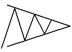
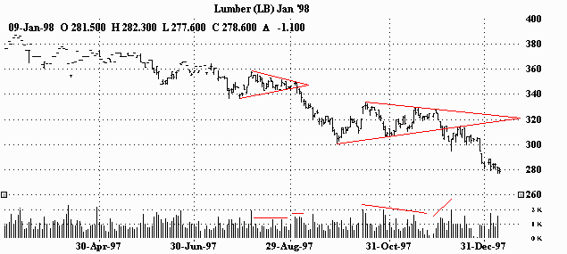
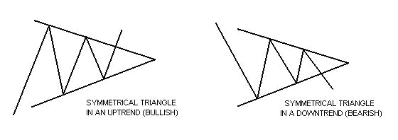 Symmetrical triangles can be characterized as areas of indecision. A market pauses and future direction is questioned. Typically, the forces of supply and demand at that moment are considered nearly equal. Attempts to push higher are quickly met by selling, while dips are seen as bargains. Each new lower top and higher bottom becomes more shallow than the last, taking on the shape of a sideways triangle. (It's interesting to note that there is a tendency for volume to diminish during this period.) Eventually, this indecision is met with resolve and usually explodes out of this formation (often on heavy volume.) Research has shown that symmetrical triangles overwhelmingly resolve themselves in the direction of the trend. With this in mind, symmetrical triangles in my opinion, are great patterns to use and should be traded as continuation patterns.
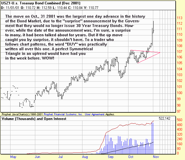
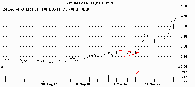
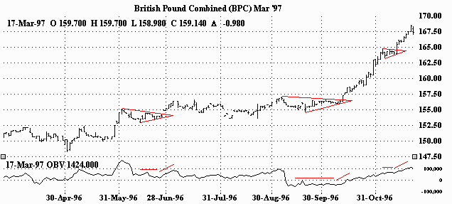
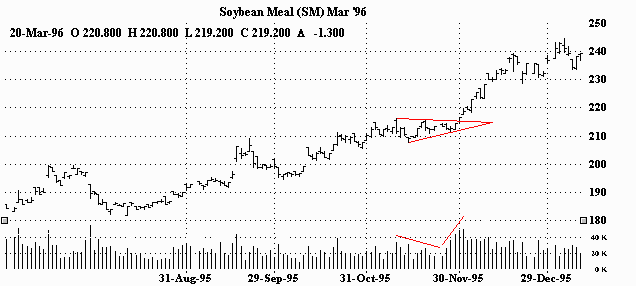
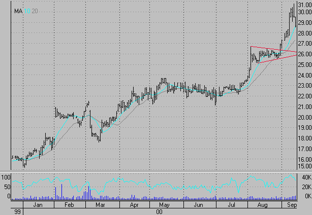

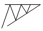
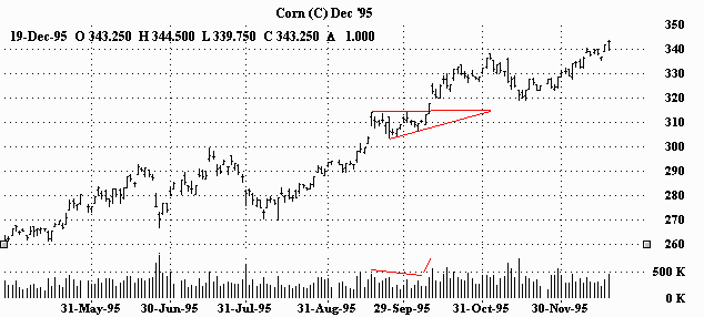
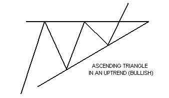 The ascending triangle is a variation of the symmetrical triangle. Ascending triangles are generally considered bullish and are most reliable when found in an uptrend. The top part of the triangle appears flat, while the bottom part of the triangle has an upward slant. In ascending triangles, the market becomes overbought and prices are turned back. Buying then re-enters the market and prices soon reach their old highs, where they are once again turned back. Buying then resurfaces, although at a higher level than before. Prices eventually break through the old highs and are propelled even higher as new buying comes in. (As in the case of the symmetrical triangle, the breakout is generally accompanied by a marked increase in volume.)
  Ascending triangle in an uptrend. Volume falls off during the formation, picks up and then expands on the breakout and ensuing upmove. ASCENDING TRIANGLE IN AN UPTREND (BULLISH)
 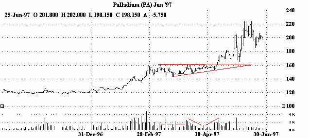 An ascending triangle in an uptrend. After nearly two months of indecision, the market aggressively resolves itself in the direction of the trend. As for volume, other than a few spikes of activity within the pattern, there is a general lessening of participation with a marked increase on the breakout. ASCENDING TRIANGLE IN AN UPTREND (BULLISH)
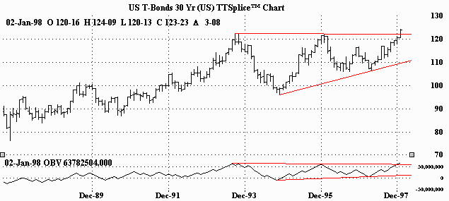
 An ascending triangle in an uptrend. Diminishing volume during the pattern and a jump in volume on the breakout. ASCENDING TRIANGLE IN AN UPTREND (BULLISH)
 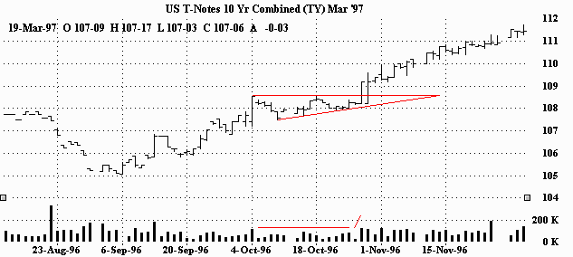 The ascending triangle in this uptrend continued the move higher. Volume wanes a bit during the formation and then picks up on the breakout. The march higher is also accompanied by sustained volume. The information contained here was gathered from sources deemed reliable, however, no claim is made as to its accuracy or content. This does not contain specific recommendations to buy or sell at particular prices or times, nor should any of the examples presented be deemed as such. There is a risk of loss in trading futures and futures options and you should carefully consider your financial position before making any trades. The reference to statistical probabilities does not pertain to profitability, but rather to the direction of the market. The size and the duration of the markets move, as well as entry and exit prices ultimately determines success or failure in a trade and is in no way represented in these statistics. Furthermore, no representation is being made that any of the examples shown resulted in actual trades. This is not, nor is it intended to be, a complete study of chart patterns or technical analysis and should not be deemed as such.
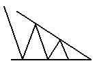
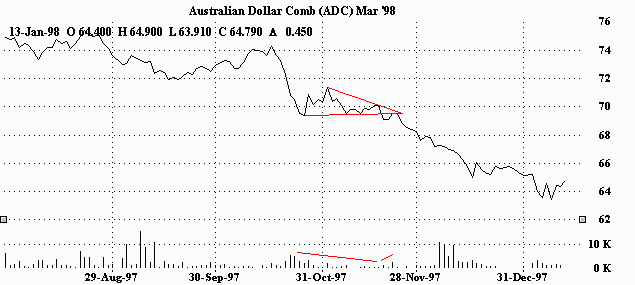
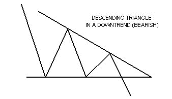 The descending triangle, also a variation of the symmetrical triangle, is generally considered to be bearish and is usually found in downtrends. Unlike the ascending triangle, this time the bottom part of the triangle appears flat. The top part of the triangle has a downward slant. Prices drop to a point where they are oversold. Tentative buying comes in at the lows, and prices perk up. The higher price however attracts more sellers and prices re-test the old lows. Buyers then once again tentatively re-enter the market. The better prices though, once again attract even more selling. Sellers are now in control and push through the old lows of this pattern, while the previous buyers rush to dump their positions. (And like the symmetrical triangle and the ascending triangle, volume tends to diminish during the formation of the pattern with an increase in volume on its resolve.)
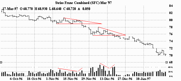
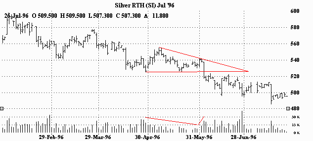
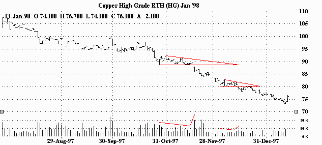
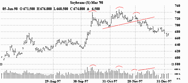
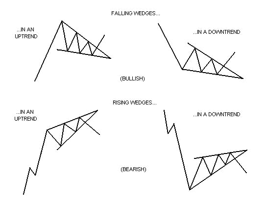 The wedge formation is also similar to a symmetrical triangle in appearance, in that they have converging trendlines that come together at an apex. However, wedges are distinguished by a noticeable slant, either to the upside or to the downside. (As with triangles, volume should diminish during its formation and increase on its resolve.) A falling wedge is generally considered bullish and is usually found in uptrends. But they can also be found in downtrends as well. The implication however is still generally bullish. This pattern is marked by a series of lower tops and lower bottoms. A rising wedge is generally considered bearish and is usually found in downtrends. They can be found in uptrends too, but would still generally be regarded as bearish. Rising wedges put in a series of higher tops and higher bottoms.
 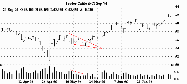 Here's a falling wedge in the very beginning of an uptrend. As you can see, volume dissipates during the formation of the wedge pattern and then picks up on the breakout. FALLING WEDGE IN AN UPTREND (BULLISH)
 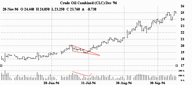 Falling wedge in an uptrend. After more than a $2.00 rally, the market pauses before continuing higher for an impressive run. Volume dips during this pause and then picks up on the breakout and trek higher. FALLING WEDGE IN A DOWNTREND (BULLISH)
 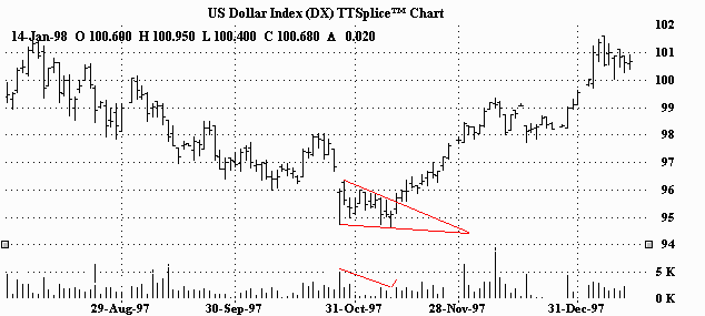 Falling wedge in a downtrend. This pattern was able to reverse the downtrend nicely. Volume drops off in the wedge and then comes back as the market moves out of the pattern. FALLING WEDGE IN A DOWNTREND (BULLISH)
 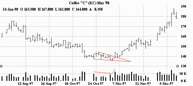 Falling wedge in downtrend. Nice reversal. After waning volume in the wedge, there's a good increase on the breakout. In fact, these good volume readings were able to sustain themselves during the move higher. RISING WEDGE IN AN UPTREND (BEARISH)
 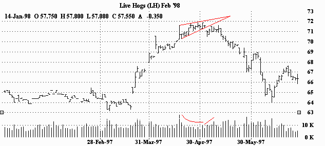 The rising wedge put a stop to this uptrend. Volume tails off as the trend struggles. Volume expands as the market falls through the bottom of the wedge and the new downtrend begins. RISING WEDGE IN AN UPTREND (BEARISH)
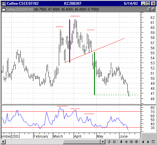
 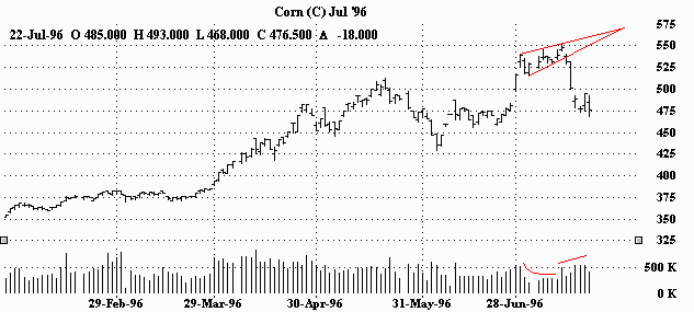 This rising wedge stopped corn dead in its tracks! (As you can see, July corn went off the board shortly after the downside breakout, but nevertheless, lost more than 70 cents in just six days - WOW!) As for volume, the story remains the same. Volume falls off in the wedge and jumps on the breakout. RISING WEDGE IN A DOWNTREND (BEARISH)
 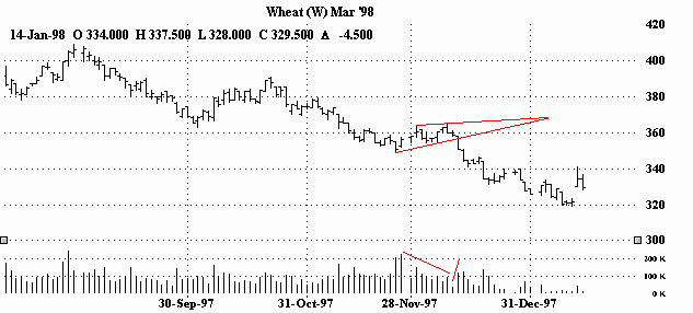 This rising wedge seemingly presented an area of indecision. However, within a few weeks the market resolved itself in the direction of the trend (down.) As usual, volume increases on the breakout after diminishing during the pattern. RISING WEDGE IN A DOWNTREND (BEARISH)
 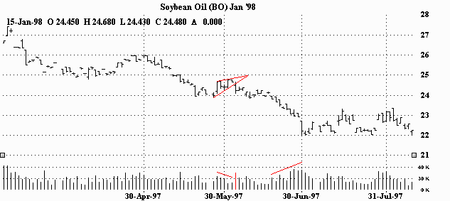 Rising wedge in a downtrend. A short pause followed by renewed downside conviction. And once again, volume dries up in the pattern and increases on the breakout. (Notice how the volume really starts to pick up as the downtrend gains momentum shortly after the break.)

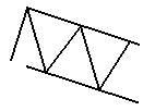
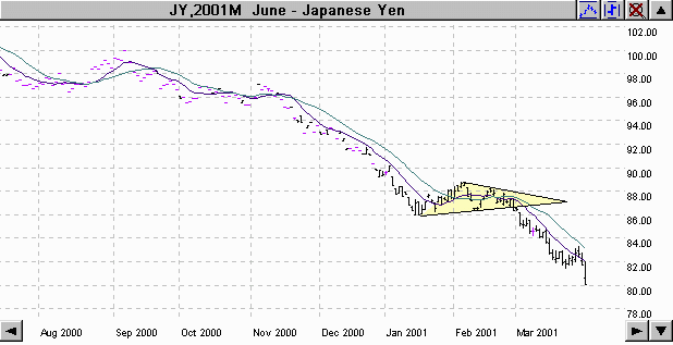
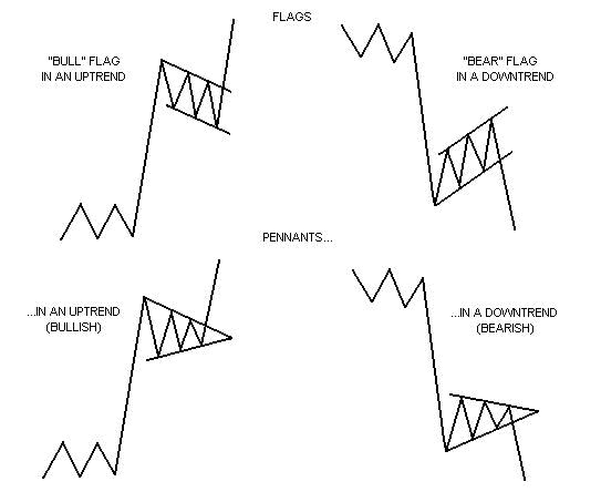 Flags and pennants can be categorized as continuation patterns. They usually represent only brief pauses in a dynamic market. They are typically seen right after a big, quick move. The market then usually takes off again in the same direction. Research has shown that these patterns are some of the most reliable continuation patterns. Bullish flags are characterized by lower tops and lower bottoms, with the pattern slanting against the trend. But unlike wedges, their trendlines run parallel. Bearish flags are comprised of higher tops and higher bottoms. "Bear" flags also have a tendency to slope against the trend. Their trendlines run parallel as well. Pennants look very much like symmetrical triangles. But pennants are typically smaller in size (volatility) and duration. (Volume generally contracts during the pause with an increase on the breakout.)
 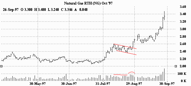 After a sharp rally, this "bull" flag served as a breather before running off again in the same direction. You can see the volume ease up a bit in the beginning of the flag, but then pick up as it nears the top of the formation and blows through it. "BULL" FLAG IN AN UPTREND (BULLISH)
 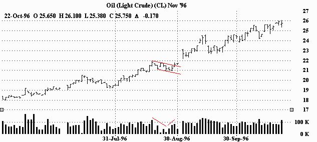 "Bull" flag in an uptrend. Quick rally, short pause, blast higher. Volume dips in the flag and surges on the breakout. "BEAR" FLAG IN A DOWNTREND (BEARISH)
 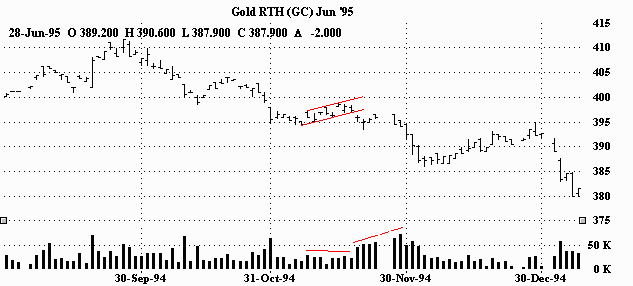 "Bear" flag in a downtrend. After a big rout, the flag seemingly presents a chance to re-group before continuing in the same direction (down.) Volume diminishes during the pause and then rapidly expands on the continuation. "BEAR" FLAG IN THE BEGINNING OF A DOWNTREND (BEARISH)
 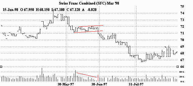 After a big dump, this "bear" flag sets the stage for another quick and even larger fall. Volume decreases considerably in the flag, but the break to the downside is accompanied by a big increase in activity. "BULL" PENNANT IN AN UPTREND (BULLISH)
 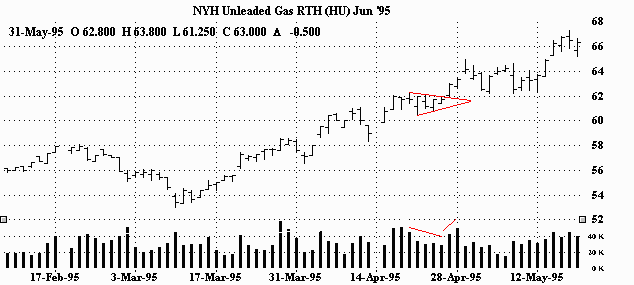 "Bull" pennant in an uptrend. After a month long rally, the market takes a five day breather and continues even higher. Volume dips briefly and then picks up on the breakout. "BULL" PENNANT IN AN UPTREND (BULLISH)
 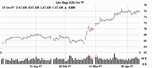 How's that for a pattern? Remember from the preceding page; 'pennants look very much like symmetrical triangles, but are typically smaller in size (volatility) and duration.' After a near straight up advance, the market takes only three days before resuming the upmove. During those few days, participation drops off a bit, but comes back as the market explodes out of the pennant. (Take a look at all those gaps right before and right after the pennant. Obviously a very strong and convinced market!) "BEAR" PENNANT IN A DOWNTREND (BEARISH)
 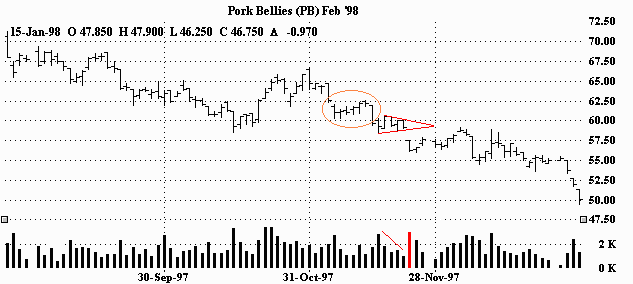 "Bear" pennant in a downtrend. This pattern came right after a 'bear' flag breakout. (Can you see it?) This pennant also presents only a brief pause before the market reasserts itself in the direction of the trend (down.) Volume dips in the pattern and jumps as the market breaks out and gaps lower. "BEAR" PENNANT IN THE BEGINNING OF A DOWNTREND (BEARISH)
 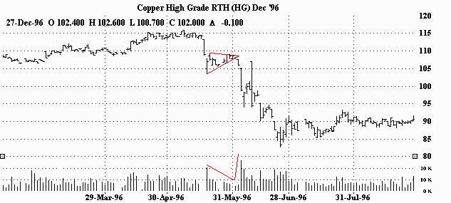 "Bear" pennant in the beginning of a downtrend. After a dramatic two day plunge, the market has a short lived consolidation. The rout continues and the market collapses. You can see activity dry up in the pennant. The breakout though, was made on extremely heavy volume. The information contained here was gathered from sources deemed reliable, however, no claim is made as to its accuracy or content. This does not contain specific recommendations to buy or sell at particular prices or times, nor should any of the examples presented be deemed as such. There is a risk of loss in trading futures and futures options and you should carefully consider your financial position before making any trades. The reference to statistical probabilities does not pertain to profitability, but rather to the direction of the market. The size and the duration of the markets move, as well as entry and exit prices ultimately determines success or failure in a trade and is in no way represented in these statistics. Furthermore, no representation is being made that any of the examples shown resulted in actual trades. This is not, nor is it intended to be, a complete study of chart patterns or technical analysis and should not be deemed as such.
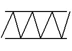
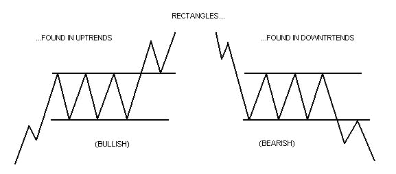 Rectangles should generally be traded as continuation patterns. They are indecision areas that are usually resolved in the direction of the trend. Research has shown that this is true far more often than not. Of course, the trendlines run parallel in a rectangle. Supply and demand seems evenly balanced at the moment. Buyers and sellers also seem equally matched. The same 'highs' are constantly tested as are the same 'lows'. The market vacillates between two clearly set parameters. (While volume doesn't seem to suffer like it does in other patterns, there usually is a lessening of activity within the pattern. But like the others, volume should noticeably increase on the breakout.)
 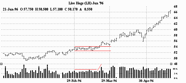 Rectangle pattern in an uptrend. The market goes into roughly a three week consolidation before it finds its resolve and pushes higher. There is a general lessening and sort of balance to volume during the formation, but there is a clear increase on the breakout. (It's interesting to note that the volume seems erratic prior to the consolidation, kind of balanced during, and while still generally balanced as the market moves away from the rectangle, noticeably heavier.) RECTANGLE IN THE BEGINNING AN UPTREND (BULLISH)
 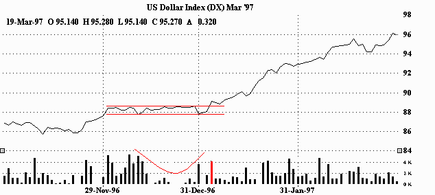 This rectangle in the beginning of an uptrend kept the market guessing for a month before resuming what it had started (uptrend.) This lengthy indecision saw volume dive. But the breakout seemed to wake everybody up. As you can see it was made on heavy volume. (By the way, a line chart was used in this example for easier viewing.) RECTANGLE IN AN UPTREND (BULLISH)
 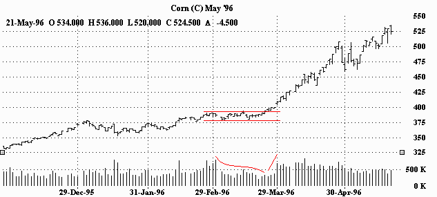 Another month long rectangle in an uptrend. But, there's no looking back once the market resolves itself. Volume decreases during the wait. You can see that somewhere in the middle of the rectangle, there is an attempted breakout. The market pokes through the top 'parameter' only to be turned back, closing lower than it opened. You can also see the short lived spike in volume as well. However, when the market fails to violate the bottom 'parameter', the market charges back up. And even before the ultimate upside breakout, volume starts expanding on the trek higher. The breakout finally happens and is accomplished on strong volume. RECTANGLE IN A DOWNTREND (BEARISH)
 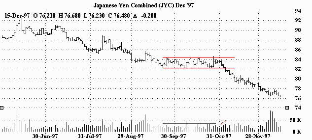 Here we have a rectangle in a downtrend. This one lasted for about six weeks. After a pretty big fall, the market consolidated before determining where to go next. Obviously, they figured it out, and headed off in the direction they started in (down.) Volume kind of thins out during this sideways period and then picks up as it heads for the bottom of the rectangle one last time and breaks through it. Notice that just prior to the downside resolution there was an attempted (failed) breakout to the upside. The markets inability to follow through was quickly exploited by the 'bears', as the market collapsed only a handful of days later. RECTANGLE IN A DOWNTREND (BEARISH)
 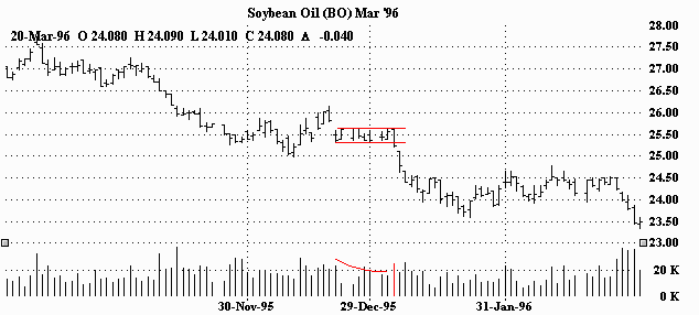 Rectangle in a downtrend. The market gets rocked, and bounces a bit, before settling into a two week sideways pattern. The market then resolves itself and blows through the bottom of the rectangle. Volume can best be described as a bit lighter but erratic during the pattern. However, volume is clearly heavier on the break lower. RECTANGLE(S) IN A DOWNTREND (BEARISH)
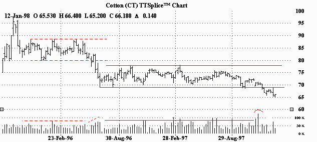
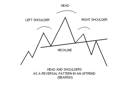 The head and shoulders pattern is generally regarded as a reversal pattern and it is most often seen in uptrends. It is also most reliable when found in an uptrend as well. Eventually, the market begins to slow down and the forces of supply and demand are generally considered in balance. Sellers come in at the highs (left shoulder) and the downside is probed (beginning neckline.) Buyers soon return to the market and ultimately push through to new highs (head.) However, the new highs are quickly turned back and the downside is tested again (continuing neckline.) Tentative buying re-emerges and the market rallies once more, but fails to take out the previous high. (This last top is considered the right shoulder.) Buying dries up and the market tests the downside yet again. Your trendline for this pattern should be drawn from the beginning neckline to the continuing neckline. (Volume has a greater importance in the head and shoulders pattern in comparison to other patterns. Volume generally follows the price higher on the left shoulder. However, the head is formed on diminished volume indicating the buyers aren't as aggressive as they once were. And on the last rallying attempt-the left shoulder-volume is even lighter than on the head, signaling that the buyers may have exhausted themselves.) New selling comes in and previous buyers get out. The pattern is complete when the market breaks the neckline. (Volume should increase on the breakout.)
 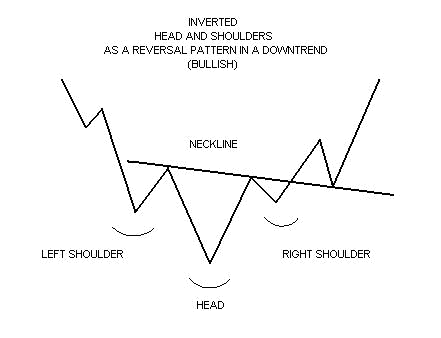 The head and shoulders pattern can sometimes be inverted. The inverted head and shoulders is typically seen in downtrends. (What's noteworthy about the inverted head and shoulders is the volume aspect. The inverted left shoulder should be accompanied by an increase in volume. The inverted head should be made on lighter volume. The rally from the head however, should show greater volume than the rally from the left shoulder. Ultimately, the inverted right shoulder should register the lightest volume of all. When the market then rallies through the neckline, a big increase in volume should be seen.)
 The head and shoulders signaled a market top. You can see that the volume diminished with each market top during the formation of the head and shoulders pattern, but then picked up on the breakout and continued to expand on the sell-off.
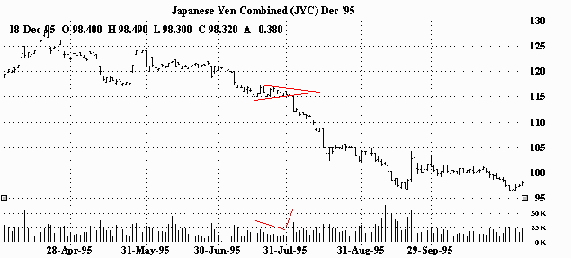
 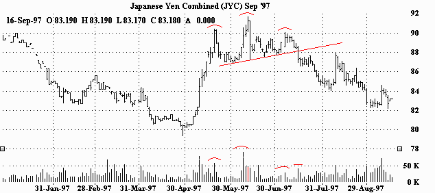 The head and shoulders signaled a top to this rally. (The Japanese Yen had been in a downtrend for more than three years prior to this relatively short lived upmove.) As you can see, the head and shoulders pattern is easily recognizable on the price chart. While the volume chart is'nt as clear, closer scrutiny will reveal that indeed each topping day in the pattern was made on diminishing volume. The big jump in activity just prior to completing the 'head', was done on short covering, (shorts getting out of their positions rather than new longs coming in.) However, the familiar spike in volume is evident on the breaking of the neckline. HEAD AND SHOULDERS AS A REVERSAL PATTERN IN A MINOR UPTREND (BEARISH)
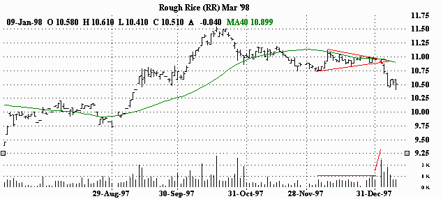
 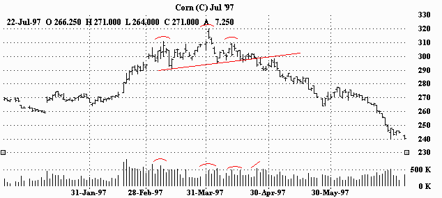 This head and shoulders pattern signaled an end to corn's advance. (Prior to this bounce, it had been in a downtrend for about six months.) You can see the volume diminish as the market eventually loses steam, followed by the typical burst of activity with the breaking of the neckline. HEAD AND SHOULDERS AS A REVERSAL PATTERN IN AN UPTREND (BEARISH)
 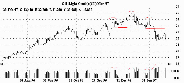 This head and shoulders pattern reversed a nearly year long uptrend. (You'll notice that in this example the neckline is sloping on a slight downward angle.) Nevertheless, as with the other examples, as the pattern unfolded, the volume weakened with each topping action. In fact, volume actually started to pick up on the initial dump after the head was formed (another bearish sign). And of course, there was the big increase in volume on the breaking of the neckline. (The market actually gapped below it!)
 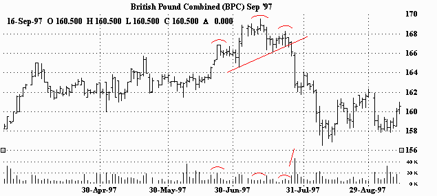 The head and shoulders pattern foreshadowed the end to the British Pound's run. Volume dried up on the last few advances and prices ultimately collapsed. The dramatic plunge through the neckline was accompanied by a huge increase in volume. The information contained here was gathered from sources deemed reliable, however, no claim is made as to its accuracy or content. This does not contain specific recommendations to buy or sell at particular prices or times, nor should any of the examples presented be deemed as such. There is a risk of loss in trading futures and futures options and you should carefully consider your financial position before making any trades. The reference to statistical probabilities does not pertain to profitability, but rather to the direction of the market. The size and the duration of the markets move, as well as entry and exit prices ultimately determines success or failure in a trade and is in no way represented in these statistics. Furthermore, no representation is being made that any of the examples shown resulted in actual trades. This is not, nor is it intended to be, a complete study of chart patterns or technical analysis and should not be deemed as such.
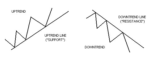 If a market is moving up, a line can be drawn connecting each successive higher bottom. This is an uptrend line or 'support'. As long as the market remains on or above this line, the uptrend is intact. If a market is moving down, a line can be drawn connecting each successive lower top. This is a downtrend line or 'resistance'. As long as prices remain on or below this line, the downtrend is intact.
 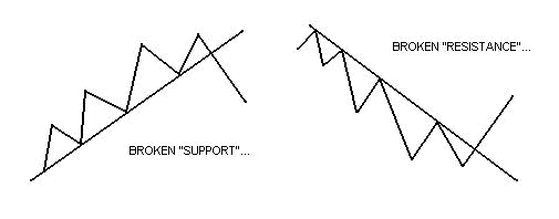 In general, once a trendline is broken, the trend which was previously in force is considered over, or at least in pause. It should be noted that when an uptrend line or 'support' is broken, it then acts as 'resistance'. Likewise, if a downtrend line or 'resistance' is broken, it then becomes 'support'.
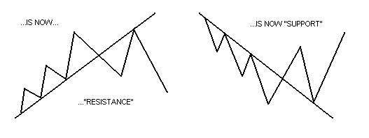
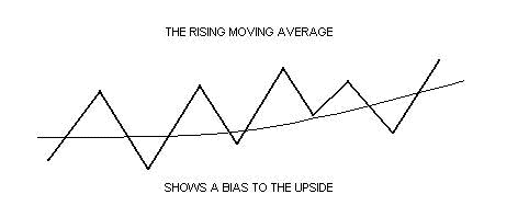 Moving averages are also very helpful in defining a trend. Sometimes, when no clear trendline can be drawn, moving averages can clarify market bias by showing which direction the market has favored over a specific period of time. A rising moving average is generally price friendly (bullish), while a declining moving average would be considered negative (bearish.) A flat moving average would be viewed as neutral or (sideways-trending.) Futures and options trading carries significant risk and you can lose some, all or even more than your investment. Stock trading involves high risks and you can lose a significant amount of money. The information contained here was gathered from sources deemed reliable, however, no claim is made as to its accuracy or content. This does not contain specific recommendations to buy or sell at particular prices or times, nor should any of the examples presented be deemed as such. There is a risk of loss in trading futures and futures options and stocks and stocks options and you should carefully consider your financial position before making any trades. The reference to statistical probabilities does not pertain to profitability, but rather to the direction of the market. The size and the duration of the markets move, as well as entry and exit prices ultimately determines success or failure in a trade and is in no way represented in these statistics. This is not, nor is it intended to be, a complete study of chart patterns or technical analysis and should not be deemed as such.